Blog

Using the Nikon D200 Alongside Modern Cameras

The Quiraing in dappled light, Nikon D200 and 18-55 Zoom. A one shot image with careful exposure.

Introduction

I’ve continued to use the venerable Nikon D200 camera alongside the latest technology in 2024 and will continue to use it along side other great cameras of yesteryear. I have been using this camera for a few years now, following recommendation from a friend. I wanted to share some pictures from the last few years that inspire me to continue using this CCD colour king. If you read the very first blog post I made on this camera, you will know I value this classic body for it’s CCD sensor alongside it’s strict Colour Filter Array (CFA) which follows strict colour discrimination which produces naturally vibrant and colourful images out of the box, without oversaturating individual colours and hues. This allows for an overall very organic, ‘filmic’ looking output with sublime skin tones that I enjoy to this day. In fact, I’d go as far to say that with the right conditions and lens, I sometimes prefer the initial output from the Nikon D200 to other cameras, and contrary to some opinion, find it difficult to get a D200 ‘look’ from other cameras. Knowing how to use the D200 to get the best out of it is another matter, so we will explore that here along with some other tips and tricks. This will also be a bit of a ramble. Most people do not perceive, or seem to care much about colour in digital photography. As long as the sky is blue and the grass is green (no matter what shade or hue of blue and green that is), most people simply don't care one bit. Nobody cares, because if the camera they grab to shoot with has the sky coming out blue, with the grass remaining green, and caucasian people are not Alien-green, and skin colours somewhat resemble close to real life, they are happy. I think that colour is important in photography and I have noticed a couple of things about cameras that do colour well. Read the first article I wrote about the Nikon D200 here.

The D200 CCD Sensor

The 10 Megapixel CCD sensor found within the D200 has some interesting characteristics. 10 MP is considered very low by today’s standards - however for most work I have to ask why people think like this. Nine times out of ten, I’d imagine most people buy the marketing koolaid. “You aren’t a man if you don’t shoot 45 megapixels!” However, consider that most do not print now, and most simply display images on tiny phone screens, so I ask again, why do we really need 45-60MP bodies? I say this as a user of such bodies. I have no choice in the matter if I want a modern, high dynamic range camera with all the bells and whistles that provides. I would say 36MP is the limit I would ever require, but hey, what do I know. The D200 sensor is a CCD technology, mostly phased out for the cheaper CMOS design found in most digital cameras these days, which offers better high ISO capability (and it does). The D200 sensor falls apart at high ISO, and I simply wouldn’t use it for such. You should be aware, the D200 sensor has quite a thick anti-aliasing filter. Because of this, it really benefits from using nice and sharp lenses, though as I will show, combined with some lens attributes / optical imperfections, one can use this to their own advantage to create a very specific look to the resulting pictures.

D200 with 85/1.4 Sigma Art. Shot in JPG. (A friend’s shot)

The above picture of my friend’s son demonstrates beautifully what I am speaking about when it comes to colour reproduction and skin tones. This is an impromptu picture which was shot in JPG image format, (it probably needs a little cropped off the bottom). Here we can see beautiful colour reproduction out of the box: so many modern cameras fail in this regard and I guess I didn’t notice how bad they do as I tend to shoot RAW nearly all the time for professional work. This shot could easily be further processed and dodged and burned for even more dramatic effect of this little moment captured. And how nice is this portrait too? It is so rich, doesn’t feel digital at all, and has beautiful skin tone reproduction. The subtle changes of red - orange hues in the skin tones are picked up beautifully here. The subtle red hue of the top is picked up beautifully. Some cameras struggle with basic colour reproduction such as this; red tones are pushed to orange, golden colours, skewed to yellows to name a few. Some of my modern CMOS camera’s really have issue with red colours especially in lowered light. My D810 changes red neon signs to orange every time. Even although the high ISO ability of the D200 is much poorer, I found it doesn’t do this sort of colour skewing that my eyes have become accustomed to seeing. As mentioned, this is a straight out of camera shot too! Hold that thought.

The Colour Filter Array - By en:User:Cburnett - Own work, CC BY-SA 3.0, https://commons.wikimedia.org/w/index.php?curid=1496858

Colour Filter Array

In digital imaging, a colour filter array (CFA), is a mosaic of tiny colour filters placed over the pixel sensors of an image sensor to capture colour information. Without such a filter in the imaging chain, the sensor is not able to ‘see’ the differing wavelengths of light, and thus would not be able to produce an eventual colour image. The illustration shows a Bayer colour filter array typical in many digital camera sensor designs. Each two-by-two submosaic contains 2 green, 1 blue, and 1 red filter, each filter covering one pixel sensor. (You can see therefore, that natively some sensors capture more green wavelengths of light easier - this sometimes presents itself as a problem when processing deep sky images - there’s more green to deal with). The colour filters filter the light by wavelength range, such that the separate filtered intensities include information about the colour of light. For example, the Bayer filter gives information about the intensity of light in red, green, and blue (RGB) wavelength regions. The raw image data captured by the image sensor is then converted to a full-colour image (with intensities of all three primary colours represented at each pixel) by a demosaicing algorithm which is tailored for each type of colour filter. The old CFA's were clearly built to prioritize colour fidelity at base ISO, whereas, at least in the initial generation of high megapixel sensors, they seem to have been weakened to let more light pass, to allow those sensors to achieve better high iso capability. This I feel may have affected their native colour output, compared to bodies like the D200, D60, D40, which had strict CFAs and CCD sensors which borrowed the kodak colour recipe from the film days. Modern CMOS image sensors tend to have smaller pixels (to increase resolution and reduce optics weight, volume and cost) and thus. less light gathering capability per pixel. A "weaker" CFA is used to partially compensate this. Do the same with a CCD and you will also get "weak colors." So the point is, the CFA is extremely crucial here in the imaging chain. There are plenty of CCD sensors that produce subjectively bad colour. This is where people go wrong with this CCD thing. It’s the CFA that has probably the largest say in the colour discrimination from the sensor and it just so happens to be that CFA’s a the advent of digital technology were more strict then some found in more modern tech. BSI CMOS has basically erased the light gathering advantage CCD sensors enjoyed years ago when FSI CMOS sensor circuitry still blocked part of the pixel. Although the  sensor itself is monochromatic, the colour  depends on more than just the CFA. There's an interpolation step required to convert the 4 measured RGBG pixels into  native colour after which a 3x3 color correction matrix produces sRGB.

A weak CFA over CCD can and will indeed suffer the same color problems as a weak CFA over CMOS.

Sensor Colour Response - SMI

From DXOMark - “The sensitivity metamerism index (SMI) is defined in the ISO standard 17321 and describes the ability of a camera to reproduce accurate colors. Digital processing permits changing color rendering at will, but whether the camera can or cannot exactly and accurately reproduce the scene colors is intrinsic to the sensor response and independent of the raw converter.

The underlying physics is that a sensor can distinguish exactly the same colors as the average human eye, if and only if the spectral responses of the sensor can be obtained by a linear combination of the eye cone responses. These conditions are called Luther-Ives conditions, and in practice, these never occur. There are objects that a sensor sees as having certain colors, while the eye sees the same objects differently, and the reverse is also true.

SMI is an index quantifying this property, and is represented by a number lower than 100 (negative values are possible). A value equal to 100 is perfect color accuracy, and is only attained when Luther-Ives conditions hold (which, as previously stated, never happens in practice). A value of 50 is the difference in color between a daylight illuminant and an illuminant generated by fluorescent tubes, which is considered a moderate error.”

NB: SMI depends more on CFA selectivity and AA strength than other sensor parameters, and since newer cameras with more pixels can do with weaker AAs, they can be a little less precise at handling colour in this regard.

Nikon D200 SMI Colour Response in Daylight. Courtesy of DXOMark.

Sensitivity metamerism index, or SMI, is essentially a measure of how well a specific camera under test lighting can reproduce the colour checker colour set. To give you an idea, under testing many phones sit around 40-50 in their SMI score out of 100, which is pretty low. Larger sensor cameras, aka DSLR’s and mirrorless designs tend to be much better, They start around 75 and go up. Scores in the 80s tend to be very good indicators of ‘good’ colour reproduction. Cameras valued for good color typically have high SMI values, while those known for poor color usually have low numbers. But not always. Anecdotal evidence suggests that some photographers feel that their older cameras deliver better colour than their newer ones (of course, a subjective quality regarding colour). In our colour images, it can be valuable to have a camera that is able to accurately pick up all the subtle tones and hues of individual colours, without oversaturating any of them like some other cameras do (new and old, I might add). This would be like someone noticing their camera did not saturate individual colours well in a scene, and another remarking that they could just turn up the saturation in post processing. However, in doing so, colours over-saturate before the more subtle colours saturate properly. That said, I mostly just go by look though in these matters. This stands to reason, because when I first picked up the D200 to shoot with it I immediately noticed what my buddy was saying. This is despite having a lot of cameras under my belt and using the latest cameras for landscape photography, astrophotography and other genres.

Let’s have a look at the DXOMark data on colour for the D200 camera. What we are looking at here is the daylight response to colour reproduction (CIE-D50) Click to see a larger view, or pinch zoom if on a mobile over the data. The D200 scores very highly, at 84 in this metric. Compare that to another body, not known for it’s colour reproduction quality - the D600. Note that it is scoring notably lower from the testing procedure at 77. Actually, the two Nikon cameras that top DXO's list for highest color SMI are the D40 and D60 which both scored 85 and 84 respectively for CIE-D50 and CIE-A. The only downside is they are very old bodies now and come with a worse autofocus system, and less bells and whistles than the D200 provides. They are definitely not built like the D200 either.

Nikon D600 SMI Colour Response in Daylight. Courtesy of DXOmark.

See here to find the full details on the ISO International Standard for Camera Colour ISO 17321-1. Feel free to look up SMI figures for colour for other cameras. Generally, the trend is, the lower that number, the worse it’s out of the box colour tends to be for the particular body under investigation. Curiously though, things have gotten interesting recently. At the advent of modern high megapixel cameras such as the D800, D810 and D850, there was a slight drop in colour performance if we look at this metric. For example the D800 took a notable hit at 78 on the SMI scale. The D850 scored a slightly better 79. The Z7 mirrorless reached 82, and now the Z8 I own got an 83! Only one point less than my beloved D200. However, as I wanted to describe, it is important to not just attribute colour performance to one number. The Z8 colour is very different to the D200 in the way it’s colours present. Different is the best adjective here. Neither is better, it really becomes a personal preference. This is indeed another point that I would make. I have realised that I am someone that loves to shoot different cameras, also for the experience in itself. To me, every sensor ‘draws’ differently. So even cameras that I have stated have ‘poorer’ colour than the D200, such as the D800, I love to use because I still like their output, for other reasons. It becomes a tool to task, or what I want to create type of thing. With regards to the D200, it does feel very film like in it’s reproduction. The colours feel older school, the thick AA filter mutes some detail too, the skin tones are gorgeous. The effect is, the D200 really feels like a digital-film camera hybrid to me in comparison to the modern technology. It is noted that the D200 can individually pickup and discriminate all the subtle hue changes and saturations of individual colours in an image. In trying to emulate what the D200 does natively with other cameras, tends to make particular colours go ‘nuclear’ with oversaturation, whilst trying to properly saturate the weaker colours in the image. I have noticed this over and over.

There are some problems with SMI, and using it in isolation:

  • As a statistical measure, it only gives us an average and doesn’t tell us about the distribution of errors.

  • If they only use the ColorChecker 18 color chart, then this is an amazingly poor sample. Really, there should be a better methodology using far more colors. What I find surprising is that manufacturers can’t even get these 18 colors right.

  • There could be a potential problem of them ‘gaming the system’ where manufacturers only work on getting those 18 colors right, ignoring the others, giving a deceivingly high SMI number. This is a big problem with artificial illuminants such as fluorescent and LED lamps, which are often designed to delver a high Color Rendering Index even though they still have poor spectra — and the CRI test is even worse than SMI, using only 8 sample colors. Lamp manufacturers lately rejected the use of the full ColorChecker chart, which is rather distressing.

  • I’m not to sure how good CIELab is as a color distance metric, although it is far better than Euclidian RGB distance.

  • This does not take ease of re-touchability of colors into account, which is related to color depth.  High color depth does not mean that the colors are correct, but it does make them more correctable in post processing. 

Looking at this in a bit more detail with a test scene, it all looks similar until we take a closer look. It proves the point that this isn’t really about CCD vs CMOS. It is more about, which camera has the stricter CFA with that sensor. Look at the D200 colours, then for example the D300 example below it. Green crayon, third from the left, look at the wrapper. It’s barely saturated compared to the D200 image. Same with the purple crayon wrapper near the centre. The D200 shows the subtle saturation of the hue, whereas the D200 shows a very washed out tone in comparison. This is true of many of the other colours shown here. Note that only the D200 has a CCD sensor here. The Canon 5D does well in this comparison because it appears to have a much stricter CFA than the D2XS or the D300, despite having a CMOS sensor.

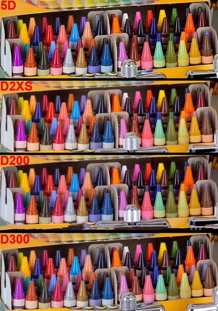
Canon 5D - CMOS with strict CFA, D2XS, CMOS weak CFA, D200 CCD, strong CFA, D300, CMOS, weak CFA. Image used with permission courtesy of   Imaging Resource.

In the above scene, there is a subtle but noticeable colour difference; a ‘when you see it’ type of thing. The M240 image is on the left side. The Leica M9 CCD sensor with strict CFA is on the right. Here the author can't match the M9's rich rendering of the purple vine because the green foliage of the M240 image would go nuclear if he did. Yet we can see the strong saturation applied to bring the M240 image closer to the M9 has already unnaturally overcooked the weaker colours in the M240 walkway, yet it still doesn’t match it. Only the M9 seems to preserve the full dynamic colour range of the scene. If you are looking at these images on a cheap monitor that doesn’t show at least 100% RGB colour, you won’t see the subtle differences I am showing here. Also note that the M9 image shows more shadow detail in the gate than the image from the M240, despite still being a punchier, more contrasty image. You might look at this and think oh I see it but it’s subtle. However I see it across other colours too. Many cameras skew reds to orange, and golds to yellows, as well as undersaturating them, which is even more problematic.

D200 Top, D810 Bottom, using Nikon’s own software NX-1

Have a look at the above images. Using Lightroom classic, the rendering is dull and lifeless on the D200. However, use NX-1 (the way Nikon intended picture controls to be read), and you can really see the colour punch from the D200 here. Now I know, the framing is slightly different, and even although I used the same ISO, shutter and aperture speed, the exposure / white balance will always be slightly different. Despite this, I have yet to see anyone accurately mimic the D200. If you can, I would like to see this, and see how long it took to do, and how long it took to do it for each illuminant. I’ll wait! I know how I prefer my strawberry colour out of these two examples. The D200 might not even be more accurate here. For me, it’s about what is more pleasing. I took some time to try and match these, and frankly it was painful. I never actually got them the same, when when I approached the D200’s colour punch, by bending and shifting the colour to make the strawberries mimic the D200 on the D810, the rest of the colour got mangled. Let’s look at one example of this next.

Above is an example of the problem with the red channel in Nikon cameras. First we see the D810 output. Next, an ancient Samsung Note 20 Ultra phone, and lastly, what I have to do to get the tail light to approach how it looks colour wise (still not right however - it’s too orange). Notice how the skin tone is completely mangled? This issue is compounded by the fact that Nikon reds blow out ultra quickly, compared to the other colour channels (it’s as good a reason as any to ensure you have colour histograms enabled in any camera you shoot with). You may assume that by me simply drastically lowering the exposure of the shot, as I have done on the right, got me to this point that you are seeing here in this example. The reality is, I had to do huge pulls on the orange and yellow-red hue sliders and calibration settings. To reiterate, it is a great example of the point I would make when people tell that you can get colour any way you want it. It would be a lot of work in order to truly match the output of a favourable camera, and even so, I have reservations it is possible, if the CFA is so weak at capture stage - how can heavy handed RAW transformations (to get good colour) actually deal with the fact of an information loss at the shot taking stage?

Have a look at this image from dpreview.com : https://www.dpreview.com/forums/post/53185762?image=0

Here we can see four CMOS cameras. The D700 by far pulls out the gold tones the best. The D800 really skews this hue to yellow. The D700 has a much stricter CFA than the D800 does.

We know that despite the addition of micro-lenses, smaller pixels physically collect less light per pixel. That makes them less sensitive to light on a per pixel basis. Manufacturers have responded by progressively making the CFA's in high density sensors less selective to allow more light to reach these tiny pixels, particularly for when light levels are low and high ISO must be used.

The rationale is explained below:

Look at what Doug Peterson from PhaseOne says on the matter - “Historically, CMOS has not had the best reputation for color rendition. But teasing apart cause and effect has been, up until now, very difficult. CMOS and CCD were being used by very different companies in very different systems. Most CMOS cameras are built for the broadest possible range of applications. They are built by consumer electronics companies with a volume sales business model, where features and price are higher priorities than image quality.

As one example, the selection of a CFA, the color pattern put in front of the sensor, is a choice between quality of color, and ISO performance. If the CFA allows each pixel to see a broader spectrum of color (e.g. for the green pixels to see a bit further into yellow) a camera’s ISO range can be modestly increased. The resulting loss in color quality is subtle – subtle variations in color are missed and a handful of specific colors become difficult to photograph. In a market where a ISO 25,600 camera has a leg up on a ISO12,800 camera, the engineers are under enormous pressure to pick the modestly increased ISO over subtle color quality.”

https://luminous-landscape.com/the-phase-one-iq250-cmos-fully-realized/

Now look at the trend in SMI scores here:

http://www.dpreview.com/forums/post/56355228

Generally speaking, the top 50 list for high SMI cameras are CCD cameras (which happen to have strong CFAs) while modern, high density sensors occupy the bottom 50. It doesn't take a rocket scientist to see why...weak CFA's have been propped up by heavy handed RAW transforms, in order to get usable colour. You see, over the generations of cameras since the dawn of digital tech, there has been immense focus on ISO performance, and noise. Visit any photography forum and you will see it is mostly all they talk about day in day out. Engineers have been pushed into achieving another stop of high iso range with nearly every generational release until recent times such as sensor tech more or less has plateaued. One of the ways they did this, was by weakening these CFAs to let in more light, sacrificing those stricter colour separations of previous cameras. We see it in the reds; many modern Nikons produce oranges rather than true reds. As shown, gold tones are skewed to yellow, greens and blues are subtly off and bleed into each other. As also mentioned here, many constantly state you can just change the colour to your liking. It’s not that simple. As you push and pull things to try and get certain visible colours on a colour chart in check, we move all the other subtle tones around too. It seems there is no substitute for a strong CFA that helps discriminate colour at the capture stage.

Test Images courtesy of dpreview forum member Schnapshot

Test Images courtesy of dpreview forum member Schnapshot

Why a Strong Colour Filter Array matters when it comes to colour - further demonstration

Let’s move away from the D200 just for a moment to show the phenomenon I am speaking about. The D60 is an early CCD digital camera from Nikon with a CCD sensor and a strong CFA which allows great colour seperation. This is not a perfect test, however in every situation I have seen, a CCD sensor with a strong CFA is producing (to me) a better, punchier out of the box colour, without needing to profile a camera for every single possible illuminant. Here, even at a quick glance, we can simply see the colours of the yellows are more vibrant and less shifted than in the CMOS D750 from Nikon which came out ten years after. The same goes for the red, although more subtle, it is clearly a nicer output to my eyes. The light blue colour is also better to my eyes than the D750 seems to produce. This is a big one for me, blue sky features in many landscape photography images and I must say it is a point of contention for me personally, as many modern cameras produce this horrid magenta-blue sky colour. It’s hard to fix and get it where I want it. The D200 just does it right out of the box. Every scene will show different problems with colour, and in some scenes I find it manifests itself in a greater fashion. Consider also, that looking at colour charts can really only tell part of the story. What about every single shade in between each of these colours? The D200 is a 12 bit camera. 12-bit color provides 4,096 shades per color channel (Red, Green, Blue), resulting in a massive total of over 68.7 billion (68,719,476,736) possible colors! A strong CFA is able to separate colour better than a weak one (we know this, as previously mentioned in this article; PhaseOne knew this problem so well that they went back to the drawing board in recent years to ensure colour and image quality was a top priority in their IQ250 camera). As we have observed, the selection of a CFA, the color pattern put in front of the sensor, is a choice between quality of color, and ISO performance for many cameras in modern times. Perhaps one of the drives for this is new photographers’ seeming reluctance to learn to light a scene (where possible) and rely on ‘ISO performance’ that colour has taken a back seat. The grass is green, the sky is blue, seems to be all these guys care about…ISO specs sell cameras quicker than “this camera has better colour”.

Nikon D200 Skin tones

How To Get the Best from the D200

To get the best from the D200, and considering that it is an older body and sensor in terms of digital tech, we need to understand the nature of light is noisy. The inherent nature of light is such that in anything but the brightest sunlight, light comes bundled along with ample amounts of noise. Most of that noise is located within the shadow regions of course, but not all of it resides there, depending on the conditions. We don’t see any of this however, as our visual system is not evolved to require to see or care about this, however it is the reality. (Consider that the noise present along with light is different from shot noise, which is the noise generated in capturing and processing the signal within the sensor and associated tech, essentially the noise generated from the electronics within the camera). Why am I labouring so much on the basic physics of light here? Because it is crucial to understand this, and to realise that the best way to deal with the D200, or any camera is to properly expose to the right. Ensure that everything is pushed as far to the right wall of the histogram before overexposure occurs, for the best overall fidelity. (This is tricky in some ways, and sometimes you might have to bracket exposures). In addition, the second layer of complexity comes about when we realise that the histogram on the back of the camera is built from a jpg preview - meaning it is a rough guess of the actual RAW data at best because it isn’t linear data and has thus a tone curve applied to it.. It is however, all we have got, and with experience, it is a useful tool. Just know that sometimes it will say you have clipped, when you have not. (So never delete a shot because of this, at the scene). The D200 files cannot be pulled as easily as files from class leading full frame image quality camera’s such as the D850, Z7ii, Z8. Also, since the D200 is a smaller sensor camera than the full frame cameras I use alongside it; I also have less latitude in terms of dynamic range, over 3.5 stops less at base ISO:

7.79 Stops of Dynamic Range for the D200 vs 11.32 for the Z8, another camera I also use (at base ISO).

Because of the reduced malleability of the RAW files coming from the D200 camera, and it’s lowered dynamic range as shown above - it is important to maximise each and every exposure. I do this by using good shot discipline. I suggest clicking the link to learn more, however one should understand that using base ISO is absolutely crucial to this concept.

Consider Processing in NX Studio

NB: Note that I use Lightroom most of the time for Raw conversion and processing, along with Photoshop. Despite this, Nikon’s free to download NX Studio software really allows the D200 to sing, and display colour the way Nikon intended it. It is important to note that adobe won’t be doing this accurately with their simulated picture controls. NX Studio really does create some magic with the D200 and some other cameras. Whilst it is much less polished than Lightroom, I still often start conversions here, and export them to Lightroom as a Tiff to maintain accurate colour as Nikon intended when I really want critical colours. As much of a hassle as that may sound, for special pictures it is best to take time with them to get them just right. Nikon’s NX Studio is as I said, a little clunky, however you will find it will match the reproduction you are seeing on the monitor on your camera better than adobe or any other software will display. Have you ever noticed that Lightroom’s rendition of your image looks miles away from the back of the camera? This is why (it would also occur if you had different picture controls on camera vs the software, of course). I highly recommend using NX Studio, especially for a colour king such as the D200. So often in lightroom I find things like the vibrant red colours appear as orangey hues in LR, however in the Nikon software they are spot on. Easy solution…open those Raw files in NX, give them a very basic minimal process, and export them as a TIF and continue in Lightroom / Photoshop. Below is a very quick and dirty test. I’ve shot at ISO 400 (not an ideal test but demonstrates my point here fine - this is the highest I would ever push this sensor - I have plenty of cameras that do high ISO well) and shown that the LR conversion (right) skews all the red and orange hues to pinks which are not accurate to my desktop editing PC lighting). Notice also, that on the right side, (LR conversion) much less detail is seen in the glass reflection than on the NX conversion on the left side. There are other differences other than just colour when we use different software to process - notice the severe blooming around the ram sticks on the LR conversion, not present on the NX picture? This lens will do this, but not to the amount that the LR edit suggests. I will add more here in daylight at base ISO when I get the chance, however it is important to stress that software plays a part in this also.

Why Shoot with a D200?

Colour and Skin Tones. As stated, this body has a very unique approach to colour reproduction, and in my opinion produces just sublime skintones. It’s Colour Filter Array (CFA) is extremely strict relative to most modern CMOS style sensors, built to be able to deal with high ISO better; (they let more light pass to be able to do this). In doing so, many argue that it affected colour, which was better on the old bodies such as the D200. Better is of course a subjective term. I have heard many explain that they can make any RAW file look like it came from a D200. I have yet to see it. I tend to still shoot in RAW format on the D200; however there is a strong case, depending on your shooting style, to use JPG with this body. This is because the JPG ‘recipe’ is naturally very strong with this body. It produces fantastic JPG files in fact. The colours that this body produces may or may not be technically accurate to your eyes, and if you don’t see what is special; move along. I have always felt this body had something great to offer and I continue to use it. The other reasons I use it - I like to take a lightweight backup camera and zoom out with me. This body is lightweight; yet extremely well built. Carrying it with an 18-55 feels like barely any additional weight to me.

What Lenses to use with the D200?

I will go through in turn my most used lenses with the D200 body. There is a bit of a mixture in there, which for my preferences works well. First up is the must have 18-55 f/3.5-5.6 VR DX Zoom Nikkor

18-55mm f/3.5-5.6 VR DX Zoom Nikkor

Glen Tilt: The Autumn Scene, 18-55mm Zoom.

The Wave: St Monan’s Scotland. Nikon D200 with 18-55  Zoom

Rainbow at Pine Cone Point, Nikon D200 with 18-55 Zoom

The Forest, Nikon D200 with 18-55 Zoom

The Praying Hands - Glen Lyon

This is a must have all rounder which is surprisingly sharp considering it being a very cheap DX zoom lens. As you can see, it also produces beautifully pointed sunstars, a feature that I find lacking in so many modern lenses. Above all, this lens is lightweight, has fast and accurate autofocus and is small in stature, making it perfect for use with the Nikon D200 body.

Nikon 50mm f/1.4D

The next up is the Nikon 50mm f/1.4D prime lens. For me, it is important that it is the D variant, because the G lenses are much larger and don’t have the attributes that I use the D200 for. On a DX body such as the D200, bear in mind that a 50mm lens acts like an 85mm in terms of field of view one would experience with a full frame body, because of the smaller sensor size. This allows the 50/1.4D lens to be a lens to isolate a subject. The 1.4D lens produces a truly painterly image, in part due to massively under-corrected spherical aberration, which gives images shot near wide open a glow as we can see in the following frames:

Nikon D200 , 50mm f/1.4D @  f/1.4

As we can see here, the greatest effect comes at the widest aperture of f/1.4. The lens has tons of spherical aberration here, and with dappled light as seen here in this close up scene, is akin to a painting. The light is soft here. If the light was more contrasty or direct, you would see some chromatic aberration. We can see the sharpness is overall lower than most modern lenses.

Nikon D200 , 50mm f/1.4D @  f/2

Light really affects the perception of sharpness, so hold that thought, however we can see that by stopping down to f2 the lens is sharper and whilst the effect remains (good), it is not as prominent now. Below is another shot at f/2:

Nikon D200 , 50mm f/1.4D @  f/2

Nikon D200, 50mm f/1.4D @ f/5

It is important to note, that all of these images are shot at base ISO to get the best from the sensor. I very rarely deviate from this as previously mentioned. The 50mm f/1.4D is a dual personality lens. Stopped down it is bitingly sharp as shown in the final autumnal scene vs these wide open characteristics of the close-range flower shots above. I’d give a special mention to the 50mm 1.8D lens also. It is much cheaper and still and extremely good choice for a camera like the D200. Whilst not achieving a f/1.4 aperture, it actually has basically zero distortion. Very useful to have in a 50mm lens. Straight lines stay perfectly straight.

Let’s draw our eyes to another sharp prime lens, the 20mm 1.8G Nikkor in this summer waterfall long exposure picture that I made with my son:

Nikon D200 with 20mm f/1.8G

Nikon 20mm f/1.8G

The 20mm 1.8G gives a 28mm equivalent field of view on the D200’s Dx CCD sensor. I have grown to like this focal length quite a lot, as 24mm can be too wide and too ‘foreground orientated,’ pushing details in the background too far away. I have the 20mm 1.8G for my full frame DSLRs so it was a natural progression to test it out with the D200. I found that it was extremely sharp. This above picture is a x2 frame bracket which has been exposure blended using luminosity masking to balance the bright sky to the ground. I love the layers of focus in this shot in the foreground. Sometimes I look back on this one and wished that I’d move the camera ever so slightly left to prevent the blurred edge reflection in the foreground tree. Another part of me likes that it produces a slightly unsettling feeling to the picture overall. I also have very little room to maneuver before falling into fast moving water! (Always an important consideration when framing up, I find).

Sigma 35mm f/1.4 Art

Dealing with Crap, Nikon D200 , Sigma 35mm f/1.4 Art

I used a sigma 35mm f/1.4 Art lens for the above shot. I found the focus a little erratic when using this lens. This may just be unique to the Sigma as I have heard some reports of this on other bodies. If you are buying a 35mm prime specifically for the D200 I would look at Nikon’s Dx 35mm 1.8 lens. It’s small, lightweight and sharp, acting as a 50mm field of view compared to full frame cameras. Edit: I now use a 35/f2D or Tamron 35/1.4 at 35mm after selling my Sigma. However, beware the sigma is limited to f/1.4 (the D200 has no electromagnetic aperture control), and the 35/2D full frame lens, or the 35/1.8 DX lens are better options (they are smaller, for sure).

Nikon 24mm f/1.4G

Giving it a Trim, Nikon D200 , Nikon 24mm f/1.4G

I absolutely love using the 24/1.4G lens on all bodies. The subtle but beautiful background blur produces a great cinematic feel to images when close enough (as we should be) to our subject. This image here is a good example of this in practice on the D200.

In short, use any decent prime lens with the D200 in order to keep your ISO to base, to get the best colour and quality possible. Of course, a zoom can be used too (in bright light or on a tripod) which is why I still list and use the 18-55 kit zoom as mentioned in this article.

Colour Has Improved in Some Places

Have a look at the above colour chart shots, showing the D700, D810 and Z8 respectively. Firstly, a few points to reiterate from this article. The D700 has probably the best colour here and it is CMOS (however, it has a ‘thick’ CFA). Look at the golden yellow tones on the D700, and compare it to the weak, skewed pale yellow the D810 produces. Next the red: the D700 produces a gloriously punchy and vibrant red, whereas the D810 is ultimately very muted in comparison. There are other more subtle differences between those two. The blue tones for one (think skies!) and in the oranges. Also, consider that this is just a 24 colour chart. There are billions of hues in between those displayed here and many are also likely skewed. Also note how the D810’s auto white balance goofed here, producing a green tinge on the grey background. Even if Jules had shot this scene at at a fixed white balance, the colour differences would remain (as previously shown). This is a good test to see the auto white balance functionality.

Let’s now look at the Z8. It’s obvious to see that things have changed, and while there are differences, the Z8 is definitely a step forward, colour wise from previous generations of camera in Nikon land. (It’s a step backwards in dynamic range, from the D810 though, and in other parameters, and a step forward in autofocus etc. A sort of one step forward, one step back game is going on). What can we deduce from this? A strong CFA helps separate and delineate colour at the capture stage. We can also consider that Nikon has very likely tweaked their Raw colour transforms in the Z8, to get this improvement. How do we know this? Well because the Z8’s pixels are even less sensitive to light than the D810, yet it has arguably better out of the box colour. I think though, that Nikon have used different or newer Colour Filter Array technology, which doesn’t impact colour as much as previous. This plays out - SMI for daylight illuminants on the Z8 are only one point behind the D200 colour king (not shown here).
For comparison, here is a custom profiled white balance. We can still see the colour differences:

Final Thoughts

Colour is something that is intrinsic to many great photographs and in my opinion should be valued and considered more than “the sky is blue=check, and the grass is green=check,” which is how a huge swathe of photographers consider colour in digital photography. I have placed into this article a lot of anecdotal and other evidence to try to show that there are differences between CMOS designed cameras with weak CFAs, and CCD cameras with strong CCDs. This obviously applies to CMOS sensors with strong CCDs, admittedly a seemingly rarer thing to come across; despite that the older Canon 5D achieves this accolade. I will attempt to do some of my own tests of the D200 vs the D810. When I get round to this I will add them to this article, or produce a new article on this topic (Edit: I am writing a new article on colour). So if you are after accurate colour in Nikon land, you can buy a D200, D40, D40x, D60 - they are all up there with an SMI of 85 (from DxO's Color Response tab) vs current cameras at less than 80 (D600, D800 and D4 all having the exact same score). The big win is how cheap these bodies are; they can be mostly found for peanuts, even in great condition. I highly recommend the D200, to experience that old school colour, accurate and beautiful skin tone reproduction and an overall ‘film-like’ look out of the box. You might even on occasion, find that the colour the D200 produces is better than that fancy-pants modern camera you spent thousands on! Consider that I have shown above that the Z8 has improved colour compared to some previous cameras, the D810, D750 etc, however this doesn’t devalue the D200 look, which is still instantly recognisable for me.

Have a look here, when a youtuber did a comparison of the venerable D200 vs the modern Z7 camera and found with hilarious results, that most people by far preferred the images coming off the D200. New isn’t always better.

If you enjoyed this article, consider following me on Instagram or Facebook.

Steve

Nikon D200 Colour Punch

The Nikon D810 - Still A Class Leading Camera

Street Gaming - Nikon D810, 50mm f/1.4G Nikkor

Introduction

I have shot with the D800/D800E/D810 since their release (D810 now exclusively from this series and you will see why later), and have extensive experience out in the wild with these bodies (also with the D850 which you can read about here). Let us consider pure image quality. The D810 came out a decade ago in 2014. And you would think that things have moved on in a big way since that time with regards to sensor technology, and the resulting image quality one could get? Sorry to disappoint you, however if you shoot still scenes (or scenes that aren’t sports or very heavy action - and yes I include weddings as being absolutely fine with this body), don’t care about video and value great image quality, these bodies are still cutting edge, even today. Dynamic range has not improved, because with current tech there aren’t any improvements to be made here. We have had a little improvement at high ISO with regards to shadow noise in the latest sensors such as the Z8, but that’s it. Not a huge amount has changed. This isn’t really a disappointing revelation, because we know of course that the D800 and D810 can produce fabulous pictures from the great sensors they have hidden away inside them. In some genres that involve shooting in LED lit areas, it could be argued that the slower readout speed of these DSLRs is advantageous as these bodies do not cause banding in resulting images in those conditions that can occur compared with bodies without shutters, such as the Z8 and Z9. This is the case because sensors had gotten so efficient by 2012, that only tiny gains have been made since. In fact, with the D810’s ISO 64, base image quality at the bottom of the range remains class leading and ultimately the same with the D850 and Z7ii / Z8 camera bodies. I am still regularly using the D810, and I know of many superb shooters doing the same, because they understand these basic facts. Of course other things have improved, autofocus technology, liveview tech at night, frames per second etc. If these things don’t matter to you much, or you can shoot around these, then these bodies are still absolutely relevant in today’s camera world. I say this because there are so many out there in the wild, that can be had in great condition second hand for very reasonable prices compared to new tech, which along with learning how to shoot will do much more for a shooter than buying the latest mirrorless camera and fancy lens. The truth hurts; but if you cannot make a good picture with the D810, something’s up, and it ain’t the camera…

Nikon D810 with Sigma 14mm 1.8 Art and Comet A3 in 2024 over Scotland

Nikon D810: Key Specifications

  • 36.3MP Full-frame CMOS sensor (no AA filter)

  • ISO 64-12,800 (expands to ISO 32-51,200)

  • Electronic first-curtain shutter and redesigned mirror mechanism

  • New 'RAW Size S' 9MP Raw mode

  • Expeed 4 engine

  • Max 5fps shooting in FX mode, 7fps in DX (with battery grip + EN-EL18 / AA batteries)

  • 3.2in 1,229k-dot RGBW LCD screen with customizable color

  • OLED viewfinder information display

  • 91,000-pixel RGB metering sensor for advanced subject tracking and metering

  • Improved Scene Recognition System allows face detection in OVF mode

  • 'Split screen zoom' display in live view allows horizons/lines to be leveled precisely

  • 51-point AF system with new 'Group Area AF' mode (inherited from D4S)

  • New 'Flat' Picture Control mode for massive dynamic range capture (video-focused)

  • Auto ISO available in manual exposure movie mode

  • Zebra stripes for exposure checking in video mode

  • Uncompressed HDMI output with simultaneous recording to memory card

  • Built-in stereo microphone

Of all the specifications, most don’t matter in the real world. The D800 had it down. The D810 is more refined though, and benefitted from a correction of a major design flaw which I will discuss later in this article. There is another major point to make though:

ISO 64

ISO 64 is a magic ISO where one can feel free of dynamic range problems or constraints. Unfortunately this class leading ISO was not available on the D800, only the D810 and D850, so it lost out on a tiny extra bit of dynamic range at base ISO compared to these two. Let me explain something about ISO 64 to the uninitiated. If you shoot Sony, Canon or Fuji, you are simply missing out. It’s ironic for the Sony shooters. Nikon sensors are made by Sony; however Nikon tune them and get more out of them than Sony do (and a lot better colour). ISO 64 is a landscape photographers dream with so much latitude that exposure brackets are needed less and less. NB: Of course, still needed in certain situations. Note that the D800 only natively goes to ISO 6400, although this really doesn’t have any bearing on good photography as you will see.

D810 + Tamron 35/1.4

Access to a Vast Lens Catalogue

All f mount bodies have access to an expansive lens collection from Nikon and other third parties such as the wonderful Sigma, Zeiss, Tamron, to name a few. There is simply no way that you won’t find peace in the vast amount of options out there. Special mentions go to the Sigma 40mm f/1.4 Art - a very special astro / landscape lens which is still class leading to this day. The 28mm 1.4E Nikkor on f mount, which again is utterly superb still. The 24mm f/1,4G dual personality lens which gives a beautiful softer wide open rendering and an ultra sharp stopped down landscape scene. There are so many options to choose from that you simply cannot go wrong.

Dynamic Range

Dynamic range is the single biggest marker of where a camera is at with respect to full frame bodies. It is also one of the single biggest reasons I am still using the D810 even today. Let’s take a look at the data from photonstophotos.net:

D810 vs Z7ii Photographic Dynamic Range

(Tip: If you have trouble seeing these graphs on mobile, just pinch zoom into them). Well this is embarrassing. It appears that, aside from a megre bump above ISO 400 in dynamic range terms, it is a draw here. (99% of the time, you would never see this difference anyway). I choose the Z7ii and not the newer Z8 as it technically has the highest dynamic range in Nikon’s current lineup of 11.59EV). Now let’s look at the D800 vs the Z7ii:

D800 vs Z7ii Photographic Dynamic Range

See what I mean here? There is no difference at all here in reality. They are essentially, completely the same! More fool us for pouring more money into the coffers of the camera companies.

Now I want you to think for a moment, consider that many will be saying:

‘Oh well, but the newer camera has X or Y feature that makes this or that easier and the like’.

That might very well be true, however if we are really honest, at the end of the day, when it comes down to it: the most important thing about a camera for these purposes is how true to life it can be, and how eager it can be to capture a great range at the scene, and more so, have a huge RAW file malleability built into the files for post processing. I cannot stress this enough. You could completely ruin an exposure by taking it -5 stops underexposed and still make a perfectly usable image: such is the RAW file malleability in these cameras. I’m serious: if you have never shot at ISO 64 on a D810 then you need to experience it. I see no real difference between the D810 and the D850 in this regard, of which I wrote recently about in the Nikon D850 article I wrote:

Not only this, the RAW files are so malleable (which these charts don’t necessarily tell us) in post processing. You can pull a file any which way and it holds up. It saves you if you screw up when taking the image. The shadow latitude is absolutely insane. One can expose for the highlights, and drag the shadows up to get a realistic image, without horrendous noise or banding like with other brands. It is simply ridiculous how good this sensor is.

It is of course best to have good shot discipline, however the fact that we can do this is extremely advantageous to a photographer working in contrasty light.

A demonstration of Raw file Malleability at Gourock, Scotland. D800, 24mm. This is a singular exposure, no bracketing was required luckily, since this is over 6 minutes of exposure.

ISO Invariance

The D810 is essentially ISO invariant. Shooting at higher ISO in camera, is the same as shooting at lower ISO’s at the scene and raising the exposure in post by the same amount. (Above shot was taken at ISO 400, f/1.4 and 1/60). The shot came out ultra dark - essentially ‘underexposed’ in the classic sense. I then processed it to how my eyes saw the scene. Invariance is generally a great feature of a sensor and it if course helps to save you in times if you ever screw up. It means you can shoot at much lower ISO’s where high dynamic range and image quality exists - less noise, better colour, and in post brighten intelligently whilst retaining all the benefits and none of the drawbacks. Well, except the images might look a little dark on the in camera monitor, but no matter. There are some caveats to this method however. Extreme pulls, such as the above shot, need some consideration. I shot this at ISO 400, following the ISO invariance method. I ended up with a clear purple band down the right which I removed in post. I wouldn’t have gotten this if I had shot above 3200, where the deep black noise reduces:

Shoot above 3200 if you know you are gonna need to boost an ultra dark scene 5 stops. You’ll get less magenta and amp glow.


Sensor Resolution

The D800/D800E and the D810 all share similar 36 megapixel sensors. The D800 is the only one of the three that includes an anti-aliasing filter sitting atop of the sensor to reduce possible problems with moire and false colour. This approach has sort of gone by the way side in modern times, with most cameras now not requiring to have said filter. It really only requires a little more sharpening than a camera without an AA filter, such as the D810 and D850. I tend to keep files pretty under sharpened as I find that these days in the photography world most are overdoing this; which creates ‘thin’ digital looking results. 36 Megapixels is in my opinion, the right balance of resolution vs good colour and noise reproduction. These cameras produce noise as close to film grain as I have seen from any camera. The D810 is especially good in this regard. The D810 has improved shadow noise from ISO 400 upwards over the older D800, which is actually more beneficial. The truth is though, these three are all excellent across the native ISO range.

Autofocus and FPS

The autofocus in the D810 is what I would term ‘more than capable’. The D810 can’t match the D850 in sports, but this was never really my area of shooting interest. I have shot some equestrian events, and some motor racing and have always been able to nail it on the D810 and make pictures with fast lenses, the same goes for weddings, which I have shot extensively, again no problems there for that genre. I am a bit of an ‘artistic’ shooter when it comes to that, and have long since got over the pixel sharpness thing I used to obsess over and I now look at the whole image. This doesn’t mean I accept constantly blurry pictures, but I do sometimes still use a beautiful picture that is a mild focus miss. I also slow down the shutter to create blur for weddings at times. (The same way the Cinematographer uses shutter speed creatively - this should never be discouraged). That said, close fast moving subjects on the D850 have a higher hit rate with these cameras. When it comes to speed, these camera’s are a little pedestrian compared to the modern spray and pray offerings, however I find 4FPS and 5FPS fine (mainly because I actually don’t use these modes except on the rarest of occasions). I find it tiring enough to cull and edit only the best of shots without trawling through thousands of pictures captured in this manner. Leave that for the sports guys!

Optical View Finder Advantage

Mirrorless tech now is a ways away from the first major iterations: for example the Z7, in that camera’s like the Z8 have hardly any or no perceptible lag when shooting. Despite this, there is still a case to be made for a large and bright optical viewfinder found in Nikon’s D8xx bodies. There are several things I would touch on here. The D8xx series features 100% frame coverage for composing. Also, there is absolutely zero lag with these designs; light comes in at the speed of light through optical finders. Secondly, in genres such as wedding / portrait and others that involve long staring contests of the photographer looking through the finder, optical finders are still relevant. Think about this for a second. DSLRs do not need to power an electronic feed for you to see and compose your image. You can have your settings down and simply wait for the decisive moment. Doing this with mirrorless involves chewing through batteries simply waiting on the picture. This may or may not affect a shooter; however it is important to consider. The last advantage can also for some be seen as a disadvantage by some. For me, it is nice to observe subjects without any electronic representation. As long as one knows how to meter and understands exposure, this is generally not an issue. Shooters now are growing up in a world of smartphones, where they need to see what they are going to get on the mirrorless screen in order to make a picture. However, even things like brightness can throw people shooting like this off, so it is best for them to go back to basics and learn how to meter and use histograms. Of course, the other side of this coin is that in low light, mirrorless cameras can have the advantage in that they can electronically boost the signal. When you think about it, since DSLRs have liveview, this should have been technically possible with DSLRs too, just not via the optical finder. Lastly, I love the built in viewfinder blind in the D8xx cameras; perfect for long exposure work.

Electronic Front Curtain Shutter

EFCS is designed to help reduce vibrations from the shutter. With the electronic front-curtain shutter, exposure is started electronically after the front curtain opens; exposure ends when the rear curtain closes. Only the D810 and D850 has this, however I had no issues with the D800, which doesn’t offer this function. The D850 went further to create a completely electronic way of shooting, allowing less wear on the shutter compared to the D800 and D810. Obviously this does put less wear on the shutter at night. Astro often involves many, many exposures, particularly if doing time lapse photography. Using this mode means the shutter stays open and the shutter actuations count will not rise with exposures. The electronic shutter is a huge boon for this type of shooting because of this, potentially prolonging the shutter life of the camera as well as dealing with any vibrations, unfortunately it is only available in the D850 though. It is definitely not something to loose much sleep over, however.

D810 with Sigma 14/1.8 Art

LCD monitor

The LCD monitor is extremely high resolution and adjusts to a level that it can be used in bright sunlight. A special mention goes to the D800, which has auto brightness, like all phones do. It seems Nikon considers it’s user base confuses brightness with actual image exposure perhaps and removed this function? I dare say many do, but it should still be an option in the D810, D850 and all the mirrorless bodies but it is gone. I on the other hand love this function from the D800 days. My only complaint is that I would prefer a dual axis tilt screen, like the Z8 and Z9 now have. (This becomes really useful when doing low lying vertical orientated shots, especially at night). The D800 and D810 LCD panels are fixed flat to the body. Arguably this does increase resistance to breakage though.

Pop-Up Flash and Hotshoe Flash Functions

Pop-up flash is extremely useful as fill-flash at times. Used properly, it can negate the need for a larger speedlight. It can also be used to control off camera speedlight flashes. The hot shoe on the D8xx series of cameras works perfectly with Nikon flashes, or my preference, the Godox range which I personally use. Having a good speedlight or two is really essential for any type of portrait work; and although I do not use them for every genre of photography, or every portrait type shoot, understanding how light works on a deeper level is always going to elevate your work. The fact that the D8xx series integrates so well with these, is a huge boon to the shooter. I was sad to see the D850 loose the pop up flash, by the way.

Mode Dial, Top LCD and other Buttons

The Nikon D8xx range has the best implementation of this in DSLR land. Special mention to the D800 which also places a nice metering dial on the back of the camera, right where it should be, with the ability to switch between matrix, spot and evaluative metering easily. The D810 and D850 has this moved to the flash hump, and I don’t like it as much. This was in part I expect, due to the fact the D810 inherited a new metering mode - ‘highlight’ metering. It can be customized in menu, which I did as I find it cared too much about specular highlights too much. I tuned it so that it would expose bright white clouds as far right as possible on my histogram. The top LCD screen may look like an 80s Casio watch, however I would not be without them. In fact, they are kind of cool, and better yet, they can tell you a ton of information about your settings from a quick top down glance. As mentioned, the D810 has a larger thumb support and I personally find it more comfortable in the hands; however I find the button layout slightly better on the D800. So it’s horses for courses, one wins a little in one area over the other, however they are both really good in most respects. As mentioned also, I do wish Nikon kept the ‘auto brightness’ feature on the D800. You can see the sensor for it on the back above the liveview mode switch. I wish the D810 I use had this now.

Nikon D810 Build Quality

D800 Chassis - A great deal of magneium alloy, however looks can deceive. It did have some problems with the subframe in mirrorbox

Call me old fashioned, however I like to buy products that have been solidly built and can if required endure the rigors of modern life. The D810 certainly qualifies in this regard. Yes, it is not small, and are quite ‘brick-like’ however overall I have never had one skip a beat in use. Just look at the D810. It’s full magnesium alloy chassis is extensive and is a massive superstructure that all the main parts are attached to. This gives it a great longevity, as it benefited from a design flaw correction in the D800. Yes eventually the shutter may give out, but there are still places that will repair them (and Nikon), and there is a plentiful second hand market. The D810 feels great in larger hands, and feels much more comfortable because of the deeper grip compared to the D800. (Note that the D800’s evolution was perfected at the time of the D810-D850. The D800’s shallow thumb rest and shallow grip for the right hand and fingers makes it a little less ergonomic over prolonged periods of use I find. Otherwise, it is good).

The Build Quality of the D800 Let it Down

The D800 really pushed the envelope when released. It was the first true high megapixel sensor in a 35mm body ever. Like so many things that push boundaries; mistakes were made, and sadly some of them, did turn out to be problematic.

The D800 should have had seriously good build quality, but there were engineering problems with the way it was built, despite the amount of metal used in it’s construction that could sometimes cause issue. The D800 has had problems with cracked subframes (a metal structure which runs around the LCD monitor on the back and extends down above the tripod plate which keeps the sensor and AF system - mirrorbox in alignment - a serious part) due to a design flaw. This means using the tripod socket could cause a fulcrum effect to occur when using heavier lenses like the 24-70/2.8, because the tripod socket was not directly connected into the chassis. If it were, it would be a better design. This sometimes resulted in cracked subframes from the tension this caused internally, especially if front weighted lenses where used on a tripod with this body. On examination it was found to be too thin a structure and had sharp corners (the cracks nearly always occured at these areas too). This combined with the one’s examined by a metallurgist, which were thought to have a poor pour, these were always destined to fail in this area. The problem is, D800’s can have this broken frame internally with no visible damage externally, making it tricky to know what is going on without disassembling it.

Not only this, early D800 batches suffered from broken 10 pin remote terminals, whereby the socket would fall into the body and Nikon was still initially expecting the customer to pay for this (it happened to me, but I pressed the issue and forced them to cover the cost). There was also the left autofocus issue, which plagued early bodies, causing mis-focus when using the far left AF sensors in the viewfinder. Eventually they did acknowledge this issue after the internet blew up about the issue; they really had no choice. The frame issue and the socket problem flew under the radar for a long time because the nature of it was more obscure and it took time to reveal itself. Make no mistake though, Nikon knew, and fixed this silently in the D810 with a design modification…

D810 with 135/f2 DC

The problems really mounted up for Nikon with the D800 (which still seemed to be an excellent seller for them - because there was nothing else like it at the time), and they failed to acknowledge this broken frame thing they kept seeing in service centres, wrongly claiming user error and ‘impact damage’ as the cause. It should not be possible that a light knock externally could have caused this to break internally, especially when all the marketing stated how rugged and secure the build of the camera actually was. From examination of many broken frames it was thought to be tensile forces that were the cause of the breakages. The thing was, many camera’s examined by Nikon had zero external damage. No chips, no marks, camera’s in mint condition; yet this frame was broken and was potentially, sometimes the cause of autofocus problems.

You can see why my recommendation has to be the D810 for most users, or of course the fantastic D850 because of these problems. Even if you find what seems like a good D800, and yes it is a great camera when it is working, however it can be difficult to know what you will get when buying second hand, and external examination will not reveal the issues mentioned here. I have tried two second hand mint condition D800’s and both had the left autofocus issue to varying degrees; or just general screwy autofocus precision compared to my D810: they might even have this coming from the cracked subframe which could have drifted the left side out of alignment. D’oh Nikon! This should never have happened with a camera maker this experienced, and it is worse they never properly admitted it.

Aurora over Northern Scotland

This is why I recommend the D810 or D850 only now, unless you are not going to need the outer points or are willing to test and see if everything is good first before commiting to a purchase. The D810 was redesigned to have a stronger subframe, and a plastic mirror box so that if anything breaks from a large impact (which by the way would be externally visible), the part will shear away and have a much greater chance of being repairable because it will have much less chance of screwing up the internal alignment of crucial parts. Initially the internet experts thought this was a bad move before they fully understood the problem, with the ‘metal is better’ thing coming out. For more issue on this cracking subframe problem, and pictures which show the issue, (which most of the time makes the camera irreparable), click here to read the in depth discussion which eventually reaches conclusion. The word is out, the D810 is solidly built and is absolutely and unequivocally proven in the field; whereas the D800 is in most cases probably best avoided now, unless you already have one that you are happy with and is working, and you have checked for these issues.

One notable plus point to the D800

Low light autofocus is interesting to compare with the D800 and D810. I find, and other websites confirm, that the D810 gives up in low light a little quicker than I would expect a body like this to. For info on low light sentivitities, as a guide:

EV-3: scene lit by full moon
EV-2: snow-covered scene lit by full moon
EV-1 to 0: dim ambient artificial light

Most confirm the D810 focus points giving up around -1 EV without the AF assist light (it is rated by Nikon to go down to -2 EV, the same as the D800 is). I noted it gave up somewhere in this region of -1 EV also. The D800 however, manages down to at least -3 EV, and sometimes -4 EV (meaning it was under-rated. Nikon state it goes to - 2EV). You might think that this doesn’t matter to you if you don’t shoot in such low light, however consider that a more sensitive system that works in much lower light, will tend to be more accurate in lower light than a system that starts failing around -1 EV as the D810 does. It’s something to consider at least, and it seems to be noted in multiple places. It is also my experience of the situation. I’ll throw in a second point for free - the D800 is cheaper too…


D810 for Weddings. Shot with D810 and 135 f/2 DC Nikkor

Use Cases:

Landscape Photography

An obvious genre for the D810 - and tried and tested by many for years. You are in good company if you participate in this genre. For 99% of shooting, you will be at ISO 64. As I have shown, with good lenses you aren’t missing anything from the modern technology. This means you can do exactly the same thing as the modern cameras for a quarter of the price or less.

Astrophotography (Landscape / Deep Sky)

I have a tutorial on this here with the D850 used for years to photograph the deep night sky. I wouldn’t say I don’t recommend the D810 for night sky work. I can’t, because I am still using the D810 regularly for this purpose in astro landscape style shooting. The caveat is, that the D810 camera is a little ‘night-blind’ - a trait shared by most DSLR cameras that only got fixed in mirrorless (it took til the Z8 for Nikon to work this out also, talk about slow!). This only affects composing and framing up the shot / focus, in the sense that it makes these things a bit more difficult than with a modern camera. It doesn’t affect the great pictures I see from many great astro and landscape photographers though. It absolutely has no bearing on the end pictures (unless you screw those parts up). The D810 therefore doesn’t see the night sky like modern mirrorless cameras or phones do. You will be picking out a few bright stars to focus on and taking test shots for composing. This isn’t as bad as it sounds - it’s the way we always used to work at night. It’s only the modern technology that came along and spoiled us. That said, you should be aware of it, and camera’s like the Z8 are much better in this aspect. The D810 like the D800 does not have a full electronic shutter mode, so timelapse shooters etc will add to their shutter count on long sessions, which is another thing to be aware of, at least compared to the D850.

D810 + 50/1.4D

Portraiture / Weddings

Another obvious win for the D810. Yes it may lack eye AF, but you really don’t need this, not really. Image quality for portraits is excellent, skin tones are sublime and the files are so malleable as with the other genres, this camera is tried and tested. You also get to look at your subject in real time without an electronic veil applied. Less tiring on the eyes, no?

Macro / Copy work

I am not a macro shooter per se, however I can see no reason why the D810 would not be perfect in such disciplines. The high quality, high megapixel sensor will take care of all needs in these situations.

Final Thoughts

The D810 was around £3K on release in the UK / Europe. Now one can be picked up from around £500-£700 depending on condition. I recommend the D810 if you are a deliberate shooter and aren’t worried so much about tracking or fast sports, and especially if you want a pop up flash which is very useful even to control speedlights etc. The D850 is better suited to sports of course. What’s shiny and new one day becomes old as this camera has, however it functions just the same. D810’s still work great, despite their previous owners feeling they needed the latest and greatest. How many of us have been guilty of falling for the marketing? Spend less time on chasing the latest equipment; especially when it comes to tech such as the D810, because as I have shown, it is just as good (with some caveats) to the newest mirrorless tech. Be free of the current trend in mirrorless, in that to get better readout speed for things like the EVF and autofocus system, that they have actually worsened image quality, by simply shooting a DSLR! I am not a shooter who has to come down on one side or the other. I don’t love DSLRs and hate Mirrorless tech. This would be a naive view to take, and besides, I use a Z8 for astrophotography. I select the camera to use out of a ‘Tool to Task’ approach, and sometimes, just for the fun of showing others that newer is not always better,* and that these cameras never stopped taking great images.

*Definitely not better for the wallet.

If you enjoyed this article, consider following me on Instagram or Facebook.

Steve

How I Photographed Comet C/2023 A3 Tsuchinshan-ATLAS over Loch Earn

50 Stacked shots. Sigma 35mm 1.4 on a Nikon D810

Introduction

Spotted in February 2023, comet A3 follows the now well established naming convention of it's recorded year, and it's discoverers. This comet hasn’t been seen for 80,000 years; and another 80,000 will have passed when it completes it's orbit!

My son and I went on a hike last night, carrying all the equipment up the side of a hill in the dark. Looking west over Loch Earn, I tracked this comet for about 50 individual pictures, beginning just at the point of darkness. A large and very bright moon was up, hence the sky is fairly bright and blue coloured. I had many individual shots without the huge imposing cloud formation; however I think it frames the image nicely, so I have went with this one to show you. I like the way the comet straddles the side of the cloud down toward the horizon. This being the wider framed shot, I will see about looking at my more magnified view of the comet from my other camera soon. I will add that picture to this article when finished. The other shot is at 200mm on a star tracker mount.

The Technical Side of a Widefield Comet Picture

The equipment I had with me last night was a Star Adventurer Star Tracker, two tripods and two cameras - a Nikon D810 and Z8. This particular shot is with the Nikon D810. I took 50 shots. My settings where ISO 400, f/1.4 and 8 seconds. Don’t bother stopping down for comets; you want a large clear aperture size, and you want to suck in as much light in as short a time as possible. Don’t stop down to sharpen up edge stars or aberrations as you might normally do. (If concerned about that, simply do another shot stopped down for the stars themselves. I would recommend using a star tracker for this, because stacking stopped down is difficult - yet it might work in bright moonlight like this). In addition to the 50 shots taken, I also took x3 of the foreground light from a small caravan site at the southern banks of the loch. This allowed me to use luminosity masking to reduce the blowout of the lights in the other exposures of the foreground. I layered this section up in post production to correct this area as to how my eyes roughly seen it. In processing the aims are to correct this area, and bring out the comet and the background stars. I did not bother taking a final shot of the stars stopped down - mainly because I forgot, so I used a small ‘coma corrector’ brush which I have made in photoshop to tidy up some winged stars in the deep corners.

Processing

I did a very quick vignette removal in lightroom of the 50 pictures and made sure the white balance was 5500K (daylight). I then stacked the 50 sky pictures in Sequator. We can also use Photoshop, however if you go that route it involves manual aligning, which will take you more time. I imported the stacked Tiff into Photoshop and started using curves to dig out the comet signal and tail, and balanced the stars with that. I used a very low amount of Orton applied to the sky only (low amount, lots looks bad!). The reason I do this with most night sky images is due to digital having a lack of Halation. Halation is a photographic effect, normally naturally occuring with film cameras, born when light traverses a film emulsion and reflects back, crafting a soft glow around bright areas of an image. This occurs due to the scattering of light within the film's structure, resulting in a diffusion that bestows a dreamy, ethereal quality. Unfortunately, digital tech doesn’t do this. It’s too sharp. One of my biggest inspirations is the late foremost wide angle astrophotographer, Akira Fujii. His images are iconic and memorable. A prominent astronomer, he is the author of several books and periodicals about the night sky. He featured in Sky and Telescope Magazine for decades and in other prominent astronomy publications. The main-belt asteroid 3872 Akirafujii is named in his honor. He shot almost exclusively on large format colour film, which gives this effect naturally. To get this in digital, we either use filters applied at the time of shooting (which in a way, lack control and can’t be modded later), or we use orton and other effects in post processing, as I have done here. I applied a custom vignette using a curve layer and a large soft brush, painting the edges and corners to bring the eye in centrally and towards the comet on the right of the frame. I applied a bit of noise reduction at a low level with NoiseXTerminator and was done with the sky portion of the image. The foreground needed an exposure blend of x3 pictures in order to better capture the ultra bright area on the Southern banks, as previously mentioned. I blended these together using luminosity masking. Then I masked both shots together, did a final couple of curves and the like and was done. The overall trick to producing good results in astrophotography, or any genre, is small, focused adjustments. Gradual, gradual, gradual, and following masking, some global adjustments to meld the image together. It is very important to consider overall exposure using the histogram at all times, and the brightness of the land vs the night sky. I have written a great deal about how poor night sky images appear when they have massively bright foregrounds and deep, dark skies. Now let’s look at the deep sky picture of the comet that I obtained:

Comet C/2023 A3 Tsuchinshan-ATLAS

The Technical Side of a Deepfield Comet Picture

I obtained this picture in the same location, as the comet appeared in the sky at approximate heading of 245 degrees due west, and approximately 21 degrees inclination. I used a Nikon Z8 camera with their 70-200/2.8S lens on a Star Adventurer star tracker mount. I use the ‘pro pack’ version with wifi for this mount, which allows me to properly balance the payload with the counterweight kit onto the top of the mount. This is essential in order to do any sort of deep sky, or ‘magnified’ close up images of celestial objects such as comets or galaxies / constellations. I took 40 pictures of the comet at 200mm. I used 35; five having some light cloud obstruct the view of the comet during the exposures.

I shot the comet as mentioned, at 200mm with the following settings:

  • Aperture of f/2.8

  • Exposure time of 20s

  • ISO of 500

I will address these in order. The widest aperture is always where we should use the lens for comet imaging. As previously noted in this article, forget worrying about lens aberrations and the stars in the midframes corners, at least for now. The most important point to hold in your mind is that we need to collect light and fast. We do this by having the largest aperture. This concept is called clear aperture and you can read more about this online if you want to understand it in a deeper way as it relates to astrophotography. This brings me nicely to the exposure time. The other way we gather light, is clearly via exposure length; in fact these are the only two variables that influence the final collected light. (ISO is a digital boost for the most part, and does not change the physical light collected during at exposure). Lastly, the ISO of 500 was selected because it is sufficiently low enough as to protect the star cores from blowing out to white during the individual sub exposures, and because it, along with the aperture and exposure time, created a histogram with the data bump being approximately 1/3 from the left wall. We have to be really careful here. I am often slightly under this, to protect the stars blowing out to white, which doesn’t tend to look great in the final picture. Notice that I have picked up the individual star colours in the final shot above? Let me be clear here, that the Star Adventurer mount is capable of easily doing one minute tracked sub exposures at 200mm. In fact, I’ve managed two minutes with accurate stars. I’ve even pushed to 3 minutes before…The reason I didn’t need to do this, or couldn’t, is because it was a moonlit night, and that comes with a lot of additional light. That night, longer sub exposures than 20 seconds would have given me general overexposure.

This is a very good result for only approximately 11 minutes of total data. The more data we get, the better the image can be, technically speaking. You should always aim for this, however sometimes cloud, rain or life stops us from going any further. This image could only really be improved from a technical standpoint by increasing the number of sub exposures that I can stack together in post processing and / or by moving up to a telescope with a larger effective aperture. (Remember that aperture is a ratio of focal length. There are f/11 scopes with greater aperture than my 200/2.8 lens which has approximately 71mm of aperture). We can surmise this via the basic equation:

Focal Length / lens aperture ratio = effective aperture for light collection

So imagine I used an 800mm telescope with an f4 aperture. I would have 200mm of aperture to gather light. Significantly more aperture, yes, however with that comes the demand for significantly more equipment, accuracy and alignment. And of course…expense and weight! Bearing in mind that my son and I hoofed all this stuff up the side of a very steep hill, you will see why I am not enamoured by that thought! There aren’t enough clear nights in Scotland in my opinion for me personally to take this side of what I do any further. I do absolutely enjoy every minute of maxing out what I have. There are of course limits of what a 200mm lens can resolve, with regards to the physical size or the ‘angular view’ of the object in the sky. The smallest of objects need more aperture and focal length, that’s just the way it is. I find it extremely satisfying to max out or ‘use up’ every possible trick in the book to create the best picture from the equipment I own, in a carriable sized package.

Processing

Comet processing is very technical. Comets are one of the hardest astrophotography target types of process effectively; the process of trial and error can literally have you tearing your hair out. Eventually I may get around to making a tutorial however to surmise:

  • The 35 images where stacked in Deep Sky Stacker on the stars only, producing a resulting linear 32 bit Tiff file

  • Then I aligned (called registering) each file on the comet because the background stars and the comet move at different rates to one another

  • Further to this, those resulting 35 intermediate registered files had StarXTerminator ran on each one to remove the stars, leaving only the sharply aligned comet in each one

  • I then took those resulting 35 files and stacked those together

  • So far, I had two stacked tiffs, one where the comet was sharp and in focus, and another where the background stars where

  • I went further and split the blurry comet out of the background star stack by using StarXTerminator then subtracting one from the other

  • As a result, I now had x2 workable files, one of the stacked and aligned comet, one of the stacked and aligned stars, with the comet removed

  • I then processed using most of the normal workflow available here

The Dust Tail of the Comet and very good star quality

Ta-dah! And that’s it. I highly recommend trying much easier astro targets than comets initially, because comets move differently against the background stars, they are much more complex to process. I appreciate that people will want a shot of the comet in the sky right now. That’s fine - I encourage you to go ahead, and try processing in a simplistic manner intially to get a resulting image, hopefully the information in this article can help. There can be great satisfaction to be had in this process. Comets come when they come. You can even keep the resulting data for when you are able to process them better than your initial try, after learning / improving your skills over time. As you can see with my crop into the ion tail, the stars are very good with this lens, considering it is a zoom, I use it because of it’s aperture and I am very pleased with what it can do. More later, maybe…

If you enjoyed this article, consider following me on Instagram or Facebook.

Steve

Nikon 14-24/2.8S Lens for Astrophotography

Introduction

The Nikon 14-24/2.8S lens is a solid choice for landscape astrophotography style photographic work. The more I have used this lens, the more continually impressed I am by it. If you have been reading my blog over the last year, you will know that I favour tracking the night sky in most instances. This lens is very easy to use in such situations to produce high fidelity results edge to edge, The above image in this article is demonstrative of this. I have done no correction to coma, astigmatism or chromatic aberration here. The stars at the edge frame and corner, remain in good shape and are not noticeably affected by these aberrations which are so common in ultra wide lenses. This shot is at 14mm, as I discuss later there are some changes to this behaviour through the zoom range (with 14mm being the best), however it is safe to say, that Nikon did a really good job with this lens on Z mount.

Lens Features

This is probably the lightest 2.8 ultrawide zoom on the market. This is no mean feat when considering how optically proficient this fast aperture ultra wide zoom is. It weighs only 650g, and it is well built to boot, with extensive sealing against dust and moisture. This is very good for climates like Scotland where humidity at night can be intense. It’s size is not unwieldy, being smaller than the previous f mount version. This is a huge boon for hikers and night sky photographers in general. I was intially indifferent to the small LCD information screen built into the barrel of the lens; however I found it, along with the top LCD screens on the Nikon mirrorless cameras, to be invaluable at night. I of course use a headtorch, however this saves me having to turn it on to make small adjustments in the dark. You can even mod it’s brightness and the information it displays, from focus distance, aperture, or focal length information. One of the best features that this lens, and others in the Nikon Z mount ecosystem have, is the ability to remember the focus position from when the camera was turned off. I cannot tell you how good this feature is. I am a strong advocate for shot discipline and have previously written quite a bit about it on this blog. I am no stranger to making sure focus is right as part of this strong discipline. That said, I rarely need to adjust this lens. It’s just right out of the bag - so much so that it feels like witchcraft sometimes. The lens, like many in the Z mount family also has a control ring which can be customised for things like the changing of aperture etc. I turned this off as I was concerned of knocking it a night, however I can see many using this function. The focus ring is a narrow but smooth ring, and is very responsive on the Nikon Z8, such that it feels very close to a manual focus lens. This lens can take filters, important if you also want to double it as a daytime landscape lens which I do. I suggest magnetic 112mm Kase filters with an inlaid adapter. I can stack x2 of these no problem with no vignette between 15-24mm. You can also buy a big holder if you want to go that route for daytime landscape work.

Aurora over the Quiraing, Scotland - 14-24/2.8S

Aperture

Yes, aperture can certainly be considered a 'feature’ of this lens, however it deserves it’s own topic heading. I see too many folks trying to shoot landscape astrophotography with f/4 lenses. These individuals seem to want to experience pain. Photography is light, and I’ll tell you at dark starry landscape locations it is in very short supply. Combine that problem with the issue of balancing burning out star cores to white blobs whilst trying to properly expose the sky background and you already have problems: so why add to them before we even start? If you are half way serious, discount any f/4 ultra wide zoom lenses for this purpose from the get go. Ultra wide angle lenses already have tiny clear aperture sizes - remember that aperture is a ratio.

To capture fantasitc details and colour in the night sky with low noise, we want the fastest lenses we have, and to keep things easier, a wider frame of view to begin with is best until we become proficient in capturing the night sky. I always recommend lenses no slower than an f/2.8 aperture. When shooting with limited light, it should be a given that we want to maximise light collection. There isn’t much light at night, so we can use large aperture lenses in order to help us out in that regard. See my gear page for some of the lenses and cameras that I personally use. In terms of light collection, some of the most efficient lenses are between 24-50mm and with an f/1.4 aperture. This is due to clear aperture size (the amount of light a lens collects is based on it’s aperture and focal length. We have to remember that aperture is a ratio, thus it is affected by the focal length of the lens. A 14mm 2.8 lens does not gather anywhere near the same amount of light as a 50mm 2.8 lens does, so we really do not want to hamper this further by selecting an even slower f/4 lens). To work out a clear aperture size for a lens, we take the focal length and divide it by it’s aperture. Thus:

For a 24mm f/1.4 lens we get:

24 / 1.4 = 17mm diameter of clear aperture

For a 35mm f/1.4 lens we get:

35 / 1.4 = 25mm diameter of clear aperture

Now let’s look at something that everyone jumps onto when shooting the night sky, or aurora. Ultra Wide Angle lenses. Now they can have some advantages, however, with regards to light collection, let’s look at the numbers:

For a 14mm 2.8 lens we get:

14 / 2.8 = 5mm diameter of clear aperture

Since clear aperture is a direct correlation of the light collection abilities of a lens, we can deduce that ultra wide angle lenses are not necessarily the best as everyone thinks they are, despite this I still love using them at night and continue to do so. For further reading on this subject, please see here. It is important to understand that once you get more competent, you may want to explore this on a deeper level.

If we use a 14mm f/4 zoom lens in an astrophotography situation, our light gathering clear aperture is only 3.5mm!

Orion over Duncansby Sea Stacks

Optical Performance

I used to shoot with the 14-24mm 2.8G lens for the F mount. This lens was revolutionary at the time it came out in 2007, and even had people from other systems adapting it to their cameras. As mentioned, this new lens improves the basics like size and weight, and further pushes optical quality. I no longer have the G lens, however the major improvements I notice are generally better aberration control throughout the zoom range and vastly improved vignetting control. Firstly, this lens is sharp throughout the zoom range and across the frame (I generally hate talking about lens sharpness, it is such a bourgeois concept). The strongest points of the zoom lens across the frame are 14mm where it is superb, this is also the case up to about 22mm where it slowly drops off in a very mild way with regards to corner performance. This sharpness drop off is so mild, and it starts off so great that you will simply never notice this in real images, for the most part this is a normal phenomenon optically: that the longest end of the zoom is a little weaker. Despite this, it’s actually 24mm that has the sharpest central region of the whole lens, and lens testing that shows this corner drop off in sharpness, doesn’t seem to affect stars badly at all. In fact, I found that the stars got better again at around 24mm in the deep corners, a touch better than at 20mm. Regarding other major factors, there is significantly less chromatic aberration in the new S lens, so star colour is improved. The shape of the stars remains better into the far corners throughout the zoom range than the old lens. Please bare in mind that these images are not all taken on the same evening, so conditions can and do effect what we see. However, the following will still give you a great idea of what to expect when using this lens for astrophotography. Let’s have a look at where this lens performs at it’s absolute best in terms of most aberrations:

100% Corner Crop - 14mm f/2.8 ISO 500, 60s, Tracked sky

This is a 100% crop from the deepest corner on a 45MP Z8 body at it’s widest focal length of 14mm of the headline shot in this article. This is very good performance from a fast, rectilinear ultra wide lens. Star colour is good, chromatic aberration is under very good control, and star shapes remain very good into the far corners, with almost imperceptable enlargement of their size which is not noticeable in the end shot, even for the discerning viewer, on a large screen or print. Note that some of the glow is due to atmospheric conditions. I also wonder if I was just a slight hair off perfect focus, because in other shots, I’ve seen even better corners (atmospheric conditions too). Another thing to point out here, is that almost every ultra wide angle zoom has some level of field curvature present. This means the plane of focus isn’t perfectly flat. This can reveal itself more at certain points throughout the zoom range. Here, I could have improved this by focusing a bit further out from the centre. Most of the time I advocate focusing 1/3 in from the sides to get balance between central sharpness and corner performance. This doesn’t mean that the centre will turn blurry - no sir, infact it will stay sharp, but the corners will benefit hugely. NB: there was also aurora present during this shot. I’ve shot with a 14mm 1.8 sigma art lens on my DSLRs for years now, and it is crazy how much optics have been able to be improved for astro in the corners. This is in part due to the Z mount no doubt, and of course we are comparing different apertures - however I can tell you even if I put the 14mm 1.8 art to 2.8, the 14-24mm would easily win in this regard. (Of course, I wouldn’t do that, because you shoot a 1.8 lens at 1.8 for these situations and you take the pain of the aberrations). Now let’s move our attention to the centre of the frame and see how the stars look:

100% Centre Crop - 14mm f/2.8 ISO 500, 60s, Tracked sky

A centre crop shows good star colour, chromatic aberration is under very good control, and star shapes are nice and rounded. Now let’s zoom in a little to 17mm:

100% Corner Crop - 17mm f/2.8 ISO 500, 15s, Non Tracked sky

Again, this is an aurora shot. At 17mm, in the far corners of a 45MP file, the star performance is still very good, and consider that if I had tracked here, this would be better than I am showing here, and generally is. There is a touch of chromatic aberration on the larger stars at 17mm. Now let’s look at the centre at 17mm:

100% Centre Crop - 17mm f/2.8 ISO 500, 15s, Non Tracked sky

The centre is excellent with this lens. I can see nice round stars, good star colour and no CA. Now lets move up to 21mm and view the corners we get at this focal length:

100% Corner Crop - 21mm f/2.8 ISO 500, 15s, Tracked sky

This is clearly where there is some minor issue with the star shapes. It’s only found in the deepest corners, where they develop little wings, a slight ‘T’ shape and enlargen a little more than at other focal lengths. It’s still useable, and bear in mind, we are looking at vast crops here. I have said don’t buy an f/4 lens, and for good reason. (f/4 lenses are usually worse than this and stopping down to f/5.6 is a torture test). However, you could stop down to casily improve this issue if it were shot critical. You can do such things with a star tracker, which is why I highly recommend them if you are serious about taking your astro work to the next level. To demonstrate this improvement at f/4 at 20-21mm, let’s look at another 100% crop shot at that aperture on a tracked sky under dark conditions, firstly observing the full scene:

Full Scene, 20mm f/4 ISO 800, 60s, Tracked sky

100% Corner Crop - 20mm f/4 ISO 800, 60s,  Tracked sky

As you can see, accessing f4 on this lens at 20-21mm helps to solve this minor issue, giving good optical performance.

100% Centre Crop - 21mm f/2.8 ISO 500, 15s, Tracked sky

As expected, no issues here, the lens looks perfect and stars are nicely rounded. NB the brightness difference you are seeing from corner to centre in these crops are due to vignette and aurora. You will not normally see as large a discrepancy as you are seeing here. It just so happens that when testing the lens at different focal lengths there was a major aurora event (May 2024 in the Northern Hemisphere). Finally, let’s examine the end of the zoom range, 24mm:

100% Corner Crop - 24mm f/2.8 ISO 500, 15s, Non Tracked sky

The corners improve a bit again here and are perfectly useable. We can also (if using a tracker) shoot at f/4 if required to improve this. Doing so improves the star sharps to a slightly better, circular shape as they appear naturally in the night sky.

100% Centre Crop - 24mm f/2.8 ISO 500, 15s, Non Tracked sky

The centre is once again solid at 24mm. Let’s have a brief look at vignetting:

14mm full star field - tracked, vignette at f/2.8, ISO 800, 30s (I could have done 60 here)

24mm full star field - tracked, vignette at f/2.8. ISO 800, 60s

Vignetting is well controlled with this lens. There is nothing here that good shooting technique cannot overcome to produce a picture with a high image quality. You may be wondering about these images being quite dark. Remember, that these are singular shots with zero processing, to show what the lens is doing. You will notice however, that because I have carefully selected low ISOs and exposure times which are long, but not too long, in order to properly reveal stellar colours, that the stars are not burned out white dots? Essentially I have protected the highlights by shooting this way. I will normally stack several of these tracked exposures (three is common) to produce the results shown on this website. Both these shots were carefully exposed, with an intent on stacking the tracked exposures. Many minutes, or high ISO will often burn out the star cores, and we don’t really want that. It is very rare to find me shooting over ISO 1600 for this reason. Distortion is on the whole, well controlled. 14mm does have the expected barrel distortion, as seen from the 14mm star field shot shown, and it’s not bad for a zoom lens. To give a comparison, the 14-30/4 has over double the amount of barrel distortion at 14mm! At around 18-19mm there is basically no distortion present, then up to 24mm, a very low amount of pincushion comes back. A non issue for the most part, and can be corrected with profiles easily if needed. Of course, most of the distortion people are talking about in UWA lenses is perspective based. It reveals itself from the position they are shooting from, and the angle they are holding the lens to the scene at. Our eyes correct for all of this. Vertical and horizontal lines stray straight. When we look up at tall buildings when standing at the base of them, they don’t lean back, or keystone like they do with lenses. (They actually do, but our brains fix it, to spare us the motion sickness).

Tree Under Aurora, 14-24mm 2.8S

Why Choose the 14-24/2.8S?

I have advocated for a while now of using more than just ultra-wide lenses for the night sky. This is for many reasons - light collection (clear aperture size), framing up tighter on constellations or deep sky objects, increasing capture detail, reducing noise, etc. However, that said, it is very difficult to be an astro-landscape style shooter without having at least one ultra-wide prime or zoom lens for those times where you just want to keep it simple. Astrophotography can be as simple or as complex as you want it to be. I sometimes just shoot at 14mm. I track the sky, then I turn the tracker off and expose for the ground. I can then blend them in post processing and I am done. I can also shoot tighter, at 24mm on the lens, following the exact same principal as I did at 14mm. I can also shoot in other ways at the longer end of the zoom range; like frame up the sky with a tiny sliver of foreground. That shot is therefore mostly tracked sky only, then I can turn the tracker off, pan the shot down to the foreground, this time with only a sliver of sky and expose the foreground shot. In post processing I can simply edit and line them up from the reference points in both shots. I can be ultrawide one moment, then I can be at 24mm to line up a low lying constellation, or andromeda etc on the horizon the next, with no lens changes - a boon in the dark.

So I’ve spoken about my rationale for using such a lens, however, why this particular lens? Well, if shooting Z mount it is the only game in town. There is a 14-30/4 lens however for reasons previously mentioned I do not recommend going that route. Adapting the old G lens via the FTZii would be nonsensical. One could buy a 14mm prime lens from one of the junk brands out there, however I personally think when all is said an done this is the one lens that needs to be in the bag. If I am cold and tired, this is the lens I reach for, because it is simplier astrophotography than using a 50mm prime to make a huge mosaic panorama which takes ages to complete. The 14-24mm 2.8S is also just very fun to use. It’s well built and optically sound, and like many who do a mixture of daytime landscape photography and astrophotography - a growing crowd, it makes sense to forego the f/4 lens for this. The versatility of a fast aperture zoom with this level of optical quality is difficult to ignore. The relatively speaking lightweight nature of this lens means if you are hiking into a dark sky location you can keep your bag as light as possible, perhaps foregoing your other normal astro primes you would take with you for those ‘near car’ shots that we all do (especially on cold nights).

As one becomes a more experienced astro shooter, especially after a bit of experience in deep sky, they can really become critical of their own images and others. This is not necessarily a bad thing. The first thing that always jumps out at me is when I see astro landscape pictures with huge, deformed stars at the periphery. It’s probably only something we see, but once you see it, it cannot be unseen and in some lenses it is quite ugly. It would be made even worse if the lens was decentered, or had a tilted element. As you can see from the full size images I have shown here, or even the crops, this lens is very solid in this regard and doesn’t leave these problems in any significant way imprinted on the images.

The Long Loch and the Big Dipper

Always be Critical and Re-evaluate

In this game it is important to constantly evaluate our needs and shooting practices. I write this article for 2024, however it may be in 5, or 10 years something else can help me up my game even more. I think it is likely anything I see will be iterative, rather than revolutionary. Most of the improvements will be with my technique and compositional ability over the gear. I say this because the gear has come on so much in the last 10 years that no one can decry it is getting in the way of anything anymore, like we could have perhaps said at the dawn of the digital camera era. That said, to construct these types of images to a high level, it must be said that the gear is important. I would personally like to see a 14/1.4 lens for Z mount. Sigma have one for their mount and also make it available for Sony e-mount. I’d also be interested in a non junk brand, fast aperture fish eye lens. Why you might ask? These lenses can be very creative at night. The advantage in astro shooting can be significant too; when the lens designer is free from bending starlight from the periphery of the frame through the lens to reach the sensor whilst keeping lines straight, the stars can appear much better at the edge frames and corners in a fish eye design. The Sigma 15mm 1.4 fisheye is a perfect example of this, and it’s star shapes actually beat the rectilinear 14mm 1.4 lens they make, noticeably so. I’m sure that even if a lens like this comes our way on Z mount, I’d be unlikely to sell the venerable 14-24mm 2.8S nikkor, because I use it in landscape situations, but also because it is very versatile at night also. This is coming from someone who shot landscape photography for years with just prime lenses, so I know the challenge of composing well with a fixed lens. My kit for landscape astro shooting remains to be the 14-24/2.8, a 24/1.4, 35/1.4 and a 50/1.4. Oh yes, I also have an old 20/1.8 I still use on dslrs too.

So after reading my take on this lens and viewing the crops, it will be no surprise that the 14-24/2.8S comes Highly Recommended.

If you enjoyed this article, consider following me on Instagram or Facebook.

Steve

14-24mm/2.8S of Aurora Corona, May 2024 from Scotland

Dark Starry Skies - Astrophotography Season Begins in Scotland

Castle Menzies - Nikon Z8 with 14-24/2.8S Nikkor and Star Adventurer mount

Introduction

Last Friday night we had some clear skies in Perthshire. I should rephrase; there were some clear skies, at some places and at some times during the night. I knew that it would be a risk going somewhere very far to do astro work on a night that has a patchy cloudy forecast, however I decided to go out anyway. The definitive picture I made is above, of the beautiful secluded Castle Menzies in Perthshire with the plough (or big dipper) hanging low on the sky to the right of the frame. This wasn’t the plan on setting out. From the forecast, it looked like a western milky way shot with the castle beneath would be possible, however on arrival it did not look good; and went from bad to worse in terms of cloud scuppering any hope of capturing the mosaic image I planned to take that evening.

Change Plan or Leave Empty Handed

Most experienced landscape and astrophotographers’ have a saying - ‘if conditions aren’t right, change your plan for your shoot, or leave empty handed.’ I have been a very tentative planner anyway for both landscape and astrophotography. I like the challenge of just turning up and seeing what I can do. Don’t get me wrong, I don’t shoot landscape photography scenes at sunset when they are sunrise locations, or have no idea where the milky way is when I set out at night. However beyond the basics, for me, I like to show up and see what works. This means I have always been practicing this mantra. Most of the time I leave with something viable, picture wise. It may not always be what I set off for though.

The Definitive Picture

This picture was shot quickly on arrival, before the plough sunk below the tree line. Using the Nikon Z8 I was able to quickly compose a pleasing perspective and foreground; but first, I aligned and turned the tracker on and did x3 60 second shots at ISO 500 and f/2.8 for stacking later. It is always a toss up of properly exposing the sky background; vs burning out the star cores to white, colourless dots. These days, I tend to prefer low ISO and underexposure to protect the star cores, and delicately bringing them up in post later. Stacking several shots easily takes care of the space between the stars to prevent noise or blotchyness. After capturing these three 60 second shots at low ISO, I switched up to ISO 1600 and took x3 60 second pictures with the tracker off, in exactly the same alignment for the foreground. This helps to combat any RGB pixel noise etc in the final result, and improves image fidelity overall for the foreground.

Editing

Editing took about an hour and a half. This might seem like a long time on one picture; however this includes stacking, saving, transferring between Lightroom and Photoshop, cleaning all the little hot pixels and the complex masking required, and all the other fun stuff. What makes or breaks good astro images is making sure the sky is brighter than the foreground: because that’s reality isn’t it! So despite the fact we are making a picture and it is always gonna be brighter than the actual scene, I try to bare this in mind. The pointers I would give about this, especially star tracker work, is the quality of the masking between the two is really important for believability. Even close up the first image in this article has impeccable masking between the sky and the foreground castle. I used select and mask to do this from within Photoshop, however I also use a lot of luminosity masking too (which I used in the last picture in this article). A rough outline of the edit would be:

  • Stacking the X3 tracked sky shots in Sequator following minor tweaks in Lightroom

  • Importing these to Photoshop for stretching

  • Applying star masks to prevent loss of colour during stretching process (Select, Colour Range, Highlights, adjust)

  • Bringing out the plough constellation using various techniques including StarSpikes Pro, the Orton effect and clarity

  • Fixing vignetting and some coma aberrations if required / other lens defects

  • Then, stacking the x3 ground shots in PS using a combined smart object, applying a median stack mode

  • I then gently bring that to the right place in terms of brightness colour and contrast before masking

  • Masking the two shots together - this is the time consuming part if you want the file to stand high level scrutiny

  • Masking involves hiding any blurred areas from the tracked exposures underneath the actual foreground stack - this takes time to do well

  • Minor tweak to distortion of the castle from using a wide lens, some left in for effect

  • Final touches after combining the two shots together

I had planned a ‘Vampiric’ green tinged shot. I shot at the technically incorrect white balance of 4000K which gave this naturally, on import we were somewhere around 3950 with a tint of +4 to magenta in LR.

Thoughts

Could this type of shot be done in a single shot? Yes, well of course it could. However, generally speaking this would not be optimal. The ground exposure is many times darker (on average 5-6 times darker than the sky). This means capturing the sky and ground in one shot gives serious compromises; including noise penalty. So, could we capture this without tracking? Absolutely we could. We could take 10 shots and stack them. It would make processing a bit easier too. Although it has to be said, stacking 3-4 long exposure shots of the night sky, really does provide the highest fidelity though, which is why I went this route. Notice how I have not over-brightened the ground? This seems to be a very common thing now. Because camera’s and image processing software is so powerful now, many seriously over-brighten their foregrounds when it is meant to be a night shot. I caution doing this. It creates a daytime feel, which is more often than not to the be-puzzlement of the viewer; who is thinking, why are the stars out when it is daytime? Moon shots can be really confusing because the ground gets very bright at night when photographing the night sky with full moons. I don’t light paint, other than accidental, head torch on during the shot light painting. Light painting is for the most part a nasty way of artificially lighting a scene. It also annoys the bejesus out of people like me trying to capture the natural starlight, and the light from the stars passed down onto the foreground. Think about how annoying it is when someone shows up to a coastal location or something, a car park or the like, and they leave their full beams on. Not fun for an astrophotographer, is it?

I also made a similar feeling shot on the way to this Castle:

Plough in the Road, Perthshire

Take Pictures While the Going is Good

I often stop on the way to a location, even just for a quick impromptu shot. I’ve done this for as long as I can remember; and whilst it started off as an eagerness to start shooting on the way to a final destination, it is something that at least means I strike when the iron is hot. By working this way, I probably never leave without at least one viable picture. Yeah it is a simple shot, and perhaps even a little cliche, however it is pleasing enough. At night sometimes there are places when traveling through you find that work very well for astro work, and seeing them during the day you wouldn’t necessarily think they would make a good picture.

I have one more picture to share from this night, as it clouded over and I was done for the night. I will add this here if I get round to looking at it.

If you enjoyed this article, consider following me on Instagram or Facebook.

Steve

Aurora Activity Strong as Solar Maximum Arrives

Aurora over Perthshire on the 12th-13th Sept 2024

Introduction

Scientists predict the Solar Maximum in 2024-25 will result in the most frequent and impressive Northern Lights displays in more than a decade. This has certainly fast becoming the case. The sun is now reaching it’s peak of it’s 11 year cycle. The solar maximum is defined as the point when the sun’s magnetic field flips between north and south. When the sun reaches this phase, it usually has a greater number of sun spots which appear on it’s surface. This phase produces dramatically more aurora displays with greater intensity; with the potential to see the colours such as greens, reds, pinks and blues with our own dark adapted eyes. This year, there has already been several spectacularly strong displays including the absolute standout in May which lit up the skies for several hours and grew in strength. During this display, aurora was seen overhead even in lower latitudes and it was also seen looking south! We also had a powerful showing in March, August, and most recently on the 12th-13th September. 2024-2025 will see the greatest and best aurora displays until 2035 so we should be primed as photographers, star gazers and astronomers to make the most of it.

Aurora over Scotland on the 12th August 2024

How to See Aurora with your Own Eyes - Dark Adaption

It takes the average eye - brain combination about 45 minutes to become dark adapted at night. We don’t see much at all at first when looking for aurora, unless it is extremely strong. However, our eyes are capable of seeing fainter aurora, or the colour of starlight (they aren’t all white dots), if we allow them time to adapt to the darkness. The purkinje effect describes the situation in human vision: as light levels decrease, the perception of warm colour drops, especially the red end of the spectrum. It is very important to observe the night sky with dark adapted eyes for this reason. To properly have our eyes adjusted for light levels this low, one must observe for at least 30 minutes and avoid all forms of artificial light during that time. This is a much longer time than most people give it. This is why many struggle to see the Northern Lights, and decry that they are a camera effect. Whilst bad over processing and over exaggeration of still images does exist, people that say that the aurora is only good / visible on camera, are often observing the night sky with un-adapted vision, in short they are not giving their eyes a chance to see it. Sometimes they are compounding the problem by trying to view it near streetlights, or in other severely light polluted areas. Tell me how many stars you can see when you look up through / past a streetlight…

Purkinje Effect

As I touched on previously, due to what’s called the purkinje effect, our own human vision is very poor at night at seeing colour. The peak sensitivity of our human vision in extremely low light tends to skew hard towards the blue end of the colour spectrum. Beyond this, when light levels really drop through the floor, our human vision sees very little colour at all. Warm colours register with our eyes much less than cooler colours do; hence the shift is blue-green in our colour range dissemination. With faint aurora, our eyes (especially our un-adapted eyes) will see aurora as a white glowing wash of light on the northern horizon. We have to also conclude, that some people with better vision will see more. Children have obvious advantages in seeing aurora due to their younger eyes / vision system. Of course, it doesn’t mean that older people will not see anything. There are plenty of older folks with good eyesight. The reality is, evolution has not yet given us superb vision for night. There has been no reason to; as how we evolve is shaped by natural selection. For this reason, we can try to maximise what we have and use it to the best of our ability.

Aurora over the Isle of Skye in Early March 2024

On the Isle of Skye, with dark adapted eyes and a strong display, it was easy to see green and very faint pink pillars as seen above. Aurora is not a camera effect. Make sure you are outside looking North and not at your phone or any other artificial light source for at least 30 minutes. Your chances of seeing colour and the like, rise dramatically.

How to Find and See the Aurora Borealis with your own Eyes

For Aurora we need clear and dark skies, good visibility and a prediction of aurora activity.

The darkest skies you have access too, along with the strength of the display, will greatly increase your chances on the night. People’s definition of dark skies varies. Ideally, you want to be 30 - 50 miles from the nearest city or more. That is my definition however I am spoiled where I live in Scotland; however for most, this would mean a long drive which wouldn’t always be manageable. It is advisable to get at least 5-10 miles away from any major city at least, and if possible, have no further light pollution in the northerly direction from your viewing location. We also do not really want any moon. The maximum would be somewhere around 50% illumination, and hopefully the moon would only be low on the sky. Ideally, it is always better with no moonlight, because it blocks our perception of faint auroral light.

Aurora is most commonly seen looking North when in the Northern Hemisphere, with ultra strong displays, it can be seen overhead and in the south sky. Even for a beginner to the night sky, finding north is fairly simple. Most people are aware of the asterism, the ‘Plough’, or ‘Big Dipper’. If you see that, you are facing north, as it is linked to the north star, Polaris. If you are still struggling, download the Stellarium app on your phone, and it will easily show you a north facing direction.

In terms of an accurate aurora prediction app, Glendale is by far the best, and it sometimes even able to alert that something is coming within the next few hours. Forget the rest, this one is the best and only one you need.

I have already explained how important dark adapted eyes are when hunting aurora. Make sure you get off your phone and just observe the night sky in an northerly direction.

The strongest Aurora display of 2024 so far in May

It would be extremely rare from our latitudes in Scotland to see the Aurora Corona, however this is exactly what we got in May 2024. Corona only occurs on the strongest of displays and will present itself overhead in the sky dome (zenith) as you can see from this picture above. This is usually much more common to see at high latitudes, such as in countries like Iceland or northern Norway. I cannot put into words how surreal it felt to be standing in Perthshire, Scotland, looking up at these corona patterns in the above image. It was mesmerizing, and a very real reminder of our connection to the cosmos, and our star, the sun’s influence on our little blue and green planet.

Aurora Pillars over Balvaird Castle

Aurora is very changeable and can be unique night to night. Here there is very little green, and mostly pinks:

Pink Aurora and the Big Dipper, or plough

Here there are strong greens, pinks and reds:

Strong Aurora over Castletown beach on the NC500 route

You might be traveling to your dark sky destination to hunt aurora, however it pays to pay attention to the apps once in a while. (Please don’t look at phones when driving). You can have the phone set to beep when alerts come in, because driving with lights on, especially full beams, will mean you will not see any aurora in the car, even when traveling north, unless it goes completely nuclear. Sometimes you just need to stop by the roadside in a passing place and look up. Activity will come and go, so when it fades, you can get back in the car and continue the journey, in the hope you see more later on at your destination.

Aurora by the Roadside

When Aurora activity is strong, you may even be able to see it in residential areas. This is less than ideal; believe me when I tell you that dark skies are the way to go. However, if you happen to be ‘caught short’ (no, not in the way you are thinking), then it is worthwhile taking a look:

Aurora over the Houses

Own a Print!

To buy any of these spectacular display’s of Aurora in a print for your wall, see here to visit my Shop. These can be shipped to any country in the world, just go down to the drop box and select the place of shipping.

In Summary

In order to see the Aurora Borealis, as we have talked about, we must have night adapted eyes. We need to be facing north (look for the plough / big dipper if you have little night sky knowledge, or use an app such as stellarium to help you find north etc). We obviously need to have a clear sky, and be checking the Glendale Aurora App (which can be set to give audible alerts). This can be downloaded free to your phone for convenience. It is not on the app store, go here to find it. Lastly, it is advisable to temper expectations on full moon nights when aurora hunting. The reflected sunlight off the moon into our sky dome on Earth, will vastly inhibit any aurora display, even stronger showings. If might only be a camera that can see it on nights such as these, and it will likely not be as impactful as on moonless nights.

Learning

To learn how to photograph aurora, see my full guide here.

If you enjoyed this article, consider following me on Instagram or Facebook.

Steve

Making Memorable Autumnal Pictures

The Hermitage in full Autumnal Glory. Nikon Z8, with 14-24/2.8

Introduction

As the last days of summer are fast approaching in the Northern Hemisphere; it is time to turn our thoughts to the autumnal season, arguably one of the best times of the year to shoot beautiful landscape scenes. This is for a couple of reasons. One, the sun is arcing over the sky dome at a much shallower angle in these coming months, allowing us to be able in certain circumstances, to shoot all day long because of better light quality and longer shadows. Two, the change of seasons of course allows for some gorgeous colours not seen at any other time of year to develop and slowly fade away. We can use colour contrast to build more interesting pictures than we sometimes can in the depths of summer when it perhaps becomes ‘too green’. It is useful to consider that there are many different ways to photograph autumn, and in this guide I wanted to touch on my approach to the subject, and the myriad of options and styles available to us when shooting.

Long Exposure Photography and the Grand Scene

A scene now lost - Long Exposure Photography and Autumn go together like Peas and Carrots (as Forrest Gump would say)

As with the first picture in this article, the grand scene is probably the most common way any photographer shoots any landscape, and for good reason. I too love the grand scene; infact it is probably my favourite within the whole genre. I love the interplay of foreground, midground and distance and using composition to direct the eye and tell the story. For these pictures; wide angle and ultra wide angle lenses are my go-to in order to produce memorable pictures, if we can somehow meld light and composition into something that makes sense compositionally.

I love to shoot autumnal scenes by water, so I can create evocative long exposure photographs. I have to say that long exposure photography was one of my first loves when I started, and that love is not lost all these years later. There is something so etherial about the final look of a good long exposure photograph, and the excitement when creating: as there is always an element of chance. Will everything come together to make a great picture or not? Whilst recording the image we have no true idea of how it will appear until it is done. At times we really have to explore different shutter speeds to reveal different effects, and the best pictures are not always the ones that have the longest exposures either! This certainly keeps the creative juices flowing when out in nature, I find. The above shot is one I am particularly fond of. I shot this with an old 24mm prime lens (I used to work only with primes), and took a sixty second exposure in the early morning light with a ten stop filter. This is a picture that now cannot be replicated. The trees on the left have all landslipped into the water below and the landscape is left bare now. I’ve said it before and I’ll say it again. Base ISO, a stopped down aperture and a shutter speed to create an appropriate exposure is all that is needed here. Sometimes, if the range of light is expansive, you might also need to bracket a scene like this. I took two frames, one properly exposed for the highlights, and a second for the shadows. The intent was to create realism to the eye of the viewer.

Polarisation

I will admit that I am not a photographer that constantly uses a polarising filter; however in autumn at least, it finds more use when I am doing long exposure photography. There are many reasons they are useful to have around in autumn. In autumn we can naturally enrich the colours of the folliage by polarising the light and thus removing the glare from leaves that are reflecting harsh light back into our lens, preventing us from realising the full detail and colour tones within the scene. Polarising filters are also extremely useful in order to cut through glare on the surface of water; however I caution you here on how much polarisation we need shot to shot. If there are some interesting rocks in a deep pool of still water, and the light on the surface blocks their view, it might be advantageous to apply the maximum effect. However, too often I see pictures with too much polarisation applied, since that the water looses it’s naturally reflective nature that we see with our own eyes, and the scene can begin to look flat because of it, loosing it’s realism. Be careful of pushing this effect too far. I would also caution using it on blue skies. If you use it on blue skies, especially in very wide angles of view, it will polarise different sections of the sky by differing amounts, causing bands to appear which are nigh on impossible to remove in processing. If the sky is cloudy, you do not have to be concerned about this, however. Used appropriately, polarising the light can add to the overall look and meaning of the scene.

The Grand Scene On It’s Own

Glencoe Heather Colours, Autumn

As often with photography, sometimes the simplest compositions with a bit of directional light make the most overall impact. For the above picture; there are no long exposure tricks, just a great location, light and moment. This image was just a waiting game, albeit a long one. I set up the composition and I simply waited until we got some light on Buachaille Etive Mòr, Scotland’s most famous mountain. The heather in the foreground and grasses are lit by soft dappled light which leads us right up to the mountain in the distance. This shot would not really have suited a bright blue sky, so the overall conditions made sense for the shot.

Go Panoramic

Go Panoramic to really discover the grand scene

When the grand scene is just too interesting, sometimes a panoramic picture is the way to go. This is a very basic handheld pano, at the time taken with no real attention with a 35mm prime lens. Panoramic images are very simple to make nowadays with software. We simply want to use a modest focal length (here I used a 35mm), so not too wide to introduce distortion into the scene, and not too long or you will literally be there forever - unless that is your thing. I then simply stitched them in Lightroom / Photoshop. I also highly recommend Microsoft ICE - a free stitching software available online. The proper way to be super accurate when making a panorama is to use a tripod, level it, and overlap each shot. I know how to do this, believe me, but I find most of the time these images never come about until I am wandering, the light comes (and will go if I don’t react), thus I nearly always do it hand held. I am careful to keep the frames perfectly vertical, and to give a good overlap to aid the stitching software later. It was nice to be able to record this scene in the colours of autumn, without hoardes of people. The never-ending problem with the iconic areas: it gets very people-ly at times. Whilst we can remove them easily now, it is nicer to have the place to ourself in early morning or at sunset, or heck, even after a heavy rain shower.

Long Lens Autumnal Landscapes

70-200/2.8 shot at 200mm

The above shot is about detail. Here I have lopped off the top of the mountain to get in nice and close to the intricate detail of the mountain which was created about 400 million years ago by fire, and then shaped by ice. Autumn is a great time of year to capture subjects at distance with long lenses in great light. My go to lens with this type of work is always a 70-200/2.8 due to sheer flexibility. A 70-200/2.8 is not my most used lens. Especially on long hikes, it will often get left behind (although saying that, I have lugged a 70-200 up and down plenty of mountains - called munros, in Scotland). At one point I even sold my 70-200, to eventually buy it back. Although I am admittedly very wide angle focused, there are too many pictures I would be missing if I did not have a long telephoto lens in the bag. This is not just true of autumnal photography; it applies to the other genres which I shoot in, and of course for other times of year. I’ll often use it wide open to create a bit of a vignette, and add to it later on in some cases.

The Flow of the Landscape in Autumn

This next picture is very simple. It is all about intersecting lines, and of course, the light that falls on the right most slop, curving down to the lower left third area of the frame. Long lens photography is of course all about removing distracting elements from a scene as well as getting closer so we can see what our wide angled vision doesn’t allow. If there is too much going on, or the light is not quite falling in the correct places, it’s often time to slow down, and distill the scene into basic shapes and elements.

Aerial Photography by Drone

Loch Tummel in Scotland, also known as Queen's View

Aerial photography literally gives us a diferent point of view anyway, over ground based landscape photography. So therefore, in autumn it can let us even further accentuate the landscape from an aerial perspective. I very rarely shoot drone photographs straight down, as most of the time I find them quite uninspiring. Note in the above picture, again shot for realism, I have not overly tamed the highlights. Nothing is burned out here, however I have left the sky realistic: large, bold and bright. with a nice strong central-based cloud. A very simple composition here, all centralised. This was a two shot bracket, which was blended using luminosity masking in Photoshop.

Kenmore Church, Loch Tay

Sometimes I like to pick of little subjects in the landscape - in this case this picturesque church in Kenmore on the east banks of Loch Tay. Ideally I would like to reprise this shot soon. I would ideally like big black clouds covering that whole sky, so we will see what we get this year when I visit.

The Wolf, Rannoch Moor

In this shot, you might be able to find a little animal. I am going to admit that I did not see this when taking the shot on the monitor. However, it was a pleasant surprize. Again, a very simple shot depicting the extreme flatness and desolation of Rannoch Moor, vs the glacial landscape of Glencoe. If you want to learn how to shoot captivating aerial photography, click here.

Ultra Close Isolation

Lit Leaf - Nikon 24mm f/1.4G prime lens to give a wide field of view and isolate the leaf

Not always the first thing that comes to mind in autumn, however closely isolating subjects is a nice way of shooting something different. Here I have used a Nikon 24mm 1.4G prime lens, but any fast wide to medium telephoto would do the trick depending on the scene and the intended picture. You could of course also use your favourite macro lens. If you have a macro lens, then you probably already know more about that genre than I do. It’s important to make sure the lens you are using produces pleasing bokeh and gives a good overall look to the resulting picture. Here again, it is all about light. I didn’t wait about for this picture, I saw it, walked over to it and took it. I framed up to allow the leaf to fall (see what I did there; I apologise to my American readers!) on the almost third point of the frame, yet display the other leaves in the background negative space surrounding it. The fact that the foreground leaf has the most directional and powerful sunlight striking it over the background, further pulls it outward at us, giving the photograph a good separation. Looking closely, we can see the bright and deep blue skies above, with a cloud seen in the top of the picture.

Shoot the Animals

Highland Cow, Northern Scotland in Autumn

With a camera. A camera! Whilst I do not consider myself to be a wildlife photographer, (in another life I would be using a 600/4 and absolutely loving it) I will still stop to capture any interesting animals in the landscape. Most of the time for me, I approach animals in the landscape much like the great Colin Prior does; they are not my main focus, however if I do take a picture of them, most of the time it is to tell their story within the landscape. Yes this one isn’t the best example of that priority; however I tend to take only a handful of shots like this…It works as a simple record of this fantastic beast. My aim is to get a better ‘in the landscape animal shot’ this year or next. We will see what happens.

If you enjoyed this article, consider following me on Instagram or Facebook.

Steve

Aurora Borealis Makes a Strong Appearance in August 2024

Aurora in the Glen, Perthshire - Scotland

Aurora and the Perseid Meteor Shower

It was quite a surprize to have these two things coincide on the evening of the 12th / 13th August 2024. Meteor showers are difficult animals to photograph. They involve multiple hours of shooting pictures one after the other in order to build a competent image and I had a busy day the next: so I focused on aurora. (𝘌𝘥𝘪𝘵 - 𝘐 𝘴𝘵𝘪𝘭𝘭 𝘦𝘯𝘥𝘦𝘥 𝘶𝘱 𝘣𝘦𝘪𝘯𝘨 𝘰𝘶𝘵 𝘶𝘯𝘵𝘪𝘭 𝘢𝘣𝘰𝘶𝘵 3𝘢𝘮 𝘢𝘴 𝘶𝘴𝘶𝘢𝘭). I shot my other camera in a continuous mode for an hour or so and captured some faint meteors, however nothing that is a compelling, cohesive picture in my opinion. It all just bolsters my thoughts: one good image is all that is needed. (I did happen to capture a few lesser images that I think are still worth showing here.

With aurora photography, it is very easy to make a colourful picture of the sky and forget that a truly memorable picture needs to include a foreground that makes sense in relation to the sky. I tend to look for simplicity of elements when doing so, and I am careful to display the picture depicting the night. It's something I see all the time: night that somehow looks like daylight in photographs. Not only is it confusing to the viewer; it completely shatters the illusion that a truly iconic image can build in our heads, a sense of 'being there', rather than some faked photoshop / AI creation.

I shared this above frame on a specialist astrophotography website recently and had a chap living in Ireland contact me to say it made him pine for his homeland of Perthshire. To me, I have always found it curious; the power that a single image can conjure in the mind of the viewer.

Aurora over Perthshire - 24/1.4

The above shot was extremely difficult to process. It is shot with a 24mm f/1.4 lens wide open on starlight, then a second exposure for the land, and then one for the electrical pilon, which was slightly out of the depth of field. Blending these all together involved a mixture of luminosity masking and select and masking in photoshop, along with some minor manual sections. This might sound crazy, however when you begin to see this game as a quality over quantity and get into that mindset - it all starts to make sense. People will see the effort you put in, and focus much more on one or two shots, than they will if you dump 20 on the internet.

The Plough engulfed by Aurora

At Night It Is Dark

It might sound obvious, however in most places this is true. If we want to invoke a strong emotional reaction from our imagery, we should try to simulate that in our photography.

Notice how in the above picture, it feels like night? I could have easily made that foreground bright, like daylight if I wanted. Such is the power of our photographic technology these days. However, it would have made very little sense! Aurora comes to us at night (at least, we can only see it at night). I loathe seeing all these strange composite images online of dark black milky way’s (usually they are incorrect colours, like purple), but worse than all that is that they look like the milky way appeared over a beach in the daylight. Again, another easy way to differentiate yourself from the crowd in this regard.

Panorama made with a 24/1.4 prime lens in Highland Perthshire that night

Composition

Composition is so important with any photography, and those rules do not change at night; but they do become more difficult to implement. Simply being able to see what is in the frame, and particularly at the edges is usually pretty challenging, however newer cameras such as the Nikon Z8 and the newer sony bodies are able to really help out in this regard. When the camera has a really sensitive live feed, we can easily line everything up so that the composition makes sense. Too often I see random foregrounds that make no compositional sense in the context of the overall shot. In that sense, it is low hanging fruit to be able to differentiate yourself from others when you display your pictures online.

A Simple yet effective Aurora Picture

This picture above is simple, yet effective. No it is not some masterpiece of photography, however it works as a still image as it makes compositional sense, along with having good light and subject matter.

If you want to learn how to shoot aurora for realism, thinking about composition and the more technical side of imagery, visit my Aurora Photography section.

If you enjoyed this article, consider following me on Instagram or Facebook.

Steve

Astro Landscape Lenses - How to Use Focal Length at Night

Nikon D810 with Sigma 14/1.8 art lens. Sky Tracked with same lens.

Ultra Wide Angle Lenses

One of the first lenses I used to capture starry skies was a 14-24mm/2.8 lens, and before that, many years ago, a fixed 24/2.8 prime lens when I had no 14mm zoom. Too much of the time, my zoom was fixed at 14mm because I was always wanting to have a big sky and foreground together; this was how I shot starlight. One of the reasons I was doing this was obvious - with no tracker at the time, the wider the focal length, the longer I could expose for, say 20 seconds. I am not the only person who did and does this. The top picture was an in-between shot in 2022 when I was shooting a tracked mosaic with my other camera (Nikon D850). I had long since stopped taking every shot at 14mm by 2022 (actually much earlier). The foreground is taken with the tracker off, otherwise the landscape would be a blur.

Orion over the Quiraing - 14-24/2.8S on Star Adventurer Tracker Mount

The above shot is with Nikon’s 14-24mm zoom; it is shot at 14mm and this is going to be the first field of view I show here. There are lots of reasons I stopped this practice. One of the most obvious, was that I grew and developed what I wanted to do, and my skills when shooting complex scenes improved, as did my post processing. Other reasons include the realisation that not every shot (or not as many as I was taking) required such an expansive field of view. Now that I owned a star tracker, I was no longer beholden to ultra wide angle lenses in the same what that I was with a fixed tripod up until that point. I am now glad, that I quickly got over this habit. Below, is the same scene as the first shown in this article, on the same night, shot entirely with a 50mm lens. This is about 20 individual shots of the night sky on the Star Adventurer Star Tracker.

Shooting at 50mm

Nikon D850 mosaic with a 50mm f/1.4 prime lens - A huge mosaic of the night sky on a Star Adventurer Mount showing incredible detail and colour as the core rises over the horizon

I don’t think I have to point out the very obvious difference in detail between the first 14mm milky way shot to the 50mm shot above. One is much more effort to do and takes a lot more skill to pull off, both in shooting and in post processing. I should mention that I still to this day find a great deal of satisfaction in a 14mm night shot that works well photographically. I just use it more wisely than I used to. The foreground is a little better here than in the last shot; it is less distracting and has better separation.

Shooting at 24mm

Meteor Spears Auriga - 24mm tracked sky

Shooting at 24mm is a good balance between land and sky. Every scene is different though, and in some circumstances we need slightly wider field of views in order to get a decent sky and land together. However, we are not beholden to doing them in one shot. Break free from this practice and consider that you can capture the sky right above the land where you are shooting, then pan the camera down to capture the landscape below.

Shooting at 35mm

Here is a shot made with a 35mm f/1.4 prime lens, without a star tracker because I was shooting the aurora:

Band of Green - Bright enough to be seen in residential areas

If I had used a 20mm, or 14mm focal length for this, I would have got yards of foreground, a distant sky, and the aurora would not dominate. I would also have gotten distortion to the houses in the bottom of the frame.

The next time you are shooting the night sky, consider that the be and end all is not ultra wide angle lenses. A star tracker greatly helps access longer focal lengths in your shooting. Unless there is aurora, I mostly use my Star Tracker Mount for astro work. See my gear page for more information, or my tutorial on how to shoot the milky way or aurora photography for further information and guidance.

If you enjoyed this article, consider following me on Instagram or Facebook.

Steve

The Milky Way Core over Scotland. A Mosaic made with a 50mm lens on a star tracker

Shooting and Editing for Realism in Landscape Photography

Introduction

In a time where we have to question all photographs; are they real, photoshop fakery (for example skies stripped from other images), or even full blown fakery - AI - it becomes my personal intention to capture a realistic picture of a time and place when it comes to Landscape Photography. For the most part, this is always what I have believed. However, what is my thought process when producing a picture such as the below? How do we shoot and edit for realism?

Cloch Lighthouse - Gourock, Scotland

The Scene

Coastal scenes that have lighthouses’ and other structures or rock formations are much harder to image well than you might think. There are a lot of considerations to make here with a scene such as this. How much sky to place in the frame vs foreground? How to keep the lighthouse vertical and not affect it with severe distortion? Where to cut through rocks, and which ones to keep full? How close to be (how to deal with perspective issues and focal length), and also consider background elements. Then there is the processing. If we are in fact going for realism; how do we ensure we don’t go too far? What will give the viewer visual clues that we have run amok with Lightroom or Photoshop and created a fantasy landscape? These are the basic concepts I will try to answer in this mini guide.

Timing

It is said that timing is everything. It is certainly a huge consideration in most photography genres’ such as Wedding and Portrait, Street and Documentary style shooting. However, timing is still very important in Landscape because the light will only likely be it’s best for a short while, and sometimes there are other factors like, waves and the position of moving elements in the scene affected by wind. With scenes like this, we have to decide if we consider the light will be better to be directional in some sense, i.e. we choose to image in a time that the sun hasn’t fully set yet, in this case is off camera to the left and able to illuminate the rocks on the foreground creating separation. Or, do we think that the more colourful light that can come as and after the sun sets is better; but then we sacrifice this directional light on the land. Of course, we can blend shots together - but then it becomes fakery, and makes very little sense to do when we know the sun isn’t there to do what we are producing in Photoshop. This certainly will detract from any perceived sense of realism.

Composition

Generally it is most logical to compose and wait for the light. However, with scenes like these; I like to leave with at least a couple of keepers and options, rather than just take home one picture. I also find it really boring to sit in one place and wait. Another reason for this is that a scene like I am showing can have such changeable light over the course of the evening; that it may be the first shot which I thought was the decisive moment; ends up being the weaker of the bunch when compared to the light that comes later, or vice versa. At the end of the day, I am usually binning most of what I shoot and only keeping the best one or two shots at best, and I would urge you to be ruthless in this regard. I have drawn on some compositional pointers onto this initial RAW file with zero edits applied. In this scene, we can see there are multiple flowing lines bringing us to our subject. Also the brightness of the subject, being white, and being lit by the sun immediately draws our eye. We can see the lines leading up from the beach and down and along from the sky. The clouds are in the right place, with some decent separation in the sky above the lighthouse. The height of the camera was such that we get to explore the foreground and see the height of the lighthouse better than if it where at a low angle. The camera was set about 5 feet off the ground.

Breaking down the Composition on the initial RAW

As mentioned, the above RAW is what I was presented to edit with. You can see that it doesn’t wildly differ from the final picture at the top of this article, I have just fixed the overall exposure (it wasn’t wrong at the scene, what I mean by fix is place the shadows, midtones and highlights in the right place for an evocative, realistic image), Not all scenes will be like this of course. With scenes like this, the dynamic range between the ground and sky is more balanced; thus if all we want to do is show a realistic Landscape then we need the right moment and composition, and with a simple edit process we will have achieved just that. I have went on to remove distracting elements, direct the eye and add a touch of contrast along with some dodging and burning.

Composing in this instance was all about inclusion and exclusion of scene elements. This has determined my final crop also, which is evident to see, becoming less rectangular because the sides have been chopped. It is in this sense that it is sometimes difficult or even slightly presumptuous to critique a picture that you did not make yourself in this genre of photography. The reason for this is, we don’t know what the photographer faced at the scene. Were there things slightly off to the right or left that would have been distracting that has forced a certain, tighter, more controlled composition, or vice versa? In this case, yes. As you can see, to the upper right, was a little white house which had sun striking it from the left hand frame. I darkened this in Lightroom to fairly good effect however the scene was distracting and it lifted the eye away from the lighthouse subject, we don’t want that. To balance this crop off the right frame, I took another slice off the left side, as there was too much negative space there. I could of course zoomed in to around 28mm or so (and I have other shots at that focal length and more which I will likely explore later), however that would have started to awkwardly chop into the beautiful cloud formations and affect the foreground rocks. What’s more, I wanted to include the large hill on the left in the shot. The longer focal lengths would not include that within the frame, unless I went much wider and got much closer to the lighthouse, which would impart distortion to the structure.

At the scene I knew this was roughly what I was going for, so I knew what to expect in processing later on. (The Nikon Z8 still doesn’t have a 4:5 crop in camera so I need to leave some wiggle room). In terms of the overall composition, I have kept slightly more foreground here for several reasons. One, the sunlight hitting the sides of the rocks in the foreground is quite striking and really gives the photograph a dynamic feel. Two, this balances well with the cloud formations in the sky (which luckily did not intersect over the lighthouse). This separation can make or break an image such as this. Three, and this can be an important one; since the subject is in fact the lighthouse, at this focal length of 24mm, if I tilted up to obtain more sky, the building would have key-stoned to a strange, distorted shape. And whilst I can fix that later, I wanted to get something out of camera that just worked, with basic processing to finish it off.

When shooting, the decision on focal length is often arrived at from different factors. The wider the focal length we use; the more scene elements will be pushed back in the frame and appear smaller than they do to our eyes. We see this with things like mountains and buildings, which will appear more distant and smaller / flatter in ultra wide shots, and foregrounds will start to dominate over the distance. It is then in that sense that we must be careful not to make pictures that have clear subjects full of boring foreground. We of course always have to balance this with the sky, and the amount of it we wish to show. As mentioned I selected 24mm here, and have also used focal lengths up until about 50mm on the zoom lens that evening. I found this was the one that had the best balance of foreground and land / sky light. Some later shots showed slightly more dramatic skies (though I think this does too), however had no light on the rocks which made the pictures appear flatter in my opinion, so for now I have left them unedited. I leave more shots unedited than edited. It is best to focus your time on the good pictures; not trying to make the bad ones good!

Kit and Settings

This was shot with a Nikon Z8 with an l bracket attached to the body with their venerable 24-70/2.8S Nikkor zoom lens. I used a set of Lee filters (selecting their 10 stop ND here). I also use 112mm Kase Filters for my 14-24/2.8S Nikkor, which are also very good quality. They are perhaps even more colour accurate than the Lee filters I used on the 24-70/2.8S. Since this was a coastal image, I used my manfrotto alluminium tripod rather than my Gitzo which I prefer not to dip in the sea if possible. I used the lens at 24mm for this picture, an ISO of 64, aperture of f/9, and shutter speed of 60 seconds. I was able to obtain this length of exposure through a 10 stop filter, as it was very bright and powerful sunlight on the beach at that time of night pre-sunset. Only one frame was required to make this picture. The Z8’s dynamic range is such that it is easily able to capture the range in this particular scene, with only a very modest boost in shadows in post processing. To ensure that everything was captured, from the deepest shadows to the brightest highlights in the skyline, I used the commonly used ETTR technique. (Exposure to the Right). This just means that we push the exposre as far as possible to the right wall of the histogram; without clipping any highlights. This gives us the most room to edit with the best image quality and least noise. As mentioned, if I couldn’t fit the exposure easily between the histogram left and right wall, I would be using bracketing. Many of the pictures you see here on my website do require this, due to the exceptional range of light between the foreground and sky and other elements within the frame. This then would mean I would need to move into the Luminosity Masking area of exposure blending to get a realistic result. This is generally accepted as the best modern method in order to do so, with the most control. Today however, we don’t need this.

Pre-requisites for Editing

My editing room, with old Dell Ultrasharp 27” Monitor in shot. I have since changed to an Asus ProArt 32” 4K setup

The place where we physically edit files makes a huge different to our ability to accurately edit work the way we want it, and achieve consistent results. The calibration, factory or otherwise should be for RGB standard:

  • a white point – of about 6000-6500K;

  • a gamma factor – of 2.2;

  • brightness – in the 100-150 cd/m2 range

Firstly, ideally make sure your monitor is colour accurate as possible and has a wide gamut. I recommend 100% RGB coverage for starters. (I used 97% for years - it’s perfectly fine. My current ProArt is 100% RGB and Adobe RGB). The next thing you are going to want to do is dim the lights right down and make sure the monitor is not near a window, so find a better place to edit or close the blinds if you are. Make sure there is no stray light hitting the monitor, and ideally consider a dark room to edit in. I edit with the lights off in the room, with the red glow of my PC’s RGB lighting. This gives enough light to see no problem (along with the monitor’s light of course), but also importantly doesn’t affect my vision and allows me to see the range of light captured and being edited on screen. Make sure the monitor is sitting around 120 cd/m2. (Tip - this is usually about 20-30 ish on the monitor brightness scale, quite low down). This can be done via a calibration tool like an Xrite device which I generally have done on monitors in the past. That said, my current Asus ProArt 4k monitor was run through this when I got it. It’s so close (in fact I could see no different and these are calibrated to a high standard in the factory), I removed the profile because the software was buggy and it was making no difference to my editing).

Dark Mode

Here is a simple test. Ever noticed how when observing the blacks and shadows in a picture with a white background or sides around the picture, it appears as if it is overall too contrasty and perhaps even too dark, vs when you look on a black background (or on a full screen)? Even opening an edited picture in windows photo viewer with the big white sections framing around the image, doesn’t allow our eyes to judge what we have done with the blacks and shadow areas, until we full screen the picture, allowing us to see more clearly without the glaring white borders around the photograph. Look at pictures on Instagram on a white vs black background. White should simply be banned! For one, it causes eye strain, wasted battery on mobile devices, and doesn’t allow us photographers to do our job accurately, nor display our images in a way that looks correct. Shesh! Our eyes just can’t properly interpret this range of light well and if we are editing in any poor conditions, then this is he effect we will get. You can even better see this by trying to look at an image outside on a bright sunny day. Tell me how well you see the shadow and dark areas, even with the brightness up max, it looks like you did a horrible job of editing most times! I am very aware of this affect, which is why my website is all dark, with grey text.

Make sure Lightroom and Photoshop are in a dark mode (I would recommend doing that for all of Windows 10 / 11 to ensure you aren’t blinded by harsh white light, allowing you to edit more effectively.) I have switched everything possible to dark mode, even the folders on my 32 inch monitor are black backgrounds. With such a large edit monitor, big white windows are blinding and we don’t want that…I have even read photographer’s editing differently for Instagram’s white background (Instagram does have a dark mode, so how would you know the viewer is looking at the white Instagram?). For me, this is a complete nonsense. I don’t tailor what I do for social media. If someone doesn’t understand the subtly of this and uses social media in a white mode, that is their choice; and they won’t see the detail in the darks as well, however it won’t have me wasting time doing multiple edits for something they probably are not going to notice either way. I find it crazy that people are so obsessed with social media that they would bother with something like this. We do indeed live in strange times. I’ve never seen so many people so desperate for attention.

Editing

Starting point histogram

End point after editing

If you are new to editing or otherwise, a good point to remember is that Lightroom (or Camera Raw, within Photoshop - which is essentially just Lightroom), is organised logically for how you should edit. Speaking broadly, you should move from top to bottom through the edit process. Thus we start with Exposure and White Balance and move downward as we progress through our edit. Of course things change if we have bracketed and we require to exposure blend, however this is not required for this particular picture. When editing, as standard in Lightroom and Photoshop, we are in 16 bit mode. This gives us great latitude to be able to change things and make adjustments without issues such as banding or posterization appearing between colours. Most modern full frame cameras are now 14 bit which gives us immense shadow latitude, also perfect for editing. Photoshop does have a 32 bit edit mode, but still does not have full compatibility. Thus that would mean if we used that mode, we wouldn’t be able to see the histogram properly, or use all the tools. So stick to 16 bit edit mode at all times.

Edit with the Histogram

Notice that the RAW file shown earlier in this post, with zero editing (neutral picture control by the way), has a foreground which looks on the slightly dark side? In fact this, is true for the whole shot. I am shooting to protect the highlights at all times when not bracketing. This was much brighter to my eye (I have phone footage which shows this better). This is a common issue for two main reasons; one, dynamic range of a camera does not match what our eyes - brains can interpret; and the RAW file is data in linear form, requiring processing and shifting. This means if the camera does capture the full range in one shot, the shadows might be placed too far to the left on the histogram for a natural result (they are too black, or too dark looking). However, we have to be careful when moving shadows in particular. We can split up a histogram on the left side into blacks / shadows - midtones. The dark spaces between rocks in this sort of light appear quite dark naturally. We don’t want to see into these areas because it would immediately feel unnatural. On the flipside, the shadow areas, which are the next area on the histogram, need pulling up a little (along with the deepest darks). The photographic dynamic range of the Z8 is 11.32 EV, so we can pull the very dark areas to a more natural position via basic editing. It is only when we cannot fit the range between the left and right side of the histogram that we require to bracket exposures, and exposure blend later, or if the range fits very tightly that the black and white points are slammed against the left and right wall of the histogram. We can use the curve tool to pull the file closer to where we need it, along with the shadow slider. Careful use of these tools comes with experience, and it is easy to over do it. If we are needing to raise shadows by +100 to approach a natural looking shadow level, we probably should have bracketed. Such severe adjustments done in this way, rarely look good.

Using Curves

I have adjusted the shadows in this image by adding +30 in Lightroom. I have then adjusted the midtones using the curve shown here. Notice the slight black fade on the left (not too much, we don’t really want to go full Instagram on this one!). There are upward points placed around the midtones, and a nice highlight roll off towards the right. I have also pulled the global highlights down by -25 in Lightroom, and carried out some selection based adjustments.

Edit Overview

I made a selection of the sky and did a very modest decrease in exposure, a very mild touch of contrast and that was it. I increased the white balance to match the warmness I saw at the scene, and lifted out some magenta which didn’t match the mood or scene well - the camera being on auto white balance at the time of shooting the scene (bare in mind I was using a 10 stop filter also, which can slightly skew colour). I added a basic tonal curve as you can see above, fading the blacks off slightly and bringing up the midtones to a natural level. To increase the intensity of the foreground light, I selected the colour picker and boosted them also. I added a slight increase in general exposure at the horizon to give the sunset light a more powerful feel within the picture. I added a mild global vignette, then used a brush to drive the eye away from the bottom right and left corners, moving the viewer up towards the lighthouse, tweaking the highlights as I went. I made a selection of the lighthouse and dropped the inverse of that by a tiny amount to bring more emphasis to the subject. I then made another selection and lowered the highlights on the lighthouse ever so slightly. As below, I fixed the very slight couple of degrees tilt outwards to the right that the lighthouse had from shooting with a wide angle and placing that element on the periphery of the shot. You can see how I did this below using guides and puppet warp in photoshop. And that was about it. It took a lot longer to edit than it sounds, as I tend to try different techniques when editing simple pictures such as these. Sometimes the most satisfying pictures are the simple ones.

Correcting of a very mild distortion on the Lighthouse with the Puppet Warp Tool in Photoshop. I shot to reduce this effect as much as possible so only a mild fix was required

Realism

I will say this. Try not to go too ‘perfect’. By this, I don’t mean be sloppy with adjustments or whatever. I am speaking about a less is more approach to masking and adjustments. There is a new wave of clinical / plaquey landscape photography. Ever notice those ultra wide angled cliched foreground flower shots with a distant imposing mountain and a dark cloud? The masking in some of these shots is so ridiculous, it can not and does not ever exist in nature. Light spills around, it doesn’t locally collate so strictly like how I am seeing in so many pictures because of unnatural masking applied after the fact. Ever notice how half the time the edit style of the photographer doesn’t resemble real life, or nature? Like for example when the sun is behind a mountain; but the sun seems to be directly lighting the side that the sun does not see? Or why most of the picture makes very little logical sense? When we are talking about realism, we obviously don’t want this. When you are used to editing more naturally, essentially using a less is more approach, you will very quickly know yourself when you have went too far. Just as with people who consistently create fantasy landscapes would feel the opposite way; that it looks too flat and they will want to keep playing until it looks how they prefer. A huge swathe of landscape photography does not represent what my eyes see in nature. Perhaps there is something wrong with my eyes, but check out social media and see what some are doing; I’ll say it again, it does not look like the nature I am seeing. For example, it would be like considering a professional singer like Whitney Houston. Now no one can tell us that she could not sing, or was a bad vocalist, that’s simply not true. However, despite hitting all the right notes it feels to me like she is a professional just going through the motions. It has no feeling. It is emotionally vapid and fake feeling. I don’t believe anything what she was singing about. The production is too plaquey. They removed the sound of her breathing in between lines, the timbre of the instruments have been silenced. It’s all too perfect for it to be real. I feel this way about so many Landscape edits I am seeing today. No one can say these people aren’t competent editors, however we should consider that just because we have systems that allow us to edit this crazy stuff I am seeing, doesn’t mean we should - unless we want to admit to ourselves how fake the result actually is.

It is with this knowledge that it is really useful as a shooter to really pay attention next time you are on location to the scene. Really look at the range of light, where the light is, the shadows, the highlights. It’s quality it’s direction, how does the sky appear to your eyes? What is the light in the foreground really like? How bright or dark is it actually appearing. Of course, we then rely on our memory (and that gets likely worse with passing time until we edit the file),or of course we could use a phone to take a video of the scene. I know that a phone adds it’s on impression on the scene, however there is something about taking a video then rewatching it at the scene. See if it resembles what your eyes are seeing in that moment. Then of course, it can actually be used for some validation later on, during the edit process. It is by considering things like this we can really grow as photographers.

Over Darkening of Skies

One of the biggest ‘gotcha’s’ of poor editing in Landscape work is over darkening of skies. This can be very easy to overdo, however is a dead ringer for an over edited shot, especially if clouds are burned black and huge amounts of contrast and clarity is added in during the edit process. Remember the aim of this picture was to replicate what human eyes can see. Another huge consideration is the balance of highlight and shadow / dark areas. If we pull this file in the wrong way, we will fail to get realism, and the shot may look like bad HDR from the early 2000s craze. Midtones are another consideration, dealt with via the tone curve to ensure they sit where they should do. With these three components set, we need to watch the overall image contrast to ensure that we don’t go overboard. Very dark skies are huge visual clues to the observer that editing went ‘nuclear’; however to be fair their are usually other clues also.

Too much Contrast, or Too Little

A very common problem, and something I have been guilty of myself. This one for me, has a bit more leeway though. If we consider black and white as well as some colour photography; this can be done more for dramatic effect. If we think about cinema, they tend to go for softer, more delicate shadows than the average photographer. Especially if the film has many low light scenes. A good tip is to use the histogram as previously mentioned. Try to avoid the shadows being blocked up (you will see a warning on the left side of the histogram window when this occurs). If the shot is ultra high ISO, and only has a spot of directional light on the subject, it is of course acceptable to leave this, as raising shadows which are black in appearance on screen, will likely reveal huge quantities of noise. You can also add a subtle black fade for effect if needed, to simulate how our eyes see these scenes. The next time you are in really low light, try to observe how the deepest shadows are. Surprizingly, they aren’t black, which you would assume they would be. It took me a while to properly discover this myself, years infact to start dialing it into my edits in a proper way.

The opposite of this effect is about as damming. Too little contrast, especially from midtones down to the shadows - the sense that the scene has begun to loose any sense of having present shadows, gives a horrid high dynamic range (HDR) feel. HDR was a craze that really dominated the landscape scene back in 2010. Essentially though, we see the world in HDR. Done correctly, we are shooting HDR. We just need to be careful not to wipe shadows from our pictures. We need light and shadow. We don’t want this if we are shooting for realism.

Over Saturation

This brings me nicely to another important pitfall. The over saturation problem is endemic in landscape photography these days. This is particularly noticable in the ridiculously unnatural blue sky pictures we see splashed across the internet. I have spent some time studying skies and foregrounds when I am on location. I have used this primarily to try and improve the reaslism of the shots I take and process. I really notice the shadow and highlight tones much better than I ever did, and try to convey it in my pictures. One of the things that came along with that process, was noting how blue, and how dark, blue skies actually ever get. Obviously this is situation dependant, however I am much more a fan of the subtle when it comes to this. I want to share an image with you that shows exactly what a real sky looks like:

Notice the light blue tones in the sky? So many photographers would darken this down too much, add too much contrast, and drop the highlights to unnatural levels. Nature does not look like what we are used to seeing! As I have mentioned before in my articles; this is just another way to differentiate yourself in todays crowded ‘everyone’s a photographer’ space.

Over Brightening of Scene Elements

Now this is a really common one I see all the time. Notice how I mentioned changing the lighthouse exposure slightly earlier. I am talking about 0.15 EV. A gentle nudge. Some are making selections and from those masks boosting and dropping parts of the scene by a stop or more by the looks of things. This creates a huge discontinuity between scene elements and really screams fake to the viewer. In scenes where it is carried out on people, it makes them appear like they are stuck on to the background. This is really an effect you want to avoid like the plague if shooting for realism.

Fake Light / Flaring

I have been out in the elements long enough to see the fakery in the pictures all around me. One that really gets me, is the fake light that has been added in editing. You know, the kind of unnatural edit that makes it look like the foreground has been lit by a high intensity torch, and locally around parts of the image. It goes without saying, that this is never a good look, and nine times out of ten it’s there because the shot was a throw away to start with. The need to have a picture per day on social media. The need for ‘content’ - (pass the sick bag). The other big one I see, is when people do this fake flaring with radial gradients in lightroom. You know exactly what I mean here; because you’re seeing it over and over again on places like Instagram. The sun is out of the frame (or not even) and this big huge bright flare ball casts from from the top left or right. There are a few specific cases where this occurs, and most of them are just post processing tricks. Of course we can also have them occur naturally, combined with lens flare, from light reflected about the internal elements of the lens. Here is a shot that is completely natural, with zero fakery added. Notice I have not compeltely brought back the highlights in the sky. This is because in doing so, it creates a very harsh speeration between the sun and the blue sky around it. Sometimes it is indeed better to leave it how you remember it, or how it felt. Intense:

Real Flare effects (including lens flare)

Highlight Roll-Off

Lastly I wanted to touch on highlight roll off. I see this all the time, where the highlights in the picture just don’t resemble nature in any way. It’s happening due to the way people are editing and dropping highlights too much. In doing so, the shot looses it’s energy most of the time, and by pulling back too much in these areas (especially if the sun is in shot), the areas just outwith the sun’s disc takes on a harsh line of seperation between sky and the disc. I see this constantly and it looks really nasty. Try to remember this and go easily on these areas when processing for realistic results.

Re-Evalutate

When you think you are done, leave the edit until next day, and come back to it. You may see things you missed, things that you might change, or you might physically ‘see’ some of the edits you done (never a good thing, our editing and adjustments should be invisible). Remember that everyone grows and develops through their working career. What we thought looked good and professional when we were 20 year old photographers; will likely change once we are double that age. This is just a natural fact of life, and of growing up. Sometimes we will still be happy with our old edits; and other times not so much. This is especially true if we were not using good technique when we last edited the picture. We are living in times where the software is so good at allowing a proficient user to make targeted, precise adjustments, that this should be a thing of the past. That said, there are so many ways to do the same thing in Lightroom and Photoshop, and the same with actually editing of a picture generally. When I look back at pictures I edited 6-7 years ago, for the most part I am still fairly satisfied in the way in which they look. If I look back 10-15 years, then yes I may wonder if I could have done things differently (although not with every picture). However, it is important to remember that these things are a product of their time. The same as a musician, painter, any artist has a want to ‘remix’ something old or fix something from a time past, for the most part I feel it is important to remember that there is no shame is showing how a picture looked. I have some pictures on my wall that I know have a slightly different editing style than where I am now. However that does not mean I am taking them down. I am still pleased with how they look.

Other Monitors / Phones

Don’t do it. Don’t look at your edited work on another monitor, at least not with too critical an eye, unless it is calibrated and has good shadow properties. It can really make you feel bad about what you have produced. A poor monitor won’t show the subtle greys, falling down to black. It will make you think you have crushed detail, when you infact haven’t. The same is true with a mobile. The effect will be even worse if we are trying to view that screen with a secondary light source, such as a nearby window, affecting what we see. Even the better phones tend to oversaturate from a calibrated monitor edit. I find that most modern phones black points are actually quite good however, closely matching what I see on my monitor for similar brightness settings.

Reflect and Try Again

For now, this will be my tranquil, calming summer picture of the area. I am happy to add this picture to my website now. However, this doesn’t mean I am done with this place. I will come back in winter to try something different here, hopefully with wilder seas to make an entirely different picture in the process. It may be I end up liking it more and replace this one with it. This I find, is the never-ending challenge to create an even better picture the next time I am there, until perhaps I eventually achieve the ‘best’ picture of the landscape by anyone. Some might find that boring, and that is fair enough, however I find the process of trying to better what I did before keeps me growing as a landscape photographer.

Final Thought

So you might have read this and thought, ‘oh well I don’t care’. Perfectly fine! However, even if that is the case, understanding how to edit faithfully to nature will boost your understanding of how to construct a purely fantasy based edit. (Be it a natural shot pushed a great deal in PP, or simply a composite scene that you take free reign in editing). Understanding this can make the fantasy shot feel less far fetched, and more real because you now understand the dynamics of light on a much deeper level than you did before; and all you had to do was open your eyes and look…

If you enjoyed this article, consider following me on Instagram or Facebook.

Steve