Blog

CCD Cameras and ‘Retro’ Colour Output

Fuji S5 Pro Colour in harsh sunlight looks amazing. (A friend’s image)

Introduction

Over the years I have become increasingly interested in the quality of colour output in cameras I use. To begin with, when I first started to get serious shooting with early digital bodies, I would say I was fairly ignorant to this concept. To me then, all that mattered was that the grass was green, and the sky was blue. Check! Every shooter develops over time. Their skillset hopefully grows, what they do perhaps changes and morphs into a different genre perhaps, and also I think it is true to say; most shooters’ ramp up the technical and artistic quality of their work. This stands to reason. Practice makes perfect; do anything for long enough, we should naturally improve over time. I think over time, I slowly began to notice that colour wasn’t as much of a priority in cameras being released as it once was. I saw the shift with my own eyes. Manufacturers have been at war with each other for years over two basic camera aspects. Megapixels (more on this later), and High ISO noise. For the marketing departments, these are easy targets. It’s something to stick on the box. “Look, this camera has more megapixels, it must be better!” In particular, because of the latter, sacrifices to colour discrimination have been made to many camera sensors over the years, in order that they function as high iso machines. This never happened at the dawn of digital. For the most part, colour was different then…the look was different then too…

Scroll back up to the top of this page and just marvel at the headline image for this article. Notice anything? You should. This is a wonderful example of a skilled photographer using equipment that highlights nuanced colour with light to shadow detail across a nicely composed picture. If I am honest, I really have to search to find great examples like this because many modern cameras take a lot of work to get them to mimic this (I would argue, most cannot). This is partly because when shooting a modern camera in RAW, it is designed to be processed, thus the image starts off as a flat base starting point. Good colour isn’t simply speaking about a photograph being very saturated. It’s about nuance. Are each of the individual colours saturated appropriately? Does one colour bleed into another? Can the camera display colours properly saturated, next to much more subtle tones?

The Wave - St Monan’s Scotland - Nikon D200

The Dawn of Digital

The first semiconductor image sensor was the charge-coupled device (CCD), produced in 1969. Despite this development occurring over 50 years ago, it took a long time however to become a viable commercial product which was physically used in consumer cameras.

The dawn of digital cameras really began with Steven Sasson's 1975 Kodak prototype. The prototype was a huge 8 pound behemoth of a camera, which didn’t work in a traditional digital sense of today. It made 0.1 megapixel images which were black and white, relayed to a tape drive system. It was not until the late 1980s with the Fuji DS-1P (1988) and DS-X (1989) in Japan, leading to the first U.S. portable digital camera, the Dycam Model 1 (1990) that the began to become commercially more viable. Early models were low-resolution, expensive, and slow, but paved the way for the rapid mainstream adoption in the late 1990s and early 2000s, fundamentally changing photography with instant review and lower costs.  This process did take a lot of time to advance initially, however after that ten year period it progressed and developed at an exponential rate until sensor technology could take us no further than current designs. Cameras from well over 10 years ago (the D800, D810) easily match things people value in a camera, like dynamic range, compared to cameras around now (the Z7ii, the Z8, Z9) etc. However, things are slowly changing again. Sony for example, has continued to innovate. The new partially stacked sensor in the A7V shows about a stop dynamic range has been gained over the current 35mm format stalwarts.

Horse in School. Nikon D200 with 18-55

Around 1999 and the early 2000’s, digital compact camera production exploded, and nearly everyone owned one camera like this. Large advancements where constantly occurring. The same was the case for the professional camera market, or DSLRs. It was an exciting time to be a photographer. We saw Nikon produce their CCD based D1 camera, (which was only 2.7MP!) and then a prosumer CCD based D100 which bumped up output to 6MP. The D2X came along in 2004 (a CMOS DX sensor design), offering a noticeable resolution bump up to 12MP, the next year in 2005, the 10MP D200 camera was released, a long considered a CCD colour king in a small format body with professional controls. The D200 was about £2K in the UK on release! We saw cameras like the D40, D60, D70, D80 all with CCD sensors in them appear around this time also. (These were all up until this time crop sensor cameras - or DX as Nikon calls them which is a smaller sensor format than 35mm or ‘full frame’). It is fair to say that we got some really unique cameras around this time. Fuji released their 6MP S5 pro, a legendary CCD camera producing some insane dynamic range for the time and very unique and pleasing colour output. This camera used two photodiodes per pixel, one larger, normal CCD sensitive site, and another small, much less sensitive area - allowing it to control highlights in a new way and expand dynamic range well beyond anything around at the time. This was a particularly interesting camera as Fuji used the D200 body to build their sensor around. Eventually Nikon got uber serious, and despite taking longer than rivals Canon to make a true 35mm digital camera, they did so in the CMOS based D3 and then legendary D700. Now we have a rough history of the beginnings of digital (Nikon wise) we can get onto the topic of CCD colour king cameras and why they are built different.

The Colour Filter Array

In digital imaging, a colour filter array (CFA), is a mosaic of tiny colour filters placed over the pixel sensors of an image sensor to capture colour information. Without such a filter in the imaging chain, the sensor is not able to ‘see’ the differing wavelengths of light, and thus would not be able to produce an eventual colour image. The illustration here shows a Bayer colour filter array typical in many digital camera sensor designs. Each two-by-two submosaic contains 2 green, 1 blue, and 1 red filter, each filter covering one pixel sensor. (You can see therefore, that natively some sensors capture more green wavelengths of light easier - this sometimes presents itself as a problem when processing deep sky images - there’s more green to deal with). The colour filters filter the light by wavelength range, such that the separate filtered intensities include information about the colour of light. For example, the Bayer filter gives information about the intensity of light in red, green, and blue (RGB) wavelength regions. The raw image data captured by the image sensor is then converted to a full-colour image (with intensities of all three primary colours represented at each pixel) by a demosaicing algorithm which is tailored for each type of colour filter. The old CFA's were clearly built to prioritize colour fidelity at base ISO, whereas, at least in the initial generation of high megapixel sensors, they seem to have been weakened to let more light pass, to allow those sensors to achieve better high iso capability. This I feel has affected their native colour output, compared to bodies like the D200, D60, D40, which had ‘strict’ CFAs and CCD sensors which borrowed the kodak colour recipe from the film days. Modern CMOS image sensors tend to have smaller pixels (to increase resolution and reduce optics weight, volume and cost) and thus. less light gathering capability per pixel. A "weaker" CFA is used to partially compensate this. Do the same with a CCD and you will also get "weak colours." So the point is, the CFA is extremely crucial here in the imaging chain. There are plenty of CCD sensors that produce subjectively bad colour. This is where people go wrong with this CCD thing. It’s the CFA and RAW transforms that have the largest say in the colour discrimination from the sensor and it just so happens to be that CFA’s a the advent of digital technology were more strict then some found in more modern tech. BSI CMOS has basically erased the light gathering advantage CCD sensors enjoyed years ago when FSI CMOS sensor circuitry still blocked part of the pixel. Although the  sensor itself is monochromatic, the colour  depends on more than just the CFA. There's an interpolation step required to convert the 4 measured RGBG pixels into  native colour after which a 3x3 colour correction matrix produces sRGB.

In short, a weak CFA over CCD can and will indeed suffer the same colour problems as a weak CFA over CMOS. And this is why the D700 is considered to have a legendary colour palate, despite it being CMOS. It has a CFA that strongly delineates and ‘sees’ individual colours. It does not have to rely on harsh RAW transforms to bring colour back that for want of a better expression - the CFA had difficulty with..

Megapixels

The smaller the physical pixel is, the less light each individual pixel can capture. And since small pixels collect less light, their CFA's have purposefully been made more transparent to maintain a sufficient signal to noise ratio. While this has given us 60MP full frame sensors, in many cases it has come at the price of colour fidelity. Basically there's no free lunch when it comes to higher pixel density. This has however improved, with the addition of micro lenses, which help to compensate for this loss. The other way camera makes have tried to bring colour back to a pleasing area, is to adapt even stronger RAW colour transforms.

This is not to say that all low density sensors automatically come with strong CFA's. Sony's 12MP A7S and A7SII, for example, have weak CFA's despite their big pixels. But that is instead because these cameras are optimized for high ISO performance at the expense of that colour fidelity. These days the only real way to get strong CFA is to buy a camera produced before 2008 as the industry collectively moved to weaker CFA designs shortly thereafter. This is when the drive for high ISO took off. Those pesky available darkness shooters are a loud bunch…

So what's the benefit of shooting cameras with ultra high colour fidelity? They can differentiate subtle hue differences much better than cameras with weak CFA's. For photography like landscapes it is critical to separate closely related colours. Allow me to show a picture my buddy took in central China with a lowly Nikon D60. The CCD-based D60 has one of the strongest CFA's Nikon ever made and consequently scored an SMI of 85/84 for CIE-D50/CIE-A respectively. (Source - DXO):

Nikon D60 - China

If you have a spare 20 minutes, click here to watch a video on youtube of a shooter using a Z7 against a D200, with hilarious results at the end when he finds out that approximately 90% of the viewership prefer the D200 image and colour overall. In some situations, I think people are so blinded to how bad colour can be that as long as the grass is green and the sky is blue, they are happy.

Let’s look at some good examples to demonstrate what is happening with colour in some of the retro camera bodies, vs ‘modern’. Have a look at the comparison of the D60 vs D750 below:

Test shot showing the obvious colour saturation issues between the Nikon D60 and D750

The difference here is obvious. Look at how badly the D750 skews the bright and vibrant yellow hue to a washed out muted tone. Consider the difference in the red too, it is not only more muted in the D750 example, it’s very obviously changed to a different hue value. There are also changes in the bright green colour shown centre-right. We need to be mindful that this is a test shot of a Macbeth 24 colour chart. It only shows these hues. What about all the millions of tones around these values? I’ll bet they have shifted out of alignment and colour balance also in the D750. The D750 is tuned to obtain good high ISO ability (for the time). It is in a different category for ISO performance. But colour? It’s a big step backwards. Some will look at this and say that they can just play with colour hues and saturations in Lightroom, and they absolutely can. However, to properly saturate one tone, will blow another out, and shift hues around in an unintended way.

But We Can Make All Camera Colour the Same!

To quote Dwight from ‘The Office” - “False"!”. I got in touch with David Farkas (a very experienced photographer) who wrote an enlightening piece over at the red dot forum about CCD vs CMOS colour. In this article, he shot with the Leica M9 CCD camera and also an M240 (CMOS). Despite on the surface being able to ‘match’ colour for the layman perhaps using Lightroom as he did, I was able to go through and identify the M9 over and over again. How was I able to do this? Well there where signs. Remember, that this will look subtle at first glance, and consider importantly, that they have already been matched by David already in an attempt to make the sensor colours the same:

Leica M9 CCD Colour

So what do we see in the M9 image above? In my opinion, we see well saturated individual hues, and colours that normally skew, seem to stay ‘in position’. Remember this is RAW and simply converted to JPG out of camera without adjustment. The next image I am going to reveal, has been ‘matched’ to try and mimic the colour in the M9. Now let’s look at the M240 image of the scene:

Leica M240 CMOS

I’ll bet many are looking at this thinking “yup, that’s a match there, all good”. On first glance maybe (and do consider there has been work to get this file here). However, as always, the devil’s in the detail. In this CMOS image of the same scene the first thing we notice is the red colour of the price at the bottom left has skewed to orange. This was perfectly held as red in the CCD image first shown. Now look at the fushia sandals at the top in this CMOS image. Notice that they have become so saturated that the colour has blocked up and become ‘nuclear’? Here we are pushing and pulling a file to mimic something in another camera that does it naturally and effortlessly. In the background behind the footwear, we can see the oversaturation that has occurred when pushing and pulling the M240 image around to try and mimic the CCD.

Modern CMOS sensors have tended to have weaker CFA's and so must use stronger RAW transforms to artificially recreate the colour in the scene. The lower native colour signal read by CMOS along with the higher applied gains means they are prone to overcooking either the strong or weak colours, never getting both correct at the same time.

Nikon D60. Thick, beautifully saturated colours out of the box. Reds look red!

I think David’s summary is well repeated by people using these retro CCD cameras:

I learned quite a lot about both the M9 and M240 during this test. I was pleasantly surprised to rediscover the M9. The camera can indeed produce some really stunning images under the right conditions. To its credit and, in line with what CCD supporters say, the colour palette produced by default in Lightroom (after my preset application) is extremely pleasing in most cases. Images have a bite and saturation that is very attractive. Deep blues, thick midtones and punchy highlights add to the M9’s inherent per-pixel sharpness. In daylight shooting with good, directional light and a scene with saturated colours, the M9 is truly hard to beat. Even though the camera is going on six years old, it still produces images that keep pace with the best. Its weakness, due to its CCD sensor, is low light performance. If your shooting needs don’t dictate the need for ISO 3200 and you’ve got some fast M glass to boot, well, by all means, the M9 can still work its magic for you.

I would say on this: Obtaining the CCD look from a CMOS sensor generally requires more image processing and still doesn't guarantee either a colour or tonal match. So if you want that colour punch, select one of the older well known CCD (or CMOS) cameras with a good colour score on DXO.

Source: https://www.reddotforum.com/content/2015/02/the-great-debate-ccd-vs-cmos-part-1/

CMOS D700 with 85/1.4D - Natural Window Light

Skin Tones

Skin tones are a subject of high contention when it comes to cameras. Skin tones can be deceptively difficult to put down on ‘paper’ as it where. On first examination, skin can appear to our eyes to be almost a single colour. However, skin of all colours, often has different hues in different areas, in differing intensities. It is for this reason, that it is technically advantageous to have at least two things going on at camera level to aid this realism. The first, would be a ‘strong’ CFA which filters and delineates colour into different hues, and catching as many of those subtle hues as possible. This leads me onto the second part, the camera ideally would have a high as possible bit depth (and usually, dynamic range). It’s very simple with this; the higher the bit depth, the more millions of subtle and altering colour hues we can display. Higher bit depths therefore, allow for more accurate, realistic, and vibrant images, while reducing colour banding in gradients. Let’s take the Nikon D800 for example. In it’s electronic gubbons, it has a 14 bit analog to digital convertor. (We process in photoshop and Lightroom in 16 bit to prevent issues like banding and posterization). The D800 therefore can technically display 4.39 trillion or there abouts colours. Most cameras have a high enough bit depth as to not cause any issues. Let me prove that by discussing the Nikon D200. It has a bit depth of 12, and thus can technically display ‘only’ 68 billion colours. That’s more than enough to get realistic skin tones in any situation for a screen or especially a print. It’s really the Colour Filter Array that holds the big key to good skin tones (along with good exposure, and lighting of course). Good colour science and auto white balance help greatly here (especially for non RAW outputs). As I have detailed before on this blog, we know that camera manufacturers’ have been under immense pressure to increase ISO abilities of each camera they release. In order to do this in the past, the trend has been to ‘weaken’ the filtration that the CFA provides. Doing so allows more light to get through to the sensor yes, however it means the camera becomes partially sighted: it can’t see overlapping hues nor saturate them as well as it could before this trick. There is no free lunch on this. This then has sadly, very often been at the expense of good colour. Every time a new camera came out with another stop of ISO ability, the general trend has been towards worsening ‘out of the box’ colour. Engineers have counteracted this by using increasingly aggressive raw transforms to bring colour back into line and keep individual hues saturated and separate. There is however, only so much that we can compensate for once we have initially blinded the camera at the point of capture. The amount of fiddling required to get skin to where it should be in a raw workflow, can be painful. It is no wonder that many have went back to cameras known to hold this principal at their core, and to produce good out of the box results with minimal fuss. We can to an extent, circumvent and profile each camera for each illuminant if we wish. This means for daylight, incandescent, flash, all would require different and timely process to try and get colours how we like them. While this is possible, I would argue it doesn’t bring back colour that the ‘sensor’ wasn’t allowed to see in the first place.

Nikon D200 Skin tones - effortless with good light and exposure

One of the great proponents of ‘CCD Colour Magic” is the Nikon D200, released in late 2005. Over two decades ago at the time of writing. I still shoot with one of these classic CCD cameras regularly, as I just love the effortless output and the punchy colours of the reds and yellows in the pictures. As you can see above image by my buddy, this is just a grab shot in a run and gun style, however it is quite a nice example of gorgeous and effortless skin tones, helped by expert use of soft diffused indirect flash and a D200.

High ISO Sensor Performance

High ISOs are something we have become all too accustomed to, and for certain genres - it is a necessity and I wouldn’t concede otherwise. However, if you are able to light a scene I encourage this, even when using high ISO to balance exposures. Most of the time, we would end up with a better resulting picture. I personally feel that we have all (myself included) become too dependant on ridiculous ISOs like 12800, or 25600. If we are at these ends of the ISO spectrum (and hopefully, using a fast prime lens - otherwise we are forcing ourselves to experience pain), then light levels truly are abysmal.

D200 at ISO 800 - Still surprizing to see such great colour with nothing blown out

In my experience the colour advantages of the best CCD-era colour filters will inevitably reveal themselves in rendering the following:

  • more realistic skin tones

  • fewer metameric errors with difficult hues (purples, for example)

  • unclipped strongly saturated colours next to accurately depicted weak colours,

  • better colour accuracy under partial illuminants like incandescent and LED bulbs

  • and (usually) better SOOC jpeg results

Camera colour accuracy is measured by DxOMark for two different illuminants, daylight and incandescent. The results yield two separate SMI scores which tell you how well one camera records colour versus another. The very best coluor cameras tend to have high scores for both illuminants.

Modern CMOS cameras tend to have daylight SMI values in the low 80’s and incandescent SMI values in the high 70’s. CCD cameras commonly have both daylight and incandescent scores in the mid 80’s. For example, the Nikon D40 and D60 share the honour of having Nikon’s highest recorded colour accuracy with an SMI score of 85 for daylight and 84 for incandescent. That being said, DxOMark never measured Nikon’s first generation digital cameras. The Nikon D1, D1h, D1x, and D100 might well have equal or better colour accuracy to the D40/D60. The reason for this is that early digitals had CFA’s that were closer to the Kodak CFA specification which was originally created for high colour accuracy at base ISO.CCD does have some advantages (instant read-out which is important for colour accuracy), however, CMOS can be optimized for colour accuracy as well - D700 is the real proof. It's just that modern CMOS sensors are usually optimized for high ISO and high resolution. The market wants that.

The legendary CCD camera the Nikon D200

Sensor Colour Response - SMI

From DXOMark - “The sensitivity metamerism index (SMI) is defined in the ISO standard 17321 and describes the ability of a camera to reproduce accurate colours. Digital processing permits changing colour rendering at will, but whether the camera can or cannot exactly and accurately reproduce the scene coluors is intrinsic to the sensor response and independent of the raw converter.

The underlying physics is that a sensor can distinguish exactly the same colours as the average human eye, if and only if the spectral responses of the sensor can be obtained by a linear combination of the eye cone responses. These conditions are called Luther-Ives conditions, and in practice, these never occur. There are objects that a sensor sees as having certain colours, while the eye sees the same objects differently, and the reverse is also true.

SMI is an index quantifying this property, and is represented by a number lower than 100 (negative values are possible). A value equal to 100 is perfect colour accuracy, and is only attained when Luther-Ives conditions hold (which, as previously stated, never happens in practice). A value of 50 is the difference in colour between a daylight illuminant and an illuminant generated by fluorescent tubes, which is considered a moderate error.”

NB: SMI depends more on CFA selectivity and AA strength than other sensor parameters, and since newer cameras with more pixels can do with weaker AAs, they can be a little less precise at handling colour in this regard.

Nikon D200 SMI Colour Response in Daylight. Courtesy of DXOMark.

Sensitivity metamerism index, or SMI, is essentially a measure of how well a specific camera under test lighting can reproduce the colour checker colour set. To give you an idea, under testing many phones sit around 40-50 in their SMI score out of 100, which is pretty low. Larger sensor cameras, aka DSLR’s and mirrorless designs tend to be much better, They start around 75 and go up. Scores in the 80s tend to be very good indicators of ‘good’ colour reproduction. Cameras valued for good color typically have high SMI values, while those known for poor color usually have low numbers. But not always. Anecdotal evidence suggests that some photographers feel that their older cameras deliver better colour than their newer ones (of course, a subjective quality regarding colour). In our colour images, it can be valuable to have a camera that is able to accurately pick up all the subtle tones and hues of individual colours, without oversaturating any of them like some other cameras do (new and old, I might add). This would be like someone noticing their camera did not saturate individual colours well in a scene, and another remarking that they could just turn up the saturation in post processing. However, in doing so, colours over-saturate before the more subtle colours saturate properly. That said, I mostly just go by look though in these matters. This stands to reason, because when I first picked up the D200 to shoot with it I immediately noticed what my buddy was saying. This is despite having a lot of cameras under my belt and using the latest cameras for landscape photography, astrophotography and other genres.

Let’s have a look at the DXOMark data on colour for the D200 camera. What we are looking at here is the daylight response to colour reproduction (CIE-D50) Click to see a larger view, or pinch zoom if on a mobile over the data. The D200 scores very highly, at 84 in this metric. Compare that to another body, not known for it’s colour reproduction quality - the D600. Note that it is scoring notably lower from the testing procedure at 77. Actually, the two Nikon cameras that top DXO's list for highest color SMI are the D40 and D60 which both scored 85 and 84 respectively for CIE-D50 and CIE-A. The only downside is they are very old bodies now and come with a worse autofocus system, and less bells and whistles than the D200 provides. They are definitely not built like the D200 either.

Nikon D600 SMI Colour Response in Daylight. Courtesy of DXOmark.

See here to find the full details on the ISO International Standard for Camera Colour ISO 17321-1. Feel free to look up SMI figures for colour for other cameras. Generally, the trend is, the lower that number, the worse it’s out of the box colour tends to be for the particular body under investigation. Curiously though, things have gotten interesting recently. At the advent of modern high megapixel cameras such as the D800, D810 and D850, there was a slight drop in colour performance if we look at this metric. For example the D800 took a notable hit at 78 on the SMI scale. The D850 scored a slightly better 79. The Z7 mirrorless reached 82, and now the Z8 I own got an 83! Only one point less than my beloved D200. However, as I wanted to describe, it is important to not just attribute colour performance to one number. The Z8 colour is very different to the D200 in the way it’s colours present. Different is the best adjective here. Neither is better, it really becomes a personal preference. This is indeed another point that I would make. I have realised that I am someone that loves to shoot different cameras, also for the experience in itself. To me, every sensor ‘draws’ differently. So even cameras that I have stated have ‘poorer’ colour than the D200, such as the D800, I love to use because I still like their output, for other reasons. It becomes a tool to task, or what I want to create type of thing. With regards to the D200, it does feel very film like in it’s reproduction. The colours feel older school, the thick AA filter mutes some detail too, the skin tones are gorgeous. The effect is, the D200 really feels like a digital-film camera hybrid to me in comparison to the modern technology. It is noted that the D200 can individually pickup and discriminate all the subtle hue changes and saturations of individual colours in an image. In trying to emulate what the D200 does natively with other cameras, tends to make particular colours go ‘nuclear’ with oversaturation, whilst trying to properly saturate the weaker colours in the image. I have noticed this over and over.

There are some problems with SMI, and using it in isolation:

  • As a statistical measure, it only gives us an average and doesn’t tell us about the distribution of errors.

  • If they only use the ColorChecker 18 color chart, then this is an amazingly poor sample. Really, there should be a better methodology using far more colors. What I find surprising is that manufacturers can’t even get these 18 colors right.

  • There could be a potential problem of them ‘gaming the system’ where manufacturers only work on getting those 18 colors right, ignoring the others, giving a deceivingly high SMI number. This is a big problem with artificial illuminants such as fluorescent and LED lamps, which are often designed to delver a high Color Rendering Index even though they still have poor spectra — and the CRI test is even worse than SMI, using only 8 sample colors. Lamp manufacturers lately rejected the use of the full ColorChecker chart, which is rather distressing.

  • I’m not to sure how good CIELab is as a color distance metric, although it is far better than Euclidian RGB distance.

  • This does not take ease of re-touchability of colors into account, which is related to color depth.  High color depth does not mean that the colors are correct, but it does make them more correctable in post processing. 

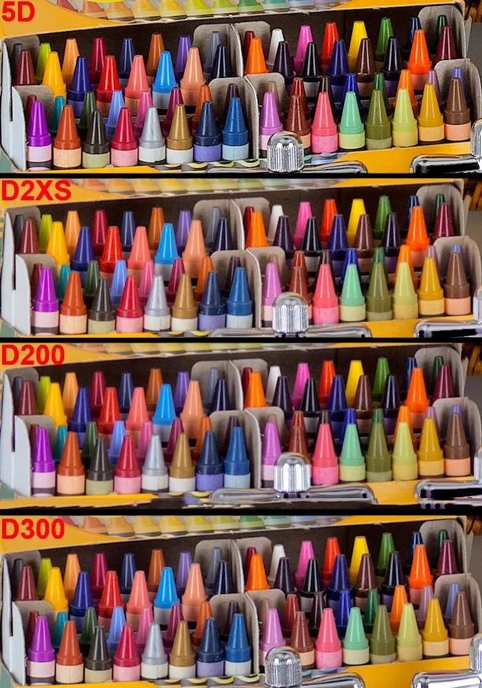
Standardized Imaging Resource test RAW images from various CCD and CMOS cameras consistently showed high density CMOS cameras were routinely unable to differentiate both weak color and fully saturated color simultaneously. This held true regardless of the convertor or profile used. Here for example, is the CCD based D200 rendering the crayon bands in IR's test image more distinctly than the CMOS based D300:

Click to see a larger view

Looking at this in a bit more detail with a test scene, it all looks similar until we take a closer look. It proves the point that this isn’t really about CCD vs CMOS. It is more about, which camera has the stricter CFA with that sensor. Look at the D200 colours, then for example the D300 example below it. Green crayon, third from the left, look at the wrapper. It’s barely saturated compared to the D200 image. Same with the purple crayon wrapper near the centre. The D200 shows the subtle saturation of the hue, whereas the D200 shows a very washed out tone in comparison. This is true of many of the other colours shown here. Note that only the D200 has a CCD sensor here. Another way to say this:

Focus on the crayon wrappers in the first row (not the crayon tips, which are equally saturated) and you can see the D300 is simply less sensitive to weak color, leaving them washed out because the RAW transform can't saturate the wrappers further without clipping the strong colors in the tips.

In the past CCD proponents expressed that CCD images have a certain "look", are "richer", or produce "better skin colors"... all subjective qualities difficult to measure in standardized testing. This goes to arachnophilia's point about the purported CCD advantages reminding him of essentially unverifiable audiophile claims.

In the washed out rendering of weak color by high density CMOS sensors we have something that's shown itself to be quite different because:

  • it can be objectively and reasonably tested for by anyone

  • it is so far holding consistent in every CCD versus CMOS comparison performed

  • it is concordant with professional reviews of equivalent CCD vs. CMOS cameras.

The reproducibility is what separates it from anecdotal evidence and has since ensconced it as a measurable characteristic of CCD image quality. Look for it and you will find it. The Canon 5D does well in this comparison because it appears to have a much stricter CFA than the D2XS or the D300, despite having a CMOS sensor.

In the above scene, there is a subtle but noticeable colour difference; a ‘when you see it’ type of thing. The M240 image is on the left side. The Leica M9 CCD sensor with strict CFA is on the right. Here the author can't match the M9's rich rendering of the purple vine because the green foliage of the M240 image would go nuclear if he did. Yet we can see the strong saturation applied to bring the M240 image closer to the M9 has already unnaturally overcooked the weaker colours in the M240 walkway, yet it still doesn’t match it. Only the M9 seems to preserve the full dynamic colour range of the scene. If you are looking at these images on a cheap monitor that doesn’t show at least 100% RGB colour, you won’t see the subtle differences I am showing here. Also note that the M9 image shows more shadow detail in the gate than the image from the M240, despite still being a punchier, more contrasty image. You might look at this and think oh I see it but it’s subtle. However I see it across other colours too. Many cameras skew reds to orange, and golds to yellows, as well as under saturating them, which is even more problematic.

Have a look at this image from dpreview.com : https://www.dpreview.com/forums/post/53185762?image=0

Here we can see four CMOS cameras. The D700 by far pulls out the gold tones the best. The D800 really skews this hue to yellow. The D700 has a much stricter CFA than the D800 does.

We know that despite the addition of micro-lenses, smaller pixels physically collect less light per pixel. That makes them less sensitive to light on a per pixel basis. Manufacturers have responded by progressively making the CFA's in high density sensors less selective to allow more light to reach these tiny pixels, particularly for when light levels are low and high ISO must be used.

The rationale is explained below:

Look at what Doug Peterson from PhaseOne says on the matter - “Historically, CMOS has not had the best reputation for color rendition. But teasing apart cause and effect has been, up until now, very difficult. CMOS and CCD were being used by very different companies in very different systems. Most CMOS cameras are built for the broadest possible range of applications. They are built by consumer electronics companies with a volume sales business model, where features and price are higher priorities than image quality.

As one example, the selection of a CFA, the color pattern put in front of the sensor, is a choice between quality of color, and ISO performance. If the CFA allows each pixel to see a broader spectrum of color (e.g. for the green pixels to see a bit further into yellow) a camera’s ISO range can be modestly increased. The resulting loss in color quality is subtle – subtle variations in color are missed and a handful of specific colors become difficult to photograph. In a market where a ISO 25,600 camera has a leg up on a ISO12,800 camera, the engineers are under enormous pressure to pick the modestly increased ISO over subtle color quality.”

https://luminous-landscape.com/the-phase-one-iq250-cmos-fully-realized/

Now look at the trend in SMI scores here:

http://www.dpreview.com/forums/post/56355228

Generally speaking, the top 50 list for high SMI cameras are CCD cameras (which happen to have strong CFAs) while modern, high density sensors occupy the bottom 50. It doesn't take a rocket scientist to see why...weak CFA's have been propped up by heavy handed RAW transforms, in order to get usable colour. You see, over the generations of cameras since the dawn of digital tech, there has been immense focus on ISO performance, and noise. Visit any photography forum and you will see it is mostly all they talk about day in day out. Engineers have been pushed into achieving another stop of high iso range with nearly every generational release until recent times such as sensor tech more or less has plateaued. One of the ways they did this, was by weakening these CFAs to let in more light, sacrificing those stricter colour separations of previous cameras. We see it in the reds; many modern Nikons produce oranges rather than true reds. As shown, gold tones are skewed to yellow, greens and blues are subtly off and bleed into each other. As also mentioned here, many constantly state you can just change the colour to your liking. It’s not that simple. As you push and pull things to try and get certain visible colours on a colour chart in check, we move all the other subtle tones around too. It seems there is no substitute for a strong CFA that helps discriminate colour at the capture stage.

So Why CCD? (Or cameras that proritize Colour)

Using older cameras has some obvious disadvantages. Some are so old now, the LCD monitors are hard to see by modern standards - they aren’t very large nor bright. Some old CCD cameras have gimped control interfaces as they were built for a consumer market (ala D60). Some don’t have focus motors built into the body, limiting use of lenses that have inbuilt motors, such as Nikon’s AF-S variants. Many are poor by modern standards in high ISO shooting. So why is it despite all these draw backs people still value their output?

  • They are very competitively priced now and can be found at low prices in mint condition

  • They can in the right hands, produce beautifully nuanced and saturated colours and a look of yesteryear

  • Many have fantastic JPG engines built in, meaning in some cases users can forego RAW for less technical shooting requirements. I use RAW for most of what I do, however JPG for many of my stock shooting business as I really don’t enjoy sitting editing for hours as much as I used to.

  • Many CCD cameras not only produce (subjectively) better out of the box colour than some costly modern cameras; they also produce a more organic, less digital, perhaps more rounded and filmic look than some of those crunchy digital sensors that need a lot of PP to get them how I like them

  • More realistic skin tones without green hues in them

  • Fewer metameric errors with difficult hues (purples, for example)

  • Unclipped strongly saturated colours next to accurately depicted weak colours,

  • Better colour accuracy under partial illuminants like incandescent and LED bulbs

  • It’s a ‘when you see it’ thing going on here. When you notice good colour (and conversely bad colour), you do think differently on the topic.

CCD cameras, and retro cameras such as the D700, famous for excellent colour output are free to be judged by their own strengths. There are better cameras to shoot in the dark with and the like, better cameras to deal with sports and action etc, so now these cameras can play to their own unique strengths. Couple that with the fact most serious shooters can afford a backup body or two second hand, it can make perfect sense if your needs align.


If you enjoyed this article, consider following me on Instagram or Facebook.

D200 with 35/1.4

Using the Nikon D200 Alongside Modern Cameras

The Quiraing in dappled light, Nikon D200 and 18-55 Zoom. A one shot image with careful exposure.

Introduction

I am going to begin with a quote I read online recently which for the most part, so eloquently sums up my feelings about cameras and sensor technology:

“Most people today are on the fast track of the forever-evolving, yet "never getting there", off-the-rails technology "train" that takes them wherever it takes them, without their choosing. Never arriving at a destination, always focusing on the next station ahead of where they currently are, hoping, no - dreaming, that one day they will "have arrived"... I for one have turned back. Having gotten off the train, stopped and looked around the platform, sat down for a while and contemplated, then firmly decided to get on a train headed in the other direction.”

I’ve continued to use the venerable Nikon D200 camera alongside the latest technology in 2024 and will continue to use it along side other great cameras of yesteryear. I have been using this camera for a few years now, following recommendation from a friend. I wanted to share some pictures from the last few years that inspire me to continue using this CCD colour king. If you read the very first blog post I made on this camera, you will know I value this classic body for it’s CCD sensor alongside it’s strict Colour Filter Array (CFA) which follows strict colour discrimination which produces naturally vibrant and colourful images out of the box, without oversaturating individual colours and hues. This allows for an overall very organic, ‘filmic’ looking output with sublime skin tones that I enjoy to this day. In fact, I’d go as far to say that with the right conditions and lens, I sometimes prefer the initial output from the Nikon D200 to other cameras, and contrary to some opinion, find it difficult to get a D200 ‘look’ from other cameras. Knowing how to use the D200 to get the best out of it is another matter, so we will explore that here along with some other tips and tricks. This will also be a bit of a ramble. Most people do not perceive, or seem to care much about colour in digital photography. As long as the sky is blue and the grass is green (no matter what shade or hue of blue and green that is), most people simply don't care one bit. Nobody cares, because if the camera they grab to shoot with has the sky coming out blue, with the grass remaining green, and caucasian people are not Alien-green, and skin colours somewhat resemble close to real life, they are happy. I think that colour is important in photography and I have noticed a couple of things about cameras that do colour well. Read the first article I wrote about the Nikon D200 here.

The D200 CCD Sensor

The 10 Megapixel CCD sensor found within the D200 has some interesting characteristics. 10 MP is considered very low by today’s standards - however for most work I have to ask why people think like this. Nine times out of ten, I’d imagine most people buy the marketing koolaid. “You aren’t a man if you don’t shoot 45 megapixels!” However, consider that most do not print now, and most simply display images on tiny phone screens, so I ask again, why do we really need 45-60MP bodies? I say this as a user of such bodies. I have no choice in the matter if I want a modern, high dynamic range camera with all the bells and whistles that provides. I would say 36MP is the limit I would ever require, but hey, what do I know. The D200 sensor is a CCD technology, mostly phased out for the cheaper CMOS design found in most digital cameras these days, which offers better high ISO capability (and it does). The D200 sensor falls apart at high ISO, and I simply wouldn’t use it for such. You should be aware, the D200 sensor has quite a thick anti-aliasing filter. Because of this, it really benefits from using nice and sharp lenses, though as I will show, combined with some lens attributes / optical imperfections, one can use this to their own advantage to create a very specific look to the resulting pictures.

D200 with 85/1.4 Sigma Art. Shot in JPG. (A friend’s shot)

The above picture of my friend’s son demonstrates beautifully what I am speaking about when it comes to colour reproduction and skin tones. This is an impromptu picture which was shot in JPG image format, (it probably needs a little cropped off the bottom). Here we can see beautiful colour reproduction out of the box: so many modern cameras fail in this regard and I guess I didn’t notice how bad they do as I tend to shoot RAW nearly all the time for professional work. This shot could easily be further processed and dodged and burned for even more dramatic effect of this little moment captured. And how nice is this portrait too? It is so rich, doesn’t feel digital at all, and has beautiful skin tone reproduction. The subtle changes of red - orange hues in the skin tones are picked up beautifully here. The subtle red hue of the top is picked up beautifully. Some cameras struggle with basic colour reproduction such as this; red tones are pushed to orange, golden colours, skewed to yellows to name a few. Some of my modern CMOS camera’s really have issue with red colours especially in lowered light. My D810 changes red neon signs to orange every time. Even although the high ISO ability of the D200 is much poorer, I found it doesn’t do this sort of colour skewing that my eyes have become accustomed to seeing. As mentioned, this is a straight out of camera shot too! Hold that thought.

Blue Marbles - D200 with 35/1.4 Tamron

The Colour Filter Array - By en:User:Cburnett - Own work, CC BY-SA 3.0, https://commons.wikimedia.org/w/index.php?curid=1496858

Colour Filter Array

In digital imaging, a colour filter array (CFA), is a mosaic of tiny colour filters placed over the pixel sensors of an image sensor to capture colour information. Without such a filter in the imaging chain, the sensor is not able to ‘see’ the differing wavelengths of light, and thus would not be able to produce an eventual colour image. The illustration shows a Bayer colour filter array typical in many digital camera sensor designs. Each two-by-two submosaic contains 2 green, 1 blue, and 1 red filter, each filter covering one pixel sensor. (You can see therefore, that natively some sensors capture more green wavelengths of light easier - this sometimes presents itself as a problem when processing deep sky images - there’s more green to deal with). The colour filters filter the light by wavelength range, such that the separate filtered intensities include information about the colour of light. For example, the Bayer filter gives information about the intensity of light in red, green, and blue (RGB) wavelength regions. The raw image data captured by the image sensor is then converted to a full-colour image (with intensities of all three primary colours represented at each pixel) by a demosaicing algorithm which is tailored for each type of colour filter. The old CFA's were clearly built to prioritize colour fidelity at base ISO, whereas, at least in the initial generation of high megapixel sensors, they seem to have been weakened to let more light pass, to allow those sensors to achieve better high iso capability. This I feel may have affected their native colour output, compared to bodies like the D200, D60, D40, which had strict CFAs and CCD sensors which borrowed the kodak colour recipe from the film days. Modern CMOS image sensors tend to have smaller pixels (to increase resolution and reduce optics weight, volume and cost) and thus. less light gathering capability per pixel. A "weaker" CFA is used to partially compensate this. Do the same with a CCD and you will also get "weak colors." So the point is, the CFA is extremely crucial here in the imaging chain. There are plenty of CCD sensors that produce subjectively bad colour. This is where people go wrong with this CCD thing. It’s the CFA that has probably the largest say in the colour discrimination from the sensor and it just so happens to be that CFA’s a the advent of digital technology were more strict then some found in more modern tech. BSI CMOS has basically erased the light gathering advantage CCD sensors enjoyed years ago when FSI CMOS sensor circuitry still blocked part of the pixel. Although the  sensor itself is monochromatic, the colour  depends on more than just the CFA. There's an interpolation step required to convert the 4 measured RGBG pixels into  native colour after which a 3x3 color correction matrix produces sRGB.

A weak CFA over CCD can and will indeed suffer the same color problems as a weak CFA over CMOS.

That D200 Look. 35/2D Nikkor

Sensor Colour Response - SMI

From DXOMark - “The sensitivity metamerism index (SMI) is defined in the ISO standard 17321 and describes the ability of a camera to reproduce accurate colors. Digital processing permits changing color rendering at will, but whether the camera can or cannot exactly and accurately reproduce the scene colors is intrinsic to the sensor response and independent of the raw converter.

The underlying physics is that a sensor can distinguish exactly the same colors as the average human eye, if and only if the spectral responses of the sensor can be obtained by a linear combination of the eye cone responses. These conditions are called Luther-Ives conditions, and in practice, these never occur. There are objects that a sensor sees as having certain colors, while the eye sees the same objects differently, and the reverse is also true.

SMI is an index quantifying this property, and is represented by a number lower than 100 (negative values are possible). A value equal to 100 is perfect color accuracy, and is only attained when Luther-Ives conditions hold (which, as previously stated, never happens in practice). A value of 50 is the difference in color between a daylight illuminant and an illuminant generated by fluorescent tubes, which is considered a moderate error.”

NB: SMI depends more on CFA selectivity and AA strength than other sensor parameters, and since newer cameras with more pixels can do with weaker AAs, they can be a little less precise at handling colour in this regard.

Nikon D200 SMI Colour Response in Daylight. Courtesy of DXOMark.

Sensitivity metamerism index, or SMI, is essentially a measure of how well a specific camera under test lighting can reproduce the colour checker colour set. To give you an idea, under testing many phones sit around 40-50 in their SMI score out of 100, which is pretty low. Larger sensor cameras, aka DSLR’s and mirrorless designs tend to be much better, They start around 75 and go up. Scores in the 80s tend to be very good indicators of ‘good’ colour reproduction. Cameras valued for good color typically have high SMI values, while those known for poor color usually have low numbers. But not always. Anecdotal evidence suggests that some photographers feel that their older cameras deliver better colour than their newer ones (of course, a subjective quality regarding colour). In our colour images, it can be valuable to have a camera that is able to accurately pick up all the subtle tones and hues of individual colours, without oversaturating any of them like some other cameras do (new and old, I might add). This would be like someone noticing their camera did not saturate individual colours well in a scene, and another remarking that they could just turn up the saturation in post processing. However, in doing so, colours over-saturate before the more subtle colours saturate properly. That said, I mostly just go by look though in these matters. This stands to reason, because when I first picked up the D200 to shoot with it I immediately noticed what my buddy was saying. This is despite having a lot of cameras under my belt and using the latest cameras for landscape photography, astrophotography and other genres.

Let’s have a look at the DXOMark data on colour for the D200 camera. What we are looking at here is the daylight response to colour reproduction (CIE-D50) Click to see a larger view, or pinch zoom if on a mobile over the data. The D200 scores very highly, at 84 in this metric. Compare that to another body, not known for it’s colour reproduction quality - the D600. Note that it is scoring notably lower from the testing procedure at 77. Actually, the two Nikon cameras that top DXO's list for highest color SMI are the D40 and D60 which both scored 85 and 84 respectively for CIE-D50 and CIE-A. The only downside is they are very old bodies now and come with a worse autofocus system, and less bells and whistles than the D200 provides. They are definitely not built like the D200 either.

Nikon D600 SMI Colour Response in Daylight. Courtesy of DXOmark.

See here to find the full details on the ISO International Standard for Camera Colour ISO 17321-1. Feel free to look up SMI figures for colour for other cameras. Generally, the trend is, the lower that number, the worse it’s out of the box colour tends to be for the particular body under investigation. Curiously though, things have gotten interesting recently. At the advent of modern high megapixel cameras such as the D800, D810 and D850, there was a slight drop in colour performance if we look at this metric. For example the D800 took a notable hit at 78 on the SMI scale. The D850 scored a slightly better 79. The Z7 mirrorless reached 82, and now the Z8 I own got an 83! Only one point less than my beloved D200. However, as I wanted to describe, it is important to not just attribute colour performance to one number. The Z8 colour is very different to the D200 in the way it’s colours present. Different is the best adjective here. Neither is better, it really becomes a personal preference. This is indeed another point that I would make. I have realised that I am someone that loves to shoot different cameras, also for the experience in itself. To me, every sensor ‘draws’ differently. So even cameras that I have stated have ‘poorer’ colour than the D200, such as the D800, I love to use because I still like their output, for other reasons. It becomes a tool to task, or what I want to create type of thing. With regards to the D200, it does feel very film like in it’s reproduction. The colours feel older school, the thick AA filter mutes some detail too, the skin tones are gorgeous. The effect is, the D200 really feels like a digital-film camera hybrid to me in comparison to the modern technology. It is noted that the D200 can individually pickup and discriminate all the subtle hue changes and saturations of individual colours in an image. In trying to emulate what the D200 does natively with other cameras, tends to make particular colours go ‘nuclear’ with oversaturation, whilst trying to properly saturate the weaker colours in the image. I have noticed this over and over.

There are some problems with SMI, and using it in isolation:

  • As a statistical measure, it only gives us an average and doesn’t tell us about the distribution of errors.

  • If they only use the ColorChecker 18 color chart, then this is an amazingly poor sample. Really, there should be a better methodology using far more colors. What I find surprising is that manufacturers can’t even get these 18 colors right.

  • There could be a potential problem of them ‘gaming the system’ where manufacturers only work on getting those 18 colors right, ignoring the others, giving a deceivingly high SMI number. This is a big problem with artificial illuminants such as fluorescent and LED lamps, which are often designed to delver a high Color Rendering Index even though they still have poor spectra — and the CRI test is even worse than SMI, using only 8 sample colors. Lamp manufacturers lately rejected the use of the full ColorChecker chart, which is rather distressing.

  • I’m not to sure how good CIELab is as a color distance metric, although it is far better than Euclidian RGB distance.

  • This does not take ease of re-touchability of colors into account, which is related to color depth.  High color depth does not mean that the colors are correct, but it does make them more correctable in post processing. 

Looking at this in a bit more detail with a test scene, it all looks similar until we take a closer look. It proves the point that this isn’t really about CCD vs CMOS. It is more about, which camera has the stricter CFA with that sensor. Look at the D200 colours, then for example the D300 example below it. Green crayon, third from the left, look at the wrapper. It’s barely saturated compared to the D200 image. Same with the purple crayon wrapper near the centre. The D200 shows the subtle saturation of the hue, whereas the D200 shows a very washed out tone in comparison. This is true of many of the other colours shown here. Note that only the D200 has a CCD sensor here. The Canon 5D does well in this comparison because it appears to have a much stricter CFA than the D2XS or the D300, despite having a CMOS sensor.

Canon 5D - CMOS with strict CFA, D2XS, CMOS weak CFA, D200 CCD, strong CFA, D300, CMOS, weak CFA. Image used with permission courtesy of   Imaging Resource.

In the above scene, there is a subtle but noticeable colour difference; a ‘when you see it’ type of thing. The M240 image is on the left side. The Leica M9 CCD sensor with strict CFA is on the right. Here the author can't match the M9's rich rendering of the purple vine because the green foliage of the M240 image would go nuclear if he did. Yet we can see the strong saturation applied to bring the M240 image closer to the M9 has already unnaturally overcooked the weaker colours in the M240 walkway, yet it still doesn’t match it. Only the M9 seems to preserve the full dynamic colour range of the scene. If you are looking at these images on a cheap monitor that doesn’t show at least 100% RGB colour, you won’t see the subtle differences I am showing here. Also note that the M9 image shows more shadow detail in the gate than the image from the M240, despite still being a punchier, more contrasty image. You might look at this and think oh I see it but it’s subtle. However I see it across other colours too. Many cameras skew reds to orange, and golds to yellows, as well as undersaturating them, which is even more problematic.

D200 Top, D810 Bottom, using Nikon’s own software NX-1

Have a look at the above images. Using Lightroom classic, the rendering is dull and lifeless on the D200. However, use NX-1 (the way Nikon intended picture controls to be read), and you can really see the colour punch from the D200 here. Now I know, the framing is slightly different, and even although I used the same ISO, shutter and aperture speed, the exposure / white balance will always be slightly different. Despite this, I have yet to see anyone accurately mimic the D200. If you can, I would like to see this, and see how long it took to do, and how long it took to do it for each illuminant. I’ll wait! I know how I prefer my strawberry colour out of these two examples. The D200 might not even be more accurate here. For me, it’s about what is more pleasing. I took some time to try and match these, and frankly it was painful. I never actually got them the same, when when I approached the D200’s colour punch, by bending and shifting the colour to make the strawberries mimic the D200 on the D810, the rest of the colour got mangled. Let’s look at one example of this next.

Above is an example of the problem with the red channel in Nikon cameras. First we see the D810 output. Next, an ancient Samsung Note 20 Ultra phone, and lastly, what I have to do to get the tail light to approach how it looks colour wise (still not right however - it’s too orange). Notice how the skin tone is completely mangled? This issue is compounded by the fact that Nikon reds blow out ultra quickly, compared to the other colour channels (it’s as good a reason as any to ensure you have colour histograms enabled in any camera you shoot with). You may assume that by me simply drastically lowering the exposure of the shot, as I have done on the right, got me to this point that you are seeing here in this example. The reality is, I had to do huge pulls on the orange and yellow-red hue sliders and calibration settings. To reiterate, it is a great example of the point I would make when people tell that you can get colour any way you want it. It would be a lot of work in order to truly match the output of a favourable camera, and even so, I have reservations it is possible, if the CFA is so weak at capture stage - how can heavy handed RAW transformations (to get good colour) actually deal with the fact of an information loss at the shot taking stage?

Have a look at this image from dpreview.com : https://www.dpreview.com/forums/post/53185762?image=0

Here we can see four CMOS cameras. The D700 by far pulls out the gold tones the best. The D800 really skews this hue to yellow. The D700 has a much stricter CFA than the D800 does.

We know that despite the addition of micro-lenses, smaller pixels physically collect less light per pixel. That makes them less sensitive to light on a per pixel basis. Manufacturers have responded by progressively making the CFA's in high density sensors less selective to allow more light to reach these tiny pixels, particularly for when light levels are low and high ISO must be used.

The rationale is explained below:

Look at what Doug Peterson from PhaseOne says on the matter - “Historically, CMOS has not had the best reputation for color rendition. But teasing apart cause and effect has been, up until now, very difficult. CMOS and CCD were being used by very different companies in very different systems. Most CMOS cameras are built for the broadest possible range of applications. They are built by consumer electronics companies with a volume sales business model, where features and price are higher priorities than image quality.

As one example, the selection of a CFA, the color pattern put in front of the sensor, is a choice between quality of color, and ISO performance. If the CFA allows each pixel to see a broader spectrum of color (e.g. for the green pixels to see a bit further into yellow) a camera’s ISO range can be modestly increased. The resulting loss in color quality is subtle – subtle variations in color are missed and a handful of specific colors become difficult to photograph. In a market where a ISO 25,600 camera has a leg up on a ISO12,800 camera, the engineers are under enormous pressure to pick the modestly increased ISO over subtle color quality.”

https://luminous-landscape.com/the-phase-one-iq250-cmos-fully-realized/

Now look at the trend in SMI scores here:

http://www.dpreview.com/forums/post/56355228

Generally speaking, the top 50 list for high SMI cameras are CCD cameras (which happen to have strong CFAs) while modern, high density sensors occupy the bottom 50. It doesn't take a rocket scientist to see why...weak CFA's have been propped up by heavy handed RAW transforms, in order to get usable colour. You see, over the generations of cameras since the dawn of digital tech, there has been immense focus on ISO performance, and noise. Visit any photography forum and you will see it is mostly all they talk about day in day out. Engineers have been pushed into achieving another stop of high iso range with nearly every generational release until recent times such as sensor tech more or less has plateaued. One of the ways they did this, was by weakening these CFAs to let in more light, sacrificing those stricter colour separations of previous cameras. We see it in the reds; many modern Nikons produce oranges rather than true reds. As shown, gold tones are skewed to yellow, greens and blues are subtly off and bleed into each other. As also mentioned here, many constantly state you can just change the colour to your liking. It’s not that simple. As you push and pull things to try and get certain visible colours on a colour chart in check, we move all the other subtle tones around too. It seems there is no substitute for a strong CFA that helps discriminate colour at the capture stage.

Test Images courtesy of dpreview forum member Schnapshot

Test Images courtesy of dpreview forum member Schnapshot

Why a Strong Colour Filter Array matters when it comes to colour - further demonstration

Let’s move away from the D200 just for a moment to show the phenomenon I am speaking about. The D60 is an early CCD digital camera from Nikon with a CCD sensor and a strong CFA which allows great colour seperation. This is not a perfect test, however in every situation I have seen, a CCD sensor with a strong CFA is producing (to me) a better, punchier out of the box colour, without needing to profile a camera for every single possible illuminant. Here, even at a quick glance, we can simply see the colours of the yellows are more vibrant and less shifted than in the CMOS D750 from Nikon which came out ten years after. The same goes for the red, although more subtle, it is clearly a nicer output to my eyes. The light blue colour is also better to my eyes than the D750 seems to produce. This is a big one for me, blue sky features in many landscape photography images and I must say it is a point of contention for me personally, as many modern cameras produce this horrid magenta-blue sky colour. It’s hard to fix and get it where I want it. The D200 just does it right out of the box. Every scene will show different problems with colour, and in some scenes I find it manifests itself in a greater fashion. Consider also, that looking at colour charts can really only tell part of the story. What about every single shade in between each of these colours? The D200 is a 12 bit camera. 12-bit color provides 4,096 shades per color channel (Red, Green, Blue), resulting in a massive total of over 68.7 billion (68,719,476,736) possible colors! A strong CFA is able to separate colour better than a weak one (we know this, as previously mentioned in this article; PhaseOne knew this problem so well that they went back to the drawing board in recent years to ensure colour and image quality was a top priority in their IQ250 camera). As we have observed, the selection of a CFA, the color pattern put in front of the sensor, is a choice between quality of color, and ISO performance for many cameras in modern times. Perhaps one of the drives for this is new photographers’ seeming reluctance to learn to light a scene (where possible) and rely on ‘ISO performance’ that colour has taken a back seat. The grass is green, the sky is blue, seems to be all these guys care about…ISO specs sell cameras quicker than “this camera has better colour”.

Nikon D200 Skin tones

How To Get the Best from the D200

To get the best from the D200, and considering that it is an older body and sensor in terms of digital tech, we need to understand the nature of light is noisy. The inherent nature of light is such that in anything but the brightest sunlight, light comes bundled along with ample amounts of noise. Most of that noise is located within the shadow regions of course, but not all of it resides there, depending on the conditions. We don’t see any of this however, as our visual system is not evolved to require to see or care about this, however it is the reality. (Consider that the noise present along with light is different from read noise, which is the noise generated in capturing and processing the signal within the sensor and associated tech, essentially the noise generated from the electronics within the camera). Why am I labouring so much on the basic physics of light here? Because it is crucial to understand this, and to realise that the best way to deal with the D200, or any camera is to properly expose to the right. Ensure that everything is pushed as far to the right wall of the histogram before overexposure occurs, for the best overall fidelity. (This is tricky in some ways, and sometimes you might have to bracket exposures). In addition, the second layer of complexity comes about when we realise that the histogram on the back of the camera is built from a jpg preview - meaning it is a rough guess of the actual RAW data at best because it isn’t linear data and has thus a tone curve applied to it.. It is however, all we have got, and with experience, it is a useful tool. Just know that sometimes it will say you have clipped, when you have not. (So never delete a shot because of this, at the scene). Also, as a further tip, I recommend dropping the D200 LCD monitor brightness to -1 or 0 unless shooting in bright sunlight. It’ll also guide your eye more and prevent underexposure. (people often shoot with the monitor so bright it makes them think shots are properly exposed. While the histogram is what we should be using as I describe here, our brains can be easily fooled. So turn that screen down!) The D200 files cannot be pulled as easily as files from class leading full frame image quality camera’s such as the D850, Z7ii, Z8. Also, since the D200 is a smaller sensor camera than the full frame cameras I use alongside it; I also have less latitude in terms of dynamic range, over 3.5 stops less at base ISO:

7.79 Stops of Dynamic Range for the D200 vs 11.32 for the Z8, another camera I also use (at base ISO).

Because of the reduced malleability of the RAW files coming from the D200 camera, and it’s lowered dynamic range as shown above - it is important to maximise each and every exposure. I do this by using good shot discipline. I suggest clicking the link to learn more, however one should understand that using base ISO is absolutely crucial to this concept.

High ISO and the D200

High ISO settings are not the D200’s strong point in a traditional sense. The body itself suggests this, by topping out at ISO 1600. That said, if you aren’t shooting purely in available light like my example below at home, it is very easy to still use the camera for this purpose if you are creative. (Also, it has to be said that if shooting in lower light, but we still have actual light present - e.g. it is not pitch black, say for example we are shooting near a window, wanting to use available light only, but need ISO 800, 1/60 and 1.4 for a decent exposure - I actually like the noise pattern. It’s grainy, moody, and yes, film like If you are used to a body that came out in the last 10 years it will perhaps feel noisy to you however). For situations like the shot below however, I like to run and gun, knowing I will need a flash for them (because it’s essentially dark here) so I use the Godox system and a trigger on the D200 hot shoe. I simply hold the speedlight to my left to get a good shadow on the left side of his face (camera right), I also benefit from the red AF assist beam, making focus even in terrible light (like here) easy peasy. This is shot with a Tamron 35mm f/1.4 (I also use a 35 f/2D when I want to go lighter) at ISO 100, 1/125 and f/1.4. I actually had the flash set to manual (because I like to experience pain), however this is tricky if the subject moves, the power needed for good exposure obviously shifts. For that reason I recommend TTL for moving things, which I mostly do myself also. I can easily go up to 800 or more when using flash, however I wanted to kill most of the ambient light with these settings:

Blue Eyed Boy - D200 with off camera speedlight, camera left

This brings me to another important point about the D200, which is critical to success with it. If you are in the mindset of using modern bodies and making ‘dark’ exposures and dragging them up 4 stops in post - forget it. It’ll produce unwanted results and poor colour with this body. You’ll get noise, banding and other artefacts. Even during the day and outside, it you find yourself with a backlit subject (ie the sun is behind them), consider the TTL popup flash on the D200. Using a bit of fill flash, prevents needing to lift shadows much (as so many have commonly developed a crutch for), and will properly illuminate our subject. We can go further, and carry a larger speedlight too if like I’ve used in this shot for more power and softer light.

Consider Processing in NX Studio

NB: Note that I use Lightroom most of the time for Raw conversion and processing, along with Photoshop. Despite this, Nikon’s free to download NX Studio software really allows the D200 to sing, and display colour the way Nikon intended it. It is important to note that adobe won’t be doing this accurately with their simulated picture controls. NX Studio really does create some magic with the D200 and some other cameras. Whilst it is much less polished than Lightroom, I still often start conversions here, and export them to Lightroom as a Tiff to maintain accurate colour as Nikon intended when I really want critical colours. As much of a hassle as that may sound, for special pictures it is best to take time with them to get them just right. Nikon’s NX Studio is as I said, a little clunky, however you will find it will match the reproduction you are seeing on the monitor on your camera better than adobe or any other software will display. Have you ever noticed that Lightroom’s rendition of your image looks miles away from the back of the camera? This is why (it would also occur if you had different picture controls on camera vs the software, of course). I highly recommend using NX Studio, especially for a colour king such as the D200. So often in lightroom I find things like the vibrant red colours appear as orangey hues in LR, however in the Nikon software they are spot on. Easy solution…open those Raw files in NX, give them a very basic minimal process, and export them as a TIF and continue in Lightroom / Photoshop. Below is a very quick and dirty test. I’ve shot at ISO 400 (not an ideal test but demonstrates my point here fine - this is the highest I would ever push this sensor - I have plenty of cameras that do high ISO well) and shown that the LR conversion (right) skews all the red and orange hues to pinks which are not accurate to my desktop editing PC lighting). Notice also, that on the right side, (LR conversion) much less detail is seen in the glass reflection than on the NX conversion on the left side. There are other differences other than just colour when we use different software to process - notice the severe blooming around the ram sticks on the LR conversion, not present on the NX picture? This lens will do this, but not to the amount that the LR edit suggests. I will add more here in daylight at base ISO when I get the chance, however it is important to stress that software plays a part in this also. Edit - I like using the D200 in ‘mode 1’ when shooting, and in lightroom I apply the ‘D2X mode 1’ picture control. I find that can save me a trip to NX studio, and give me really good skin tones. (The D200 output is basically very similar to the D2X in terms of skintones and colour reproduction is very close to one another.

Why Shoot with a D200?

Colour and Skin Tones. As stated, this body has a very unique approach to colour reproduction, and in my opinion produces just sublime skintones. It’s Colour Filter Array (CFA) is extremely strict relative to most modern CMOS style sensors, built to be able to deal with high ISO better; (they let more light pass to be able to do this). In doing so, many argue that it affected colour, which was better on the old bodies such as the D200. Better is of course a subjective term. I have heard many explain that they can make any RAW file look like it came from a D200. I have yet to see it. I tend to still shoot in RAW format on the D200; however there is a strong case, depending on your shooting style, to use JPG with this body. This is because the JPG ‘recipe’ is naturally very strong with this body. It produces fantastic JPG files in fact. The colours that this body produces may or may not be technically accurate to your eyes, and if you don’t see what is special; move along. I have always felt this body had something great to offer and I continue to use it. The other reasons I use it - I like to take a lightweight backup camera and zoom out with me. This body is lightweight; yet extremely well built. Carrying it with an 18-55 feels like barely any additional weight to me.

What Lenses to use with the D200?

I will go through in turn my most used lenses with the D200 body. There is a bit of a mixture in there, which for my preferences works well. First up is the must have 18-55 f/3.5-5.6 VR DX Zoom Nikkor

18-55mm f/3.5-5.6 VR DX Zoom Nikkor

Glen Tilt: The Autumn Scene, 18-55mm Zoom.

The Wave: St Monan’s Scotland. Nikon D200 with 18-55  Zoom

Rainbow at Pine Cone Point, Nikon D200 with 18-55 Zoom

The Forest, Nikon D200 with 18-55 Zoom

The Praying Hands - Glen Lyon

This is a must have all rounder which is surprisingly sharp considering it being a very cheap DX zoom lens. As you can see, it also produces beautifully pointed sunstars, a feature that I find lacking in so many modern lenses. Above all, this lens is lightweight, has fast and accurate autofocus and is small in stature, making it perfect for use with the Nikon D200 body.

Nikon 50mm f/1.4D

The next up is the Nikon 50mm f/1.4D prime lens. For me, it is important that it is the D variant, because the G lenses are much larger and don’t have the attributes that I use the D200 for. On a DX body such as the D200, bear in mind that a 50mm lens acts like an 85mm in terms of field of view one would experience with a full frame body, because of the smaller sensor size. This allows the 50/1.4D lens to be a lens to isolate a subject. The 1.4D lens produces a truly painterly image, in part due to massively under-corrected spherical aberration, which gives images shot near wide open a glow as we can see in the following frames:

Nikon D200 , 50mm f/1.4D @  f/1.4

As we can see here, the greatest effect comes at the widest aperture of f/1.4. The lens has tons of spherical aberration here, and with dappled light as seen here in this close up scene, is akin to a painting. The light is soft here. If the light was more contrasty or direct, you would see some chromatic aberration. We can see the sharpness is overall lower than most modern lenses.

Nikon D200 , 50mm f/1.4D @  f/2

Light really affects the perception of sharpness, so hold that thought, however we can see that by stopping down to f2 the lens is sharper and whilst the effect remains (good), it is not as prominent now. Below is another shot at f/2:

Nikon D200 , 50mm f/1.4D @  f/2

Nikon D200, 50mm f/1.4D @ f/5

It is important to note, that all of these images are shot at base ISO to get the best from the sensor. I very rarely deviate from this as previously mentioned. The 50mm f/1.4D is a dual personality lens. Stopped down it is bitingly sharp as shown in the final autumnal scene vs these wide open characteristics of the close-range flower shots above. I’d give a special mention to the 50mm 1.8D lens also. It is much cheaper and still and extremely good choice for a camera like the D200. Whilst not achieving a f/1.4 aperture, it actually has basically zero distortion. Very useful to have in a 50mm lens. Straight lines stay perfectly straight.

Let’s draw our eyes to another sharp prime lens, the 20mm 1.8G Nikkor in this summer waterfall long exposure picture that I made with my son:

Nikon D200 with 20mm f/1.8G

Nikon 20mm f/1.8G

The 20mm 1.8G gives a 28mm equivalent field of view on the D200’s Dx CCD sensor. I have grown to like this focal length quite a lot, as 24mm can be too wide and too ‘foreground orientated,’ pushing details in the background too far away. I have the 20mm 1.8G for my full frame DSLRs so it was a natural progression to test it out with the D200. I found that it was extremely sharp. This above picture is a x2 frame bracket which has been exposure blended using luminosity masking to balance the bright sky to the ground. I love the layers of focus in this shot in the foreground. Sometimes I look back on this one and wished that I’d move the camera ever so slightly left to prevent the blurred edge reflection in the foreground tree. Another part of me likes that it produces a slightly unsettling feeling to the picture overall. I also have very little room to maneuver before falling into fast moving water! (Always an important consideration when framing up, I find).

Sigma 35mm f/1.4 Art

Dealing with Crap, Nikon D200 , Sigma 35mm f/1.4 Art

I used a sigma 35mm f/1.4 Art lens for the above shot. I found the focus a little erratic when using this lens. This may just be unique to the Sigma as I have heard some reports of this on other bodies. If you are buying a 35mm prime specifically for the D200 I would look at Nikon’s Dx 35mm 1.8 lens. It’s small, lightweight and sharp, acting as a 50mm field of view compared to full frame cameras. Edit: I now use a 35/f2D or Tamron 35/1.4 at 35mm after selling my Sigma. However, beware the sigma is limited to f/1.4 (the D200 has no electromagnetic aperture control), and the 35/2D full frame lens, or the 35/1.8 DX lens are better options (they are smaller, for sure). Edit - I also have a Tamron 35/1.4 mainly bought for FX bodies, however despite being locked to f/1.4, I find it is a great combination with the D200 if you can manage this. It has close focus, and is so sharp it cuts through the thick AA filter of the D200 for times when you want a bit more accuity in the face and eyes in a portrait.

Nikon 24mm f/1.4G

Giving it a Trim, Nikon D200 , Nikon 24mm f/1.4G

I absolutely love using the 24/1.4G lens on all bodies. On the D200 it gives a FOV of 36mm on full frame - a very useful focal length for many scenes. The subtle but beautiful background blur produces a great cinematic feel to images when close enough (as we should be) to our subject. This image here is a good example of this in practice on the D200.

In short, use any decent prime lens with the D200 in order to keep your ISO to base, to get the best colour and quality possible. Of course, a zoom can be used too (in bright light or on a tripod) which is why I still list and use the 18-55 kit zoom as mentioned in this article.

Nikon 35mm f/2D

D200 at ISO 400 1/50s f/2 in true available light

This is a small and lightweight lens that I love using on the D200 and D700 bodies I own. It seems to nearly always produce good levels of 3D pop in most situations. The above is just a grab shot (a lamp lights his face from camera left. The thing about this lens is the minimum focus distance is incredible. At only 25cm from the camera sensor, you can literally be right up on a subject. (I can get much closer than I am in this example). Considering that on a DX sensor, the 35mm f/2D resembles a 50mm FOV full frame equivalent, it doesn’t introduce much perspective distortion and gives you access to a closer view of your subject, even more than shooting the lens on full frame as the sensor is smaller, so you get closer. I never realised how much I missed close focus. I’m used to lenses like the 50mm f/1.4D and 85mm f/1.4D. Classics and I love them, but sometimes I wish I could get closer. I highly recommend the 35/f2D as a lightweight lens for the D200.

There are many other lenses that work well with the D200, since I don’t own them I won’t say too much more about this. However special mention goes to the work I’ve seen people do with the 60mm f/2.8D micro lens!

Colour Has Improved in Some Places

Have a look at the above colour chart shots, showing the D700, D810 and Z8 respectively. Firstly, a few points to reiterate from this article. The D700 has probably the best colour here and it is CMOS (however, it has a ‘thick’ CFA). Look at the golden yellow tones on the D700, and compare it to the weak, skewed pale yellow the D810 produces. Next the red: the D700 produces a gloriously punchy and vibrant red, whereas the D810 is ultimately very muted in comparison. There are other more subtle differences between those two. The blue tones for one (think skies!) and in the oranges. Also, consider that this is just a 24 colour chart. There are billions of hues in between those displayed here and many are also likely skewed. Also note how the D810’s auto white balance goofed here, producing a green tinge on the grey background. Even if Jules had shot this scene at at a fixed white balance, the colour differences would remain (as previously shown). This is a good test to see the auto white balance functionality.

Let’s now look at the Z8. It’s obvious to see that things have changed, and while there are differences, the Z8 is definitely a step forward, colour wise from previous generations of camera in Nikon land. (It’s a step backwards in dynamic range, from the D810 though, and in other parameters, and a step forward in autofocus etc. A sort of one step forward, one step back game is going on). What can we deduce from this? A strong CFA helps separate and delineate colour at the capture stage. We can also consider that Nikon has very likely tweaked their Raw colour transforms in the Z8, to get this improvement. How do we know this? Well because the Z8’s pixels are even less sensitive to light than the D810, yet it has arguably better out of the box colour. I think though, that Nikon have used different or newer Colour Filter Array technology, which doesn’t impact colour as much as previous. This plays out - SMI for daylight illuminants on the Z8 are only one point behind the D200 colour king (not shown here). SMI scores only tell part of the story however. Pull up the 5D color response measurements on the DXOmark website when comparing cameras and note how much colour is seen in each individual colour channel. Eg. in the red, we want as much red as possible, without a ton of green or blue contamination, et cetera…The D200 still does better than almost any camera I know in this regard.

We can still see the colour differences:

Final Thoughts

There are basically two ways to judge or think of the D200 in terms of how it fits into the camera landscape. When it came out in late 2005, it followed the D2X the year prior. Both of these were pro cameras used by working professionals of the day, and although different form factors, they were actually similar overall. However, they where both APS-C crop sensor, or ‘DX format’ as known in Nikon land, and suffered in low light. This was a big problem for Nikon because many Nikon users looked to Canon’s full frame offerings and lusted for useable ISO 3200 and ISO 6400 that Nikon seemingly were until a year or two later, unable to give them. Today however, the Nikon D200 is completely free to be it’s own thing. It doesn’t matter that the LCD monitor is a bit small and duller, or that the autofocus isn’t going to be much use tracking fast moving objects in genres such as sports. (Or that high ISO is not good). Most of us have cameras that can do these things. The D200 can therefor play to it’s unique strength. The unique rendering and colour are absolutely unique - it probably has the best Nikon colours in any body I have seen, save for maybe a D60 which is unfortunately housed in a very primitive body, camera wise making it difficult to shoot with in the real world in some ways.

Nikon D200 Colour Punch

Colour is something that is intrinsic to many great photographs and in my opinion should be valued and considered more than “the sky is blue=check, and the grass is green=check,” which is how a huge swathe of photographers consider colour in digital photography. I have placed into this article a lot of anecdotal and other evidence to try to show that there are differences between CMOS designed cameras with weak CFAs, and CCD cameras with strong CCDs. This obviously applies to CMOS sensors with strong CCDs, admittedly a seemingly rarer thing to come across; despite that the older Canon 5D achieves this accolade. I will attempt to do some of my own tests of the D200 vs the D810. When I get round to this I will add them to this article, or produce a new article on this topic (Edit: I am writing a new article on colour). So if you are after accurate colour in Nikon land, you can buy a D200, D40, D40x, D60 - they are all up there with an SMI of 85 (from DxO's Color Response tab) vs current cameras at less than 80 (D600, D800 and D4 all having the exact same score). The big win is how cheap these bodies are; they can be mostly found for peanuts, even in great condition. I highly recommend the D200, to experience that old school colour, accurate and beautiful skin tone reproduction and an overall ‘film-like’ look out of the box. You might even on occasion, find that the colour the D200 produces is better than that fancy-pants modern camera you spent thousands on! Consider that I have shown above that the Z8 has improved colour compared to some previous cameras, the D810, D750 etc, however this doesn’t devalue the D200 look, which is still instantly recognisable for me and still cherished by many to this day. Thank you for reading.

Have a look here, when a youtuber did a comparison of the venerable D200 vs the modern Z7 camera and found with hilarious results, that most people by far preferred the images coming off the D200. New isn’t always better.

If you enjoyed this article, consider following me on Instagram or Facebook.

Steve

Edit - Updated June 2026 with images and further information on shooting with high ISO and off camera flash.

The Nikon D200 - Colour King

The Daisy. This was shot by my at the time, 8 year old son. I love this picture - Nikon D200, 24/2.8D prime. Notice the almost painterly appearance it has, helped by the slightly rougher bokeh of the 24/2.8D lens and the beautiful colours of the D200.

NEW - Updated D200 Article here.

The History

I always like to have a camera with me these days. For a while, I stopped unless I was in “Serious Landscape or Astro-Photography Mode,” and I just used my phone - which I was never really that happy with except in a pinch - like maybe at a theme park or something where I absolutely felt I could not bring a camera in with me, or if I did it would be a real annoyance all day. I used to lug the big cameras everywhere, for every occasion - I am speaking about FX Nikon DSLR or mirrorless bodies like the D810, D850, Z 8. I love using them, however they aren't lightweight systems, so in recent times I've made a much more concious effort to free myself from that weight and use a Nikon D200 with an 18-55 mm f/3.5-5.6. Such a brilliant combo, and sometimes I pack a tiny 50/1.8 prime too. With regards to weight; it feels like I don’t even have a camera with me at all. The CCD colours are just sublime. I love the way this sensor draws. The D200 gives me a different look to the other cameras, and I really like using it. I know many would be screaming at their screens reading this, telling me “oh buy a Z 7, it’s lighter, that will work,” or something along those lines. However a long time a go a friend of mine from overseas who used to shoot the same body I did at the time - the D800, was experimenting with CCD bodies from the classic era of digital tech. At first, I thought he might have been crazy to ditch something as technically proficient as a D800 for this, however over time I began to see what he was speaking about. (And no, I didn’t ditch the high resolution cameras).

Nikon D200 with 18-55 mm f/3.5-5.6

The Tech

The D200 has a special mix of a 10MP Dx CCD sensor and a strict colour filter array (CFA). A CCD sensor stands for a charge-coupled device, which is an integrated circuit containing an array of linked, or coupled, capacitors. The CCD sensor was indeed very common at the onset of digital camera tech - with many companies using them in their cameras. What tended to happen over time, was that as the demand for cleaner high ISO increased, cameras with these sensors tended to fall apart in terms of their noise performance, so demand for different tech came about. Along came CMOS sensors, which filled this need, and they slowly became in vogue, whilst also becoming cheaper to produce. With regards to CCD sensors, the specific part that makes or breaks them with regards to colour, is called a Colour Filter Array. A colour filter array (CFA) is a mosaic of colour filters (generally red, green and blue) that overlays the pixels comprising the sensor. The colour filters limit the intensity of light being recorded at the pixel to be associated with the wavelengths transmitted by that colour. Some people make the mistake of thinking all CCD sensors have ‘good’ colour. Whilst there might be some secret sauce in these sensors (which is beyond the scope of this blog post), it is the CFA that differentiates said colours, allowing punchy and subtle saturated colour. More CCDs in the early days had stricter CFAs, thus they became associated with the trait of having good colour, which is of course a subjective quality. The CFA then, in a very real sense, differentiates and separates each colour so that if done optimally / correctly, subtle colour gradiations can be recorded and made vibrant and punchy. The general trend over the years, was to achieve cleaner higher ISOs, that manufacturers’ weakened the CFA properties in cameras generally compared to early digital cameras that had CCD sensors. This allowed more light to pass and be recorded by the sensor, (thus helped with noise performance) however it also muddied colours and individual graduations don’t tend to show as well, or as punchy. Some colours even skew a little, yellows might slip to green tinged etc, other colours might contaminant others. Some people will tell us that they can get any file to look like a D200 RAW file, or any other camera. I’ve yet to see proof of that yet, but I suppose if it is possible, it would be a lot of work, so why not just use the camera that does it off the bat? The power of the CCD and a strong CFA is easy to see in the D200 - colour separation makes the different colours pop like with Kodak Ektar film or Kodachromes. To reproduce the same color micro contrast tones on Sony CMOS files, you’ll need to fine tune every different colour separately and fabricate presets depending on the lighting too - that is a huge task. Further to this, you will have to be very careful during RAW development that you don’t cause the already saturated colours to go ‘nuclear’ when dealing with the subtle tones. That isn’t a workable solution in my mind…I’ll just use a D200, rather than trying to pretend I own one.


NB: Despite these being my thoughts, I still recommend setting up appropriate picture controls in camera and in your software as your best starting point for your edit style and goals.


Learning

I read all about this stuff that my buddy was showing me, however I mostly continued ‘business as usual’ shooting with bodies like the D800, D810, D850, bringing out the D200 I eventually bought for my son only occasionally. I will be honest, I still use these a huge amount, they have bags of dynamic range, and they are obviously no doubt better at night. I am not for a minute advocating everyone pick up old bodies and just use them - unless of course you feel this fits for you. However, in buying a D200 for my son several years ago to get him along on trips with me, I have found myself using it more and more. I managed to find this copy on ebay with only a couple of hundred shots on it and in absolute mint condition, for next to nothing. I unfortunately blew the highlights a little on his knee at the bottom left, in the pure excitement of him opening the D200 box. This was not a staged photograph!

D810 capturing the D200 as unboxed for his birthday with a 50/1.8 prime

Since that day, we have both used this body a great deal. For what I call reportage landscape photography, it is excellent, and works well. We have even used it for long exposure photography, despite it’s lack of liveview functionality. I am using it a great deal whlist I wait on long exposures completing on my Z 8 camera.

What the D200 is for

I am sure many people reading this are still extremely fixated on megapixels. Some of this might come from pressure from other shooters, or a preconceieved idea that more is better. I used to be a little bit like this, however not nearly as extreme as some of the pixel peeping crazies we see in forums. I am very used to shooting high megapixel bodies and have good technique because of this. I am no stranger to 36 - 60 megapixel files, and I make panoramic pictures regularly. I am a technical shooter through and through. I maximse data collection at the scene. I use good technique, solid equipment and expose in order that I can get the most out of each file as possible, most of the time for daylight work that involves exposing to the right (ETTR) and if dynamic range exceeds the sensor capture range, bracketing shots. All that said however, I am not beholden to this megapixel thing so many seem to be, and I am so glad I freed myself of it. The Nikon D200 has 10 Megapixels across it’s large Dx sensor. I find them absolutely plenty and I use a 4K proart monitor to edit on. The D200 should be clamped to base ISO, or as near as it as possible at all times. Give it light. Expose as far to the right as possible so you will be able to bring up some shadow detail later in the RAW, bracket if required. RAW convertors have given a new life to early digital tech. We can do a great deal more with these files than we could in 2005. The D200 has a maximum native ISO of 1600, however as I point out - there are better tools for that task if needed. I do like using primes on the D200 - one of my favourite is the nikkor 24/1.4G, giving a nice 35mm equivalent view to full frame on this dx body. If I am hiking / walking / taking the D200 out for serious landscape work, I pop the 18-55 lens on it. I may seek to add a wider dx lens for this purpose, at some point in the future. I do love my foregrounds…

D200 shooting with a 24/2.8D prime - taken with D810 and 50/1.8D

Skintones

The D200 is quite well known in this department. We know that skintones are something that many cameras find difficult. Skin may look like it is mostly a couple of tones, however a nice, pleasing - realistic skintone often has a massive amount of hues and luminance values. The D200 is absolutely effortless in this regard. I find because it doesn’t skew yellows or reds that it does a consistently good job. To get the best from this, I tend to process initially in Nikon’s free NX-1 studio first, then bring into Lightroom. Another option is to select “D2X mode 1” in Lightroom which gets us very close to what NX-1 is reproducing. Take a look at the skintone below (please consider compression):

Legacy

The Nikon D200 has a big legacy for me. This is the sad part of the whole story. My buddy, Brandon, passed away in 2022, suddenly. He was a young man with a wife and two young children. We spoke every day without fail usually, even if it was just about something we’d read or something about a camera or work. When the news came in that he was gone, this led to the longest period of me not shooting since I started. It lasted a couple of months until I started picking up the cameras again. This might seem like a short period of time, but you have to remember - for someone that had a camera in their hands almost daily, that is a long time in the grand scheme of things. We couldn’t offer much. What can anybody do in a situation like this, except to affirm that if they need anything, they are here? It led my son and I to express it the only way we knew how to properly justify what we felt. We made a picture. That picture is below, shot with the Nikon D200 and a Sigma 35mm f/1.4 Art prime lens. The concept of this picture is obvious, however the technical side was to ensure a natural shadow pallate with a smooth and controlled highlight rolloff, without it feeling like it has had the HDR treatment. This picture was shared online and has been viewed many times - it is very touching to me. I have had many people contact me to say that it inspired them to pick up a D200 which is really nice to hear. And some it just made them pick up and use the camera that they have - which of course is also lovely to hear that someone has been inspired to get out and use their gear.

D200 with Sigma 35mm 1.4 Art prime

I’m going to leave you with my buddy’s best D200 process settings to get the most out of the camera that I still use to this day. Feel free to give them a go. Make sure you tweak your picture control settings. In camera matching ‘DX2 mode 1’ for Adobe Lightroom works well with a bit of a shadow adjustment to boot and these below settings I like a lot. (I made this setting my default import picture control in LR). Adobe Colour also works to an extent, but is much more contrasty so you may have to make allowances for this. The settings are listed below:

WITHIN ADOBE LIGHTROOM

These are my optimal RAW default settings for Nikon D200 files in Lightroom:

Under the "CALIBRATION" adjustments group:

o Set Red Primary channel to Hue -15 and Saturation +15. (This corrects for Adobe's orange skin tone bias with Nikon cameras)

Under the “LENS CORRECTIONS” adjustments group:

o Set “Remove Chromatic Aberration” is checked under the Color Tab.

o Leave Vignetting and Distortion sliders set to off.

Under the “DETAIL” adjustments group:

o Leave Sharpening at its default settings (40, 1.0, 25) with a masking of 50.

o Set the Color noise slider to 0 and the Luminance noise slider to 0.

Under the “TONE CURVE” adjustments group:

o Select “Linear Contrast” as the baseline tone curve.

Under the “BASIC” adjustments group

o Set "Adobe Color" as the default camera profile.

o Set 5650K +10T as the WB default (as most pictures are daylight).

o Set Shadows to +25 as default. (Look for a natural setting that simulates the eye).

o Set Vibrance to +25 as default.

o All other slider settings at 0.

Save all of these as our D200 default settings on import. When you open files for editing in Lightroom:

o Verify that the white balance is accurate and adjust it if not. Cloudy looks good around 6650K +10T and artificial lighting requires dialing in like usual.

o Now shift-double-click the Highlights label to auto-set clipping protection for your WB. Don’t be worried about big numbers like -71, etc. You want the color clipping protection it affords. If you change your WB later, re-do this step.

o Fine tune your mid-tones with the Exposure slider. I use my Lightroom exposure preset tree (shared earlier) to quickly preview the optimal mid-tone point. Often I’m backing the exposure down -.33 or -.67 in order to get the highlights safely to the left of the “Whites” range. This will leave the image a bit under-exposed and dull but I use Nik’s Pro Contrast filter to brighten the image back up in Photoshop later. That boosts both highlights and shadow areas with the added benefit of boosting local contrast (which adds to the 3D Pop).

o Push up the black point so that it just barely clips. When processing portraits I make sure no blacks are clipped in eyes/hair. I don't touch the White Point slider anymore these days.

o If skin tones look way too strong bring Vibrance down to taste. +25 is good as a default but occasionally I have to use -10 simply because the lighting saturates the colors more than usual.

o Adjust noise reduction to taste. If I’m a little above base ISO or pushing up exposure by +.67 then I’ll use Color NR +15. If I’m above ISO 400 or pushing up exposure +1 or more I’ll use Color NR +25. Otherwise I’m at 0 for both Luma and Color NR.

IN ADOBE PHOTOSHOP

o Open Nik Color Efex Pro 4 and choose “Pro Contrast” from the left panel. Leaving the Color Cast and Correct Contrast sliders at 0%, push up only the Dynamic Contrast slider until the image feels right. This will raise the brightness of your highlights back to normal while still generally protecting your colors from clipping. 20% to 30% is safe for almost any image including those with people. Some images without people in the frame can take 50% or even 70%. I have Photoshop actions setup to automate this function at 10% increments from 10% to 100%.

o Add saturation. I use Photo Wiz’s ContrastMaster filter to boost saturation as it automatically figures out a natural looking result for the ambient surroundings. Sometimes it over-boosts skin tones, however, so I leave them as is and reign skin back in with Viveza2 as described below. If you need a copy of ContrastMaster let me know.

o Fix local exposure issues or local over-saturation issues with Viveza 2. I find that mildly oversaturated skin falls back into place with Saturation of -15, strongly oversaturated skin falls into place with Saturation of -25.

Nikon D200 with 18-55 mm f/3.5-5.6 at St Monan’s Scotland

Nikon D200 CCD Sensor

The Nikon D200 Body

So what is next? Well, I would like to pickup some other bodies from this era, such as a D60. For now I will continue with the D200 to see what I can produce over the coming months into the summer and perhaps another blog post will come about from that. You can now enjoy that post here.

Have a look here, when a youtuber did a comparison of the venerable D200 vs the modern Z7 camera and found with hilarious results, that most people by far preferred the images coming off the D200. New isn’t always better.

If you enjoyed this article, consider following me on Instagram or Facebook.

Steve

D200 with 35/f2D prime lens